accent#02707f
bg#f0e9d6
surface#fdfaef
text#15150f
muted#4f4b3d
border#15150f
surface solid#ffffff
accent 2#ffd12b
accent soft#0b4a3a
Affiche is a two-ink poster language for interfaces: every surface is exactly two spot passes on bone stock, the overlap of the two plates computes a third colour, and a knockout is the absence of both.
Tokens and rules, ready for an agent to follow.
Each face set in this language's own words.
Affiche
Affiche
Affiche is a two-ink poster language for interfaces: every surface is exactly two spot passes on bone stock, the overlap of the two plates computes...
Affiche is a two-ink poster language for interfaces: every surface is exactly two spot passes on bone stock, the overlap of the two plates computes...
Affiche is a two-ink poster language for interfaces: every surface is exactly two spot passes on bone stock, the overlap of the two plates computes a third colour, and a knockout is the absence of both. State, hierarchy and emphasis are all decisions about which plates are down and how far off true the second one landed.
A reimagining of Risograph Spot-Color Editorial that keeps its spot-ink, screen and poster-scale soul while replacing the offset-headline device with an overprint-and-knockout mechanic drawn from two-colour screenprinting and the French affiche tradition.
Compose pages as printed sheets on a press bed: one full-bleed plate with display type placed into its quiet region, then bands of bone sheets separated by value alone. Asymmetry is welcome; outlines are not. Every band has one focal point and a quiet ground under its copy.
Two ends and almost no middle. Uppercase Staatliches display carries the poster moments; Instrument Sans at exactly 17px regular carries everything you read; DM Mono at 11.5–12.5px carries run numbers, ink codes and register readings. Ledes stop at 20px and the whole mid-tier compresses toward body scale.
Medium. Generous margins and poster-scaled vertical rhythm between bands; tight, tabular spacing inside a sheet. Never a crowded cluster beside a starved void.
A 12-column editorial grid on desktop collapsing to 8 at tablet and 4 on mobile, with full-bleed plates spanning 100vw and contained content capped at 1500px and centred on ultra-wide.
mobile: 0-767px, tablet: 768-1099px, desktop: 1100px+, wide: 1600px+
Generous outer margins and poster-scaled space between bands; always pad above a title; compress spacing inside a sheet so tables and job tickets stay dense and legible.
emulsion
Two-ink screenprints on bone stock: flat hard-edged cut shapes with no internal shading, a coarse halftone carrying every mid-tone, and plates laid a hair off register so a sliver of the under-ink shows along contours.
One full-bleed plate whose composition reserves a large quiet region — a flat ink sky, an empty deck, an open water band — for the display type. The type is placed into that region rather than scrimmed over a busy one.
Inline SVG at 2px stroke in currentColor; square terminals; no filled pictograms and no emoji.
# Affiche

## Philosophy

Affiche is a two-ink poster language for interfaces: every surface is exactly two spot passes on bone stock, the overlap of the two plates computes a third colour, and a knockout is the absence of both. State, hierarchy and emphasis are all decisions about which plates are down and how far off true the second one landed.

### Values

- two inks plus the stock, and nothing mixed in a bucket
- state expressed as a printing event rather than as decoration
- square geometry throughout, because everything here is cut
- depth as a second impression with zero blur
- a quiet ground under every line of copy, however loud the plates get

### Anti-Values

- glass, blur and glow
- a coloured rail on the edge of a card
- rounded corners in a cut-paper language
- an inflated mid-scale that makes a page read zoomed-in
- a third mixed ink, or a gradient standing in for an overprint

### Visual Character

- two spot inks on bone stock with a bottle-green overprint wherever they cross (mix-blend-mode: multiply)
- a halftone dot screen on ink fields, faded to nothing behind copy
- hard un-blurred offset impressions (4px at rest, 7px picked up) instead of shadows
- knockouts: shapes and letterforms punched to bare paper as the brightest value
- border-radius 0 on every element, poster-scale uppercase display, mono job-ticket furniture at 11.5–12.5px

### Lineage

> A reimagining of Risograph Spot-Color Editorial that keeps its spot-ink, screen and poster-scale soul while replacing the offset-headline device with an overprint-and-knockout mechanic drawn from two-colour screenprinting and the French affiche tradition.

## Tokens

### Colors

| Name | Value |
|------|-------|
| bg | `#f0e9d6` |
| surface | `#fdfaef` |
| surface_solid | `#ffffff` |
| text | `#15150f` |
| muted | `#4f4b3d` |
| border | `#15150f` |
| accent | `#02707f` |
| accent_2 | `#ffd12b` |
| accent_soft | `#0b4a3a` |
| on_accent | `#fdfaef` |
| success | `#0b4a3a` |
| warning | `#8a5a00` |
| error | `#9b2418` |
| info | `#02707f` |

### Typography

- **Base Size**: 17px
- **Body Font**: Instrument Sans
- **Heading Font**: Staatliches
- **Mono Font**: DM Mono
- **Heading Weight**: 400
- **Heading Transform**: uppercase
- **Letter Spacing**: -0.02em
- **Line Height**: 1.6
- **Scale Ratio**: 1.25
- **Google Fonts Url**: https://fonts.googleapis.com/css2?family=DM+Mono:wght@300;400;500&family=Instrument+Sans:wght@400;500&family=Staatliches&display=swap

### Radii

- **None**: 0px
- **Md**: 16px
- **Lg**: 24px
- **Full**: 9999px

### Shadows

- **Sm**: 2px 2px 0 rgba(21,21,15,0.14)
- **Md**: 4px 4px 0 #ffd12b
- **Lg**: 9px 9px 0 rgba(2,112,127,0.28)

### Spacing

- **Base**: 8px
- **Scale**: [4,8,12,16,24,32,48,64,96]

### Surfaces

- **Treatment**: paper
- **Card Style**: bone sheets sitting on a deeper press-bed ground, separated by value and generous margin, never outlined and never blurred
- **Bg Pattern**: halftone dot screen on ink fills, quieted to nothing wherever copy sits

### Borders

- **Default Width**: 0
- **Accent Width**: 2px
- **Style**: solid
- **Character**: horizontal poster rules only — full-measure ink rules separating bands, and hairlines between table rows; never a card outline, never a vertical edge rail

### Motion

- **Duration**: 220ms
- **Easing**: cubic-bezier(0.2, 0.8, 0.2, 1)
- **Philosophy**: one press cycle: the plate travels, lands, and settles on an easing tail — a fast approach with a soft finish, never a bounce

### Radius Stance

0 everywhere. The allowed set {0,16,24,9999} is a palette; this language uses only 0, because every shape in it is cut.

## Rules

### Composition

Compose pages as printed sheets on a press bed: one full-bleed plate with display type placed into its quiet region, then bands of bone sheets separated by value alone. Asymmetry is welcome; outlines are not. Every band has one focal point and a quiet ground under its copy.

### Hierarchy

Two ends and almost no middle. Uppercase Staatliches display carries the poster moments; Instrument Sans at exactly 17px regular carries everything you read; DM Mono at 11.5–12.5px carries run numbers, ink codes and register readings. Ledes stop at 20px and the whole mid-tier compresses toward body scale.

### Density

Medium. Generous margins and poster-scaled vertical rhythm between bands; tight, tabular spacing inside a sheet. Never a crowded cluster beside a starved void.

### Signature Patterns

- the second pull: rest carries one plate, hover lands the second plate 3px off register, active drives it to 1px, selection knocks the shape out to bare paper
- overprint by multiply: overlapping ink layers use mix-blend-mode multiply so the third colour is computed by the page at the overlap
- register as a live reading: the offset is shown as a number in mm and, on the landing, driven by the pointer
- dot gain: halftone screens coarsen under pressure, so the same field reads as a photograph at 10px and a countable grid at 110px
- ink-keyed status: severity and progress are carried by which ink a chip, dot or meter is printed in, never by a rail on an element's edge

## Layout

### Grid

A 12-column editorial grid on desktop collapsing to 8 at tablet and 4 on mobile, with full-bleed plates spanning 100vw and contained content capped at 1500px and centred on ultra-wide.

### Breakpoints

mobile: 0-767px, tablet: 768-1099px, desktop: 1100px+, wide: 1600px+

### Whitespace

Generous outer margins and poster-scaled space between bands; always pad above a title; compress spacing inside a sheet so tables and job tickets stay dense and legible.

## Guidance

### Do

- build every surface from exactly two ink passes plus the stock
- let the overprint green appear only where the two plates actually cross
- express state as a printing event: plate down, plate off register, knocked out
- keep the halftone screen visible on large fills and quiet it to nothing under copy
- set every number in mono on tabular numerals
- separate surfaces by value — the sheet is brighter than the bed

### Don't

- outline a card, or hang a coloured rail on any edge of one
- set type in marigold, or place small accent text over imagery
- round anything
- introduce a third mixed ink, a gradient, or a blurred shadow
- inflate the middle of the type scale
- trap navigation in a pill or a floating bar

## Imagery Direction

### Pairs With

emulsion

### Illustration Style

Two-ink screenprints on bone stock: flat hard-edged cut shapes with no internal shading, a coarse halftone carrying every mid-tone, and plates laid a hair off register so a sliver of the under-ink shows along contours.

### Hero Image Direction

One full-bleed plate whose composition reserves a large quiet region — a flat ink sky, an empty deck, an open water band — for the display type. The type is placed into that region rather than scrimmed over a busy one.

### Icon Style

Inline SVG at 2px stroke in currentColor; square terminals; no filled pictograms and no emoji.

### Image Gen Prompts

- A working harbour at low tide with gantry cranes over a moored trawler — a two-ink screenprint on bone-white uncoated paper, aqua teal and marigold yellow printed one plate after the other, overlaps multiplying into deep bottle green, flat hard-edged cut shapes, coarse halftone mid-tones, plates a hair off register, generous bare-paper sky. NO text, NO letters, NO logos
- A woman in a knotted headscarf looking back over her shoulder — same two-ink screenprint technique, generous bare-paper negative space around the head. NO text, NO letters, NO logos
---
version: "alpha"
name: "Affiche"
description: "Affiche is a two-ink poster language for interfaces: every surface is exactly two spot passes on bone stock, the overlap of the two plates computes a third colour, and a knockout is the absence of both. State, hierarchy and emphasis are..."
colors:
  bg: "#f0e9d6"
  surface: "#fdfaef"
  surface_solid: "#ffffff"
  text: "#15150f"
  muted: "#4f4b3d"
  border: "#15150f"
  accent: "#02707f"
  accent_2: "#ffd12b"
  accent_soft: "#0b4a3a"
  on_accent: "#fdfaef"
  success: "#0b4a3a"
  warning: "#8a5a00"
  error: "#9b2418"
  info: "#02707f"
typography:
  headline-lg:
    fontFamily: "Staatliches"
    fontSize: "2.075rem"
    fontWeight: 700
    lineHeight: 1.1
    letterSpacing: "-0.02em"
  headline-md:
    fontFamily: "Staatliches"
    fontSize: "1.66rem"
    fontWeight: 600
    lineHeight: 1.15
    letterSpacing: "-0.02em"
  body-md:
    fontFamily: "Instrument Sans"
    fontSize: "17px"
    fontWeight: 400
    lineHeight: 1.5
    letterSpacing: "-0.02em"
  label-md:
    fontFamily: "DM Mono"
    fontSize: "0.75rem"
    fontWeight: 600
    lineHeight: 1
    letterSpacing: "0.08em"
rounded:
  none: "0px"
  md: "16px"
  lg: "24px"
  full: "9999px"
spacing:
  base: "8px"
  xs: "4px"
  sm: "8px"
  md: "12px"
  lg: "16px"
  xl: "24px"
  2xl: "32px"
  3xl: "48px"
  4xl: "64px"
  step-8: "96px"
components:
  color-reference-bg:
    backgroundColor: "{colors.bg}"
  color-reference-surface:
    backgroundColor: "{colors.surface}"
  color-reference-surface_solid:
    backgroundColor: "{colors.surface_solid}"
  color-reference-text:
    backgroundColor: "{colors.text}"
  color-reference-muted:
    backgroundColor: "{colors.muted}"
  color-reference-border:
    backgroundColor: "{colors.border}"
  color-reference-accent:
    backgroundColor: "{colors.accent}"
  color-reference-accent_2:
    backgroundColor: "{colors.accent_2}"
  color-reference-accent_soft:
    backgroundColor: "{colors.accent_soft}"
  color-reference-on_accent:
    backgroundColor: "{colors.on_accent}"
  color-reference-success:
    backgroundColor: "{colors.success}"
  color-reference-warning:
    backgroundColor: "{colors.warning}"
  color-reference-error:
    backgroundColor: "{colors.error}"
  color-reference-info:
    backgroundColor: "{colors.info}"
  button-primary:
    backgroundColor: "{colors.accent}"
    textColor: "{colors.on_accent}"
    typography: "{typography.label-md}"
    rounded: "{rounded.md}"
    padding: "{spacing.md}"
  card-surface:
    backgroundColor: "{colors.surface}"
    textColor: "{colors.text}"
    rounded: "{rounded.md}"
    padding: "{spacing.md}"
  input-default:
    backgroundColor: "{colors.surface}"
    textColor: "{colors.text}"
    rounded: "{rounded.md}"
    height: "44px"
---

# Affiche

## Overview

Affiche is a two-ink poster language for interfaces: every surface is exactly two spot passes on bone stock, the overlap of the two plates computes a third colour, and a knockout is the absence of both. State, hierarchy and emphasis are all decisions about which plates are down and how far off true the second one landed.

### Values

- two inks plus the stock, and nothing mixed in a bucket
- state expressed as a printing event rather than as decoration
- square geometry throughout, because everything here is cut
- depth as a second impression with zero blur
- a quiet ground under every line of copy, however loud the plates get

### Anti-Values

- glass, blur and glow
- a coloured rail on the edge of a card
- rounded corners in a cut-paper language
- an inflated mid-scale that makes a page read zoomed-in
- a third mixed ink, or a gradient standing in for an overprint

### Visual Character

- two spot inks on bone stock with a bottle-green overprint wherever they cross (mix-blend-mode: multiply)
- a halftone dot screen on ink fields, faded to nothing behind copy
- hard un-blurred offset impressions (4px at rest, 7px picked up) instead of shadows
- knockouts: shapes and letterforms punched to bare paper as the brightest value
- border-radius 0 on every element, poster-scale uppercase display, mono job-ticket furniture at 11.5–12.5px

### Lineage

> A reimagining of Risograph Spot-Color Editorial that keeps its spot-ink, screen and poster-scale soul while replacing the offset-headline device with an overprint-and-knockout mechanic drawn from two-colour screenprinting and the French affiche tradition.

## Colors

Use the YAML color tokens as the normative palette. The prose below names the roles agents should preserve when generating UI.

| Token | Value |
|-------|-------|
| bg | `#f0e9d6` |
| surface | `#fdfaef` |
| surface_solid | `#ffffff` |
| text | `#15150f` |
| muted | `#4f4b3d` |
| border | `#15150f` |
| accent | `#02707f` |
| accent_2 | `#ffd12b` |
| accent_soft | `#0b4a3a` |
| on_accent | `#fdfaef` |
| success | `#0b4a3a` |
| warning | `#8a5a00` |
| error | `#9b2418` |
| info | `#02707f` |

## Typography

Load the fonts from Google Fonts: https://fonts.googleapis.com/css2?family=DM+Mono:wght@300;400;500&family=Instrument+Sans:wght@400;500&family=Staatliches&display=swap

- **Headline-Lg**: Staatliches, 2.075rem, weight 700, line-height 1.1.
- **Headline-Md**: Staatliches, 1.66rem, weight 600, line-height 1.15.
- **Body-Md**: Instrument Sans, 17px, weight 400, line-height 1.5.
- **Label-Md**: DM Mono, 0.75rem, weight 600, line-height 1.

## Layout

### Spacing Tokens

- **Base**: `8px`
- **Xs**: `4px`
- **Sm**: `8px`
- **Md**: `12px`
- **Lg**: `16px`
- **Xl**: `24px`
- **2xl**: `32px`
- **3xl**: `48px`
- **4xl**: `64px`
- **Step-8**: `96px`

### Grid

A 12-column editorial grid on desktop collapsing to 8 at tablet and 4 on mobile, with full-bleed plates spanning 100vw and contained content capped at 1500px and centred on ultra-wide.

### Breakpoints

mobile: 0-767px, tablet: 768-1099px, desktop: 1100px+, wide: 1600px+

### Whitespace

Generous outer margins and poster-scaled space between bands; always pad above a title; compress spacing inside a sheet so tables and job tickets stay dense and legible.

## Elevation & Depth

### Shadows

- **Sm**: 2px 2px 0 rgba(21,21,15,0.14)
- **Md**: 4px 4px 0 #ffd12b
- **Lg**: 9px 9px 0 rgba(2,112,127,0.28)

## Shapes

### Rounded

- **None**: `0px`
- **Md**: `16px`
- **Lg**: `24px`
- **Full**: `9999px`

### Surfaces

- **Treatment**: paper
- **Card Style**: bone sheets sitting on a deeper press-bed ground, separated by value and generous margin, never outlined and never blurred
- **Bg Pattern**: halftone dot screen on ink fills, quieted to nothing wherever copy sits

### Borders

- **Default Width**: 0
- **Accent Width**: 2px
- **Style**: solid
- **Character**: horizontal poster rules only — full-measure ink rules separating bands, and hairlines between table rows; never a card outline, never a vertical edge rail

## Components

### Composition

Compose pages as printed sheets on a press bed: one full-bleed plate with display type placed into its quiet region, then bands of bone sheets separated by value alone. Asymmetry is welcome; outlines are not. Every band has one focal point and a quiet ground under its copy.

### Hierarchy

Two ends and almost no middle. Uppercase Staatliches display carries the poster moments; Instrument Sans at exactly 17px regular carries everything you read; DM Mono at 11.5–12.5px carries run numbers, ink codes and register readings. Ledes stop at 20px and the whole mid-tier compresses toward body scale.

### Density

Medium. Generous margins and poster-scaled vertical rhythm between bands; tight, tabular spacing inside a sheet. Never a crowded cluster beside a starved void.

### Signature Patterns

- the second pull: rest carries one plate, hover lands the second plate 3px off register, active drives it to 1px, selection knocks the shape out to bare paper
- overprint by multiply: overlapping ink layers use mix-blend-mode multiply so the third colour is computed by the page at the overlap
- register as a live reading: the offset is shown as a number in mm and, on the landing, driven by the pointer
- dot gain: halftone screens coarsen under pressure, so the same field reads as a photograph at 10px and a countable grid at 110px
- ink-keyed status: severity and progress are carried by which ink a chip, dot or meter is printed in, never by a rail on an element's edge

## shadcn/ui Usage

When the target app uses shadcn/ui, copy DESIGN.md with shadcn instead of the plain DESIGN.md. It contains the same Katagami design-language source plus the shadcn/ui primitives, imports, theme variables, component recipes, and preview-shot guidance.

DESIGN.md with shadcn: `/language/en-019ffc43-1a16-7f20-aeac-15b6de748608/DESIGN.with-shadcn.md`.

Machine-readable companions for automation: `/language/en-019ffc43-1a16-7f20-aeac-15b6de748608/shadcn.json` (registry theme), `/language/en-019ffc43-1a16-7f20-aeac-15b6de748608/shadcn-components.md` (component recipes) and `/language/en-019ffc43-1a16-7f20-aeac-15b6de748608/shadcn-shots.json` (preview shots). The human-facing handoff is still DESIGN.md with shadcn.

Install recommended primitives with `npx shadcn@latest add button card input textarea select dialog sheet tabs badge separator checkbox switch slider tooltip dropdown-menu table`.

Use these primitives in shadcn apps:
- button
- card
- input
- textarea
- select
- dialog
- sheet
- tabs
- badge
- separator
- checkbox
- switch
- slider
- tooltip
- dropdown-menu
- table

Implementation rule for agents: import shadcn primitives from `@/components/ui/*`, apply the generated CSS variables first, then compose the language-specific recipes from the companion MD. Katagami remains the source of truth; shadcn names are the implementation surface.

## Do's and Don'ts

- Do build every surface from exactly two ink passes plus the stock
- Do let the overprint green appear only where the two plates actually cross
- Do express state as a printing event: plate down, plate off register, knocked out
- Do keep the halftone screen visible on large fills and quiet it to nothing under copy
- Do set every number in mono on tabular numerals
- Do separate surfaces by value — the sheet is brighter than the bed
- Don't outline a card, or hang a coloured rail on any edge of one
- Don't set type in marigold, or place small accent text over imagery
- Don't round anything
- Don't introduce a third mixed ink, a gradient, or a blurred shadow
- Don't inflate the middle of the type scale
- Don't trap navigation in a pill or a floating bar

## Imagery Direction

### Pairs With

emulsion

### Illustration Style

Two-ink screenprints on bone stock: flat hard-edged cut shapes with no internal shading, a coarse halftone carrying every mid-tone, and plates laid a hair off register so a sliver of the under-ink shows along contours.

### Hero Image Direction

One full-bleed plate whose composition reserves a large quiet region — a flat ink sky, an empty deck, an open water band — for the display type. The type is placed into that region rather than scrimmed over a busy one.

### Icon Style

Inline SVG at 2px stroke in currentColor; square terminals; no filled pictograms and no emoji.

### Image Gen Prompts

- A working harbour at low tide with gantry cranes over a moored trawler — a two-ink screenprint on bone-white uncoated paper, aqua teal and marigold yellow printed one plate after the other, overlaps multiplying into deep bottle green, flat hard-edged cut shapes, coarse halftone mid-tones, plates a hair off register, generous bare-paper sky. NO text, NO letters, NO logos
- A woman in a knotted headscarf looking back over her shoulder — same two-ink screenprint technique, generous bare-paper negative space around the head. NO text, NO letters, NO logos
```json
{
  "$schema": "https://ui.shadcn.com/schema/registry-item.json",
  "name": "affiche",
  "type": "registry:theme",
  "title": "Affiche shadcn Theme",
  "cssVars": {
    "theme": {},
    "light": {
      "background": "#f0e9d6",
      "foreground": "#15150f",
      "card": "#fdfaef",
      "card-foreground": "#15150f",
      "popover": "#fdfaef",
      "popover-foreground": "#15150f",
      "primary": "#15150f",
      "primary-foreground": "#ffffff",
      "secondary": "#f4f4f5",
      "secondary-foreground": "#111111",
      "muted": "#4f4b3d",
      "muted-foreground": "#15150f",
      "accent": "#02707f",
      "accent-foreground": "#ffffff",
      "destructive": "#9b2418",
      "border": "#15150f",
      "input": "#15150f",
      "ring": "#02707f",
      "chart-1": "#15150f",
      "chart-2": "#f4f4f5",
      "chart-3": "#02707f",
      "chart-4": "#0b4a3a",
      "chart-5": "#8a5a00",
      "sidebar": "#fdfaef",
      "sidebar-foreground": "#15150f",
      "sidebar-primary": "#15150f",
      "sidebar-primary-foreground": "#ffffff",
      "sidebar-accent": "#02707f",
      "sidebar-accent-foreground": "#ffffff",
      "sidebar-border": "#15150f",
      "sidebar-ring": "#02707f",
      "radius": "16px"
    },
    "dark": {
      "background": "#0f1115",
      "foreground": "#f8fafc",
      "card": "#181b22",
      "card-foreground": "#f8fafc",
      "popover": "#181b22",
      "popover-foreground": "#f8fafc",
      "primary": "#15150f",
      "primary-foreground": "#ffffff",
      "secondary": "#252a33",
      "secondary-foreground": "#f8fafc",
      "muted": "#252a33",
      "muted-foreground": "#a1a1aa",
      "accent": "#02707f",
      "accent-foreground": "#ffffff",
      "destructive": "#9b2418",
      "border": "#303642",
      "input": "#303642",
      "ring": "#02707f",
      "chart-1": "#15150f",
      "chart-2": "#f4f4f5",
      "chart-3": "#02707f",
      "chart-4": "#0b4a3a",
      "chart-5": "#8a5a00",
      "sidebar": "#181b22",
      "sidebar-foreground": "#f8fafc",
      "sidebar-primary": "#15150f",
      "sidebar-primary-foreground": "#ffffff",
      "sidebar-accent": "#02707f",
      "sidebar-accent-foreground": "#ffffff",
      "sidebar-border": "#303642",
      "sidebar-ring": "#02707f",
      "radius": "16px"
    }
  },
  "meta": {
    "source": "katagami",
    "languageId": "en-019ffc43-1a16-7f20-aeac-15b6de748608",
    "slug": "affiche",
    "componentManifest": [
      "button",
      "card",
      "input",
      "textarea",
      "select",
      "dialog",
      "sheet",
      "tabs",
      "badge",
      "separator",
      "checkbox",
      "switch",
      "slider",
      "tooltip",
      "dropdown-menu",
      "table"
    ],
    "installCommand": "npx shadcn@latest add button card input textarea select dialog sheet tabs badge separator checkbox switch slider tooltip dropdown-menu table",
    "nativeTokenNames": {
      "colors": [
        "accent",
        "accent_2",
        "accent_soft",
        "bg",
        "border",
        "error",
        "info",
        "muted",
        "on_accent",
        "success",
        "surface",
        "surface_solid",
        "text",
        "warning"
      ],
      "typography": [
        "base_size",
        "body_font",
        "google_fonts_url",
        "heading_font",
        "heading_transform",
        "heading_weight",
        "letter_spacing",
        "line_height",
        "mono_font",
        "scale_ratio"
      ],
      "radii": [
        "full",
        "lg",
        "md",
        "none"
      ],
      "shadows": [
        "lg",
        "md",
        "sm"
      ],
      "spacing": [
        "base",
        "scale"
      ],
      "surfaces": [
        "bg_pattern",
        "card_style",
        "treatment"
      ],
      "borders": [
        "accent_width",
        "character",
        "default_width",
        "style"
      ],
      "motion": [
        "duration",
        "easing",
        "philosophy"
      ]
    }
  }
}
```A generated style is an aggregate of many influences. Credit goes to the artists and traditions it draws on; it is not a claim of authorship.
Produced by claude-opus-5[1m], sourced by claude-opus-5[1m], images by FLUX1.1 [pro] ultra
The art style its pictures are drawn in and the colours its tokens carry.
The theme variables are generated from the tokens. Component recipes and preview shots have not been written for this language yet.
For an app that uses shadcn/ui: the DESIGN.md plus the install list, theme variables, component recipes, preview shots and a starter TSX file, in one Markdown file.
The same pieces as separate files: theme, CSS, TSX starter, recipes and the preview contract.
npx shadcn@latest add button card input textarea select dialog sheet tabs badge separator checkbox switch slider tooltip dropdown-menu table:root {
--background: #f0e9d6;
--foreground: #15150f;
--card: #fdfaef;
--card-foreground: #15150f;
--popover: #fdfaef;
--popover-foreground: #15150f;
--primary: #15150f;
--primary-foreground: #ffffff;
--secondary: #f4f4f5;
--secondary-foreground: #111111;
--muted: #4f4b3d;
--muted-foreground: #15150f;
--accent: #02707f;
--accent-foreground: #ffffff;
--destructive: #9b2418;
--border: #15150f;
--input: #15150f;
--ring: #02707f;
--chart-1: #15150f;
--chart-2: #f4f4f5;
--chart-3: #02707f;
--chart-4: #0b4a3a;
--chart-5: #8a5a00;
--sidebar: #fdfaef;
--sidebar-foreground: #15150f;
--sidebar-primary: #15150f;
--sidebar-primary-foreground: #ffffff;
--sidebar-accent: #02707f;
--sidebar-accent-foreground: #ffffff;
--sidebar-border: #15150f;
--sidebar-ring: #02707f;
--radius: 16px;
}
.dark {
--background: #0f1115;
--foreground: #f8fafc;
--card: #181b22;
--card-foreground: #f8fafc;
--popover: #181b22;
--popover-foreground: #f8fafc;
--primary: #15150f;
--primary-foreground: #ffffff;
--secondary: #252a33;
--secondary-foreground: #f8fafc;
--muted: #252a33;
--muted-foreground: #a1a1aa;
--accent: #02707f;
--accent-foreground: #ffffff;
--destructive: #9b2418;
--border: #303642;
--input: #303642;
--ring: #02707f;
--chart-1: #15150f;
--chart-2: #f4f4f5;
--chart-3: #02707f;
--chart-4: #0b4a3a;
--chart-5: #8a5a00;
--sidebar: #181b22;
--sidebar-foreground: #f8fafc;
--sidebar-primary: #15150f;
--sidebar-primary-foreground: #ffffff;
--sidebar-accent: #02707f;
--sidebar-accent-foreground: #ffffff;
--sidebar-border: #303642;
--sidebar-ring: #02707f;
--radius: 16px;
}
import { Badge } from "@/components/ui/badge";
import { Button } from "@/components/ui/button";
import {
  Card,
  CardContent,
  CardDescription,
  CardFooter,
  CardHeader,
  CardTitle,
} from "@/components/ui/card";
import { Input } from "@/components/ui/input";
import { Tabs, TabsList, TabsTrigger } from "@/components/ui/tabs";

export function AfficheShadcnKit() {
  return (
    <section className="grid gap-4 rounded-[var(--radius)] border bg-background p-4 text-foreground">
      <div className="flex items-start justify-between gap-4">
        <div>
          <Badge variant="outline">shadcn/ui</Badge>
          <h2 className="mt-3 text-2xl font-semibold tracking-tight">Affiche</h2>
          <p className="mt-1 max-w-xl text-sm text-muted-foreground">
            Use the Katagami registry theme, then compose these shadcn primitives
            with the language-specific component recipes.
          </p>
        </div>
        <Button>Apply theme</Button>
      </div>

      <Tabs defaultValue="components">
        <TabsList>
          <TabsTrigger value="components">Components</TabsTrigger>
          <TabsTrigger value="states">States</TabsTrigger>
          <TabsTrigger value="export">Export</TabsTrigger>
        </TabsList>
      </Tabs>

      <Card>
        <CardHeader>
          <CardTitle>Component recipe</CardTitle>
          <CardDescription>
            Replace this starter content with the agent-authored product scene
            from components.md and preview-shots.json.
          </CardDescription>
        </CardHeader>
        <CardContent className="grid gap-3 sm:grid-cols-[1fr_auto]">
          <Input defaultValue="Tokenized shadcn surface" aria-label="Recipe name" />
          <Button variant="secondary">Preview state</Button>
        </CardContent>
        <CardFooter className="justify-between">
          <Badge>Ready</Badge>
          <Button variant="outline">Copy recipe</Button>
        </CardFooter>
      </Card>
    </section>
  );
}
{
  "$schema": "https://ui.shadcn.com/schema/registry-item.json",
  "name": "affiche",
  "type": "registry:theme",
  "title": "Affiche shadcn Theme",
  "cssVars": {
    "theme": {},
    "light": {
      "background": "#f0e9d6",
      "foreground": "#15150f",
      "card": "#fdfaef",
      "card-foreground": "#15150f",
      "popover": "#fdfaef",
      "popover-foreground": "#15150f",
      "primary": "#15150f",
      "primary-foreground": "#ffffff",
      "secondary": "#f4f4f5",
      "secondary-foreground": "#111111",
      "muted": "#4f4b3d",
      "muted-foreground": "#15150f",
      "accent": "#02707f",
      "accent-foreground": "#ffffff",
      "destructive": "#9b2418",
      "border": "#15150f",
      "input": "#15150f",
      "ring": "#02707f",
      "chart-1": "#15150f",
      "chart-2": "#f4f4f5",
      "chart-3": "#02707f",
      "chart-4": "#0b4a3a",
      "chart-5": "#8a5a00",
      "sidebar": "#fdfaef",
      "sidebar-foreground": "#15150f",
      "sidebar-primary": "#15150f",
      "sidebar-primary-foreground": "#ffffff",
      "sidebar-accent": "#02707f",
      "sidebar-accent-foreground": "#ffffff",
      "sidebar-border": "#15150f",
      "sidebar-ring": "#02707f",
      "radius": "16px"
    },
    "dark": {
      "background": "#0f1115",
      "foreground": "#f8fafc",
      "card": "#181b22",
      "card-foreground": "#f8fafc",
      "popover": "#181b22",
      "popover-foreground": "#f8fafc",
      "primary": "#15150f",
      "primary-foreground": "#ffffff",
      "secondary": "#252a33",
      "secondary-foreground": "#f8fafc",
      "muted": "#252a33",
      "muted-foreground": "#a1a1aa",
      "accent": "#02707f",
      "accent-foreground": "#ffffff",
      "destructive": "#9b2418",
      "border": "#303642",
      "input": "#303642",
      "ring": "#02707f",
      "chart-1": "#15150f",
      "chart-2": "#f4f4f5",
      "chart-3": "#02707f",
      "chart-4": "#0b4a3a",
      "chart-5": "#8a5a00",
      "sidebar": "#181b22",
      "sidebar-foreground": "#f8fafc",
      "sidebar-primary": "#15150f",
      "sidebar-primary-foreground": "#ffffff",
      "sidebar-accent": "#02707f",
      "sidebar-accent-foreground": "#ffffff",
      "sidebar-border": "#303642",
      "sidebar-ring": "#02707f",
      "radius": "16px"
    }
  },
  "meta": {
    "source": "katagami",
    "languageId": "en-019ffc43-1a16-7f20-aeac-15b6de748608",
    "slug": "affiche",
    "componentManifest": [
      "button",
      "card",
      "input",
      "textarea",
      "select",
      "dialog",
      "sheet",
      "tabs",
      "badge",
      "separator",
      "checkbox",
      "switch",
      "slider",
      "tooltip",
      "dropdown-menu",
      "table"
    ],
    "installCommand": "npx shadcn@latest add button card input textarea select dialog sheet tabs badge separator checkbox switch slider tooltip dropdown-menu table",
    "nativeTokenNames": {
      "colors": [
        "accent",
        "accent_2",
        "accent_soft",
        "bg",
        "border",
        "error",
        "info",
        "muted",
        "on_accent",
        "success",
        "surface",
        "surface_solid",
        "text",
        "warning"
      ],
      "typography": [
        "base_size",
        "body_font",
        "google_fonts_url",
        "heading_font",
        "heading_transform",
        "heading_weight",
        "letter_spacing",
        "line_height",
        "mono_font",
        "scale_ratio"
      ],
      "radii": [
        "full",
        "lg",
        "md",
        "none"
      ],
      "shadows": [
        "lg",
        "md",
        "sm"
      ],
      "spacing": [
        "base",
        "scale"
      ],
      "surfaces": [
        "bg_pattern",
        "card_style",
        "treatment"
      ],
      "borders": [
        "accent_width",
        "character",
        "default_width",
        "style"
      ],
      "motion": [
        "duration",
        "easing",
        "philosophy"
      ]
    }
  }
}
# Affiche shadcn/ui Components

Author: `katagami-agent`

- Format: `component-recipes-v1`
- Language: Affiche (`affiche`), `en-019ffc43-1a16-7f20-aeac-15b6de748608`
- Theme: `shadcn_export.json` (`registry:theme`), then the Token cues block below
- Scenes: `preview-shots.json` (`katagami:shadcn-preview-shots/renderable-v1`)

## Intent

Affiche is a two-ink poster language: every surface is exactly two spot passes on bone stock, the overlap of the two plates computes a third colour, and a knockout is the absence of both. These recipes carry that printing logic into shadcn/ui primitives without adding a second component system. A control at rest is one plate with its second plate 4px off register; hover lifts it 3px further off; pressing drives it home; selection knocks the shape out to bare stock. Aqua (`accent`, `#02707f`) goes down first, marigold (`accent_2`, `#ffd12b`) second, and the bottle-green overprint (`accent_soft`, `#0b4a3a`) appears only where the two cross. Nothing is outlined, nothing is rounded, and nothing is blurred.

## Required primitives

```bash
npx shadcn@latest add button card input textarea select dialog sheet tabs badge separator checkbox switch slider tooltip dropdown-menu table
```

button, card, input, textarea, select, dialog, sheet, tabs, badge, separator, checkbox, switch, slider, tooltip, dropdown-menu, table. Every import comes from `@/components/ui/`.

## Token cues

The registry theme maps the Affiche tokens onto shadcn's variable names. Most of it is right as shipped; seven variables need a different value for these recipes, and the radius needs pinning. Each change is named here with its reason.

| shadcn variable | Theme ships | Affiche token | After the Affiche block |
|---|---|---|---|
| `--background` | `#f0e9d6` | `bg`, the press bed | unchanged |
| `--foreground` | `#15150f` | `text`, rich ink | unchanged |
| `--card`, `--popover` | `#fdfaef` | `surface`, the sheet | unchanged |
| `--primary` | `#15150f` | `text`: the primary control is an ink plate | unchanged |
| `--primary-foreground` | `#ffffff` | `on_accent`, bone stock | `#fdfaef`: a label knocked out of an ink plate is bare stock, not a new white |
| `--secondary` | `#f4f4f5` | `surface` | `#fdfaef`: `#f4f4f5` is a grey the tokens do not have; the secondary control is a bone sheet |
| `--secondary-foreground` | `#111111` | `text` | `#15150f`: `#111111` is not a token |
| `--muted` | `#4f4b3d` | `bg` | `#f0e9d6`: shadcn paints `--muted` as a fill (Slider track, TabsList, table row hover and selection). `#4f4b3d` is Affiche's muted text colour, and as a fill it floods those surfaces olive |
| `--muted-foreground` | `#15150f` | `muted` | `#4f4b3d`: secondary copy (CardDescription, TableHead, placeholders) reads a step quieter than body ink |
| `--accent` | `#02707f` | `accent`, aqua | unchanged, on purpose: both builds paint `--accent` on a highlighted Select option (and the Radix build on DropdownMenu items too), and in Affiche a highlighted row is the aqua plate going down. Some installed copies (the site's own Radix `dropdown-menu.tsx`) highlight menu items with `focus:bg-muted`, so the DropdownMenu recipe sets the aqua highlight itself and it holds on every build |
| `--accent-foreground` | `#ffffff` | `on_accent` | `#fdfaef`: the highlighted label is knocked out to stock |
| `--destructive` | `#9b2418` | `error` | unchanged |
| `--border`, `--input` | `#15150f` | `border`, rich ink | unchanged: this is the full-measure band rule. Recipes take it off every container and control (`border-0`) and set table rows to a hairline of rich ink at 14% |
| `--ring` | `#02707f` | `accent` | unchanged: the register outline |
| `--chart-2` | `#f4f4f5` | `accent_2` | `#ffd12b`: the second series is the second plate, not a grey |
| `--radius` | `16px` | `radii.none` | `0px`: see Radius below |

**Radius.** The tokens list `0`, `16px`, `24px` and `9999px` because that is the library's allowed set. Affiche uses only `0` (its `radius_stance`: "every shape in it is cut"). The theme's `--radius: 16px` comes from `radii.md` and must not reach the page. Pin `--radius: 0px`, and still write `rounded-none` on every element: current shadcn projects derive the radius scale by multiplying `--radius` (so it all falls to 0), but older projects derive `--radius-xl` as `--radius` plus 4px, which leaves a 4px corner on Card and Dialog, and `rounded-full` on the Switch and Slider (and on the Badge in some builds) is a literal full radius that no variable controls.

**Dark-OS visitors.** Affiche is printed on bone stock and has no dark variant. The export's `.dark` block holds the generator's neutral defaults (`#0f1115` ground, `#303642` rules), not Affiche inks, and a fresh `shadcn init` app adds `.dark` to `<html>` whenever the visitor's OS is in dark mode. So the block below restates every light value under `.dark`, and the recipes repeat their fills under `dark:` wherever a stock `dark:` class would otherwise win: `dark:bg-input/30` (a 30% ink wash) on fields, the select trigger, the checkbox and the outline button, `dark:bg-input/80` on the switch track, `dark:data-checked:bg-primary` on the checkbox, `dark:data-active:bg-input/30` on the active tab, `dark:disabled:bg-input/80` on a disabled field, `dark:bg-destructive/20` (Base UI) or `/60` (Radix) on the destructive button, and `dark:hover:bg-muted/50` (Base UI) or `dark:hover:bg-accent/50` (Radix) on the ghost. A dark-OS visitor sees the same bone sheet as everyone else, with no change to the app.

Put this block at the end of the stylesheet Tailwind v4 processes, after the theme's `:root` and `.dark` blocks (its `.dark` restatement has to come after the theme's to win):

```css
/* Affiche: apply after the registry theme */
:root {
  --radius: 0px;
  --primary-foreground: #fdfaef;
  --secondary: #fdfaef;
  --secondary-foreground: #15150f;
  --muted: #f0e9d6;
  --muted-foreground: #4f4b3d;
  --accent-foreground: #fdfaef;
  --chart-2: #ffd12b;
}

/* Dark-OS visitors: Affiche is printed on bone stock, so .dark restates the light values */
.dark {
  --radius: 0px;
  --background: #f0e9d6;
  --foreground: #15150f;
  --card: #fdfaef;
  --card-foreground: #15150f;
  --popover: #fdfaef;
  --popover-foreground: #15150f;
  --primary: #15150f;
  --primary-foreground: #fdfaef;
  --secondary: #fdfaef;
  --secondary-foreground: #15150f;
  --muted: #f0e9d6;
  --muted-foreground: #4f4b3d;
  --accent: #02707f;
  --accent-foreground: #fdfaef;
  --destructive: #9b2418;
  --border: #15150f;
  --input: #15150f;
  --ring: #02707f;
  --chart-1: #15150f;
  --chart-2: #ffd12b;
  --chart-3: #02707f;
  --chart-4: #0b4a3a;
  --chart-5: #8a5a00;
  --sidebar: #fdfaef;
  --sidebar-foreground: #15150f;
  --sidebar-primary: #15150f;
  --sidebar-primary-foreground: #ffffff;
  --sidebar-accent: #02707f;
  --sidebar-accent-foreground: #ffffff;
  --sidebar-border: #15150f;
  --sidebar-ring: #02707f;
}

/* The language's own names for the inks shadcn has no slot for */
@theme inline {
  --color-accent-2: #ffd12b;     /* marigold, the second plate */
  --color-accent-soft: #0b4a3a;  /* the overprint */
  --color-on-accent: #fdfaef;    /* bone stock, every knockout */
  --color-warning: #8a5a00;
  --font-sans: "Instrument Sans", system-ui, sans-serif;
  --font-display: "Staatliches", "Arial Narrow", sans-serif;
  --font-heading: "Staatliches", "Arial Narrow", sans-serif; /* the Base UI titles use font-heading */
  --font-mono: "DM Mono", ui-monospace, monospace;
}

body { font-size: 17px; line-height: 1.6; }

/* Dot gain: the halftone screen for large ink fills. Put it on the plate
   region of a flood, never on the block that carries copy. */
.screen { position: relative; isolation: isolate; }
.screen::before {
  content: ""; position: absolute; inset: 0; z-index: -1; pointer-events: none;
  background-image: radial-gradient(rgba(21, 21, 15, 0.14) 40%, transparent 44%);
  background-size: 8px 8px;
  mix-blend-mode: multiply;
}
```

Load the three faces in the document head:

```html
<link rel="stylesheet" href="https://fonts.googleapis.com/css2?family=DM+Mono:wght@300;400;500&family=Instrument+Sans:wght@400;500&family=Staatliches&display=swap">
```

**Impressions.** Depth is only the token shadows and the second-pull ladder built on them, always at zero blur: `sm` `2px 2px 0 rgba(21,21,15,0.14)` for a sheet resting on the bed, `md` `4px 4px 0 #ffd12b` for the marigold second plate at rest, `lg` `9px 9px 0 rgba(2,112,127,0.28)` for the deep aqua impression under dialogs and menus. Picked up, the md offset widens to 7px; pressed, it drops to 2px (the spec's "4px at rest, 7px picked up"). Hairlines are rich ink at 14%, the `sm` colour.

**Contrast, computed for these pairs (WCAG 2.x):**

| Text | Ground | Ratio |
|---|---|---|
| `text` `#15150f` | `surface` `#fdfaef` / `bg` `#f0e9d6` | 17.54:1 / 15.12:1 |
| `muted` `#4f4b3d` | `surface` / `bg` | 8.35:1 / 7.20:1 |
| `on_accent` `#fdfaef` | `text` (ink button, tooltip) | 17.54:1 |
| `on_accent` | `accent` (aqua flood, highlighted row) | 5.54:1 |
| `on_accent` | `accent_soft` (overprint flood) | 9.78:1 |
| `on_accent` | `error` `#9b2418` | 7.56:1 |
| `text` | `accent_2` (marigold flood) | 12.57:1 |
| `accent` as text | `surface` / `bg` | 5.54:1 / 4.78:1 |
| `error` as text | `surface` | 7.56:1 |
| `warning` `#8a5a00` as text | `surface` | 5.67:1 |
| `accent_2` as text | `surface` | 1.39:1, never |
| `muted` | `accent` | 1.51:1, so muted glyphs inside a highlighted row take `text-current` |

## Visual character to preserve

- Two spot inks on bone stock. Aqua and marigold are plates; the bottle-green overprint exists only where they cross, computed with `mix-blend-mode: multiply`, never picked as a third ink.
- State is a printing event. Rest: one plate, second plate 4px off. Hover and focus: the control lifts 3px, the offset widens to 7px. Active: driven home, offset 2px. Selected: knocked out to bare stock. Disabled: no plate is down.
- Sheets separate from the press bed by value alone (`surface` on `bg`). No card is outlined and no edge carries a coloured rail.
- Radius `0` on every element. The only curves in the language are halftone dots.
- A hard, zero-blur offset is the only depth. No glass, no blur, no glow.
- Three voices: Staatliches uppercase at `-0.02em` for poster moments; Instrument Sans at exactly 17px regular for everything read; DM Mono at 11.5 to 12.5px, uppercase and tracked, for run numbers, ink codes, register readings and labels. Ledes stop at 20px. Numbers sit on tabular numerals.
- Marigold never sets type. Text on a marigold flood is rich ink; text on an aqua or overprint flood is bone stock.
- Motion is one press cycle: `220ms` on `cubic-bezier(0.2, 0.8, 0.2, 1)`, a fast approach and a soft landing, never a bounce.

## ShadSync visual profile

```json
{
  "family": "editorial",
  "material": "paper",
  "contour": "rectangular",
  "border": "none",
  "underlay": true,
  "grain": true,
  "stickerBadges": false,
  "motion": "lift",
  "density": "balanced",
  "accents": ["aqua #02707f", "marigold #ffd12b", "overprint #0b4a3a"],
  "radii": { "card": "0px", "control": "0px", "chip": "0px" }
}
```

`editorial` because this is poster and bill work set in a type-led hierarchy; `paper` because the ground is bone stock; `rectangular` because everything is cut; `border: none` because separation is by value and horizontal rules only; `underlay: true` because depth is a second impression laid under the element (square to it, never turned); `grain: true` for the halftone screen; `motion: lift` for the 3px lift of the second pull; `density: balanced` for generous bands with tight, tabular sheets inside them; `radii` all `0px`, because the token set's 16, 24 and 9999 are the library's allowed values, not Affiche's.

## Signature component recipes

Three constants run through every recipe: `rounded-none`, no border on any container or control, and a zero-blur impression in place of any shadow. The tokens' 16, 24 and 9999 radii are never used. Focus is the register outline, a 2px aqua outline 3px off the edge, written once and reused:

```ts
const registerOutline =
  "focus-visible:ring-0 focus-visible:outline-solid focus-visible:outline-2 focus-visible:outline-offset-[3px] focus-visible:outline-ring";
```

`focus-visible:outline-solid` is needed because the primitives carry `outline-none`, which sets the outline style to none. `npx shadcn@latest add` installs either the Radix build (`new-york`) or the Base UI build (`base-nova`), and they mark state differently, so every state class below is given under both prefixes: `data-[state=active]:` and `data-active:`, `data-[state=checked]:` and `data-checked:`, `data-[orientation=horizontal]:` and `data-horizontal:`. tailwind-merge only drops a class whose prefixes match. A bracketed state class (`data-[state=active]:`, `aria-expanded:`) outranks a plain one, while shadcn's short variants (`data-active:`, `data-checked:`, `data-horizontal:`) are wrapped in `:where()` and add no specificity, so a value that has to replace a stock state class is always repeated under that class's exact prefix. Every shadow is written with explicit lengths (`shadow-[4px_4px_0_...]`), which tailwind-merge recognises as a shadow, so the stock `shadow-xs` to `shadow-lg` is dropped rather than stacked under it. Where a stock `dark:` class would repaint a fill for a dark-OS visitor, the recipe repeats its fill under `dark:` (see Token cues), so the page prints the same in both OS modes. Under reduced motion the dialog, sheet, select, menu and tooltip drop their entrance with `motion-reduce:animate-none!` (the `!` because the stock `data-open:animate-in` and `data-[state=open]:animate-in` outrank a plain class).

### Button

The second pull lives here. Every variant shares one chassis, a cut slip with a mono label and a zero-blur plate behind it:

```ts
const pull =
  "h-11 rounded-none border-0 px-5 font-mono text-[13px] font-medium uppercase tracking-[0.14em] transition-[translate,box-shadow] duration-[220ms] ease-[cubic-bezier(0.2,0.8,0.2,1)] hover:-translate-x-[3px] hover:-translate-y-[3px] active:translate-x-px active:translate-y-px motion-reduce:transition-none";
```

plus `registerOutline`. `h-11` (44px) replaces the stock default size (`h-8` in the Base UI build, `h-9` in Radix). `border-0` matters: the stock button carries a 1px transparent border with `bg-clip-padding`, which would open a line of press bed between the ink and its offset. `motion-reduce:transition-none` keeps the offsets changing, so the state still reads, while nothing travels.

- `default` is the ink plate with the marigold second plate behind it: `bg-primary text-primary-foreground shadow-[4px_4px_0_var(--color-accent-2)] hover:bg-primary [a]:hover:bg-primary hover:shadow-[7px_7px_0_var(--color-accent-2)] active:shadow-[2px_2px_0_var(--color-accent-2)]`. Rest 4px, picked up 7px, driven home 2px. `hover:bg-primary` and `[a]:hover:bg-primary` beat the variants' `hover:bg-primary/90` (Radix) and `[a]:hover:bg-primary/80` (Base UI): the ink never thins. Bone on ink reads 17.54:1.
- `secondary` is a bone sheet with an aqua second plate: `bg-secondary text-secondary-foreground shadow-[4px_4px_0_var(--color-accent)] hover:bg-secondary aria-expanded:bg-secondary hover:shadow-[7px_7px_0_var(--color-accent)] active:shadow-[2px_2px_0_var(--color-accent)]`.
- `destructive` ("Scrap the plate") is the error ink with a rich-ink impression at 14%, never marigold, so a warning does not read festive: `bg-destructive text-on-accent shadow-[4px_4px_0_rgba(21,21,15,0.14)] hover:bg-destructive hover:shadow-[7px_7px_0_rgba(21,21,15,0.14)] active:shadow-[2px_2px_0_rgba(21,21,15,0.14)] dark:bg-destructive dark:hover:bg-destructive` (7.56:1). These replace the Base UI variant's `bg-destructive/10 text-destructive hover:bg-destructive/20` tint, and the `dark:` pair its `dark:bg-destructive/20` (Radix: `/60`).
- `ghost` carries no plate and does not travel. It takes the chassis, then `relative h-auto px-0 py-3 bg-transparent shadow-none hover:translate-x-0 hover:translate-y-0 active:translate-x-0 active:translate-y-0 hover:bg-transparent dark:hover:bg-transparent hover:text-accent aria-expanded:bg-transparent aria-expanded:text-foreground after:absolute after:bottom-1 after:left-0 after:h-[2px] after:w-full after:origin-left after:scale-x-[0.32] after:bg-accent after:transition-transform after:duration-[220ms] hover:after:scale-x-100`. The label is ink over a 2px aqua rule at 32% width that grows to full on hover, and the label turns aqua (5.54:1 on the sheet, 4.78:1 on the bed). `hover:bg-transparent` and `aria-expanded:bg-transparent` beat the variants' own fills (`hover:bg-accent` in Radix, `hover:bg-muted` and `aria-expanded:bg-muted` in Base UI, and `dark:hover:bg-accent/50` or `dark:hover:bg-muted/50` for a dark-OS visitor); without them the ghost floods on hover.
- `outline` does not exist in Affiche, because an outlined shape is a card outline by another name. Where a library passes it (a DropdownMenu trigger), give it the chassis and the secondary sheet: `bg-card text-foreground shadow-[4px_4px_0_var(--color-accent)] hover:bg-card dark:bg-card dark:hover:bg-card hover:text-foreground aria-expanded:bg-card aria-expanded:text-foreground hover:shadow-[7px_7px_0_var(--color-accent)]`.
- Disabled is the absence of both plates: `disabled:opacity-100 disabled:bg-background disabled:text-muted-foreground disabled:shadow-none` (7.20:1).
- Labels never wrap and carry no emoji; icons are inline SVG at 2px stroke in `currentColor`.

### Card

A bone sheet on the press bed, separated by value alone: `rounded-none border-0 bg-card shadow-none ring-0 gap-4 py-8 text-[17px] leading-[1.6] has-data-[slot=card-footer]:pb-0`, with `px-8` on `CardHeader`, `CardContent` and `CardFooter` (32px). `ring-0` removes the Base UI build's `ring-1 ring-foreground/10` frame and `border-0` the Radix build's border. `text-[17px] leading-[1.6]` replaces the Base UI card's stock `text-sm`, so reading text inside the sheet is 17px on every build. `CardHeader` takes `rounded-none grid-rows-none gap-2` too: it carries `rounded-t-xl`, its gap is 4px in Base UI and 8px in Radix, and the Radix header reserves a second row even without a description. `CardFooter` ships as a band (`border-t bg-muted/50 rounded-b-xl`), which is an outline and a wash Affiche does not have: give it `rounded-none border-t-0 bg-transparent px-8 pt-2 pb-8`. The card's `has-data-[slot=card-footer]:pb-0` (which the Base UI Card has already and the Radix Card lacks) drops its own bottom padding when a footer is present, so the footer's `pb-8` is the sheet's 32px bottom margin on both builds. A plate card (an image on top) adds `*:[img:first-child]:rounded-none *:[img:last-child]:rounded-none`, replacing the stock image corners under their own prefixes. `CardTitle` is a poster line: `font-display text-[26px] font-normal uppercase leading-[1.05] tracking-[-0.02em]`. `CardDescription` is reading text: `text-[17px] leading-[1.6] text-muted-foreground`. Pad above every title; a title never sits on the sheet's top edge.

- **Flood** (the overprint panel): `bg-accent-soft text-on-accent`, and its `CardDescription` must take `text-on-accent` too, because `--muted-foreground` on the overprint is 1.17:1. Put `.screen` on a plate region beside the copy, never under it.
- **Overprint card**: two absolutely positioned plates inside the sheet, `bg-accent mix-blend-multiply` and `bg-accent-2 mix-blend-multiply translate-x-[6px] translate-y-[6px]`, crossing over part of their area so the page computes the green. The copy sits in the quiet region the plates leave.
- Never nest a card, never outline one, never hang a strip on any of its four edges.

### Input

A sheet lying on the ticket with a soft ink impression: `h-12 rounded-none border-0 bg-card px-3.5 text-[17px] md:text-[17px] shadow-[2px_2px_0_rgba(21,21,15,0.14)] transition-[translate,box-shadow] duration-[220ms] placeholder:text-muted-foreground focus-visible:shadow-[4px_4px_0_var(--color-accent-2)] focus-visible:-translate-x-px focus-visible:-translate-y-px dark:bg-card` plus the register outline at `focus-visible:outline-offset-2`. Focus is the button's gesture at a smaller amplitude: the marigold plate lands and the field lifts one pixel. `md:text-[17px]` beats the primitive's `md:text-sm`, and `dark:bg-card` its `dark:bg-input/30`; reading text never drops below 17px.

- Error: `aria-invalid:ring-0 aria-invalid:shadow-[4px_4px_0_var(--color-destructive)]`, with the reason in 17px `text-destructive` beneath (7.56:1). Say what to do: "The bed takes 2,000 sheets a run. Split it or shorten it."
- Disabled: `disabled:opacity-100 disabled:bg-background disabled:shadow-none disabled:text-muted-foreground dark:disabled:bg-background` (the last beats the stock `dark:disabled:bg-input/80`).
- The label sits above the field in DM Mono: `font-mono text-[11.5px] font-light uppercase tracking-[0.14em] text-muted-foreground`. Never a floating label, never a placeholder standing in for one.

### Textarea

The Input chassis for "Notes for the press": same ground, impression, focus lift, error and label, plus `min-h-[120px] resize-y py-3 leading-[1.5]`. `min-h-[120px]` replaces the primitive's `min-h-16`.

### Select

The trigger is the Input chassis: `w-full rounded-none border-0 bg-card px-3.5 text-[17px] data-[size=default]:h-12 shadow-[2px_2px_0_rgba(21,21,15,0.14)] focus-visible:shadow-[4px_4px_0_var(--color-accent-2)] [&_svg]:text-foreground [&_svg:not([class*='text-'])]:text-foreground [&_svg]:opacity-100 dark:bg-card dark:hover:bg-card` plus the register outline. `data-[size=default]:h-12` carries the primitive's own prefix to replace its `h-8` or `h-9`. The chevron is ink at full strength: the Base UI build puts `text-muted-foreground` on the icon itself, which `[&_svg]:text-foreground` outranks, and the Radix build colours it through `[&_svg:not([class*='text-'])]:`, which is repeated under that prefix. `dark:bg-card dark:hover:bg-card` beat the stock `dark:bg-input/30` and `dark:hover:bg-input/50`.

- `SelectContent` is a bone sheet with the deep aqua impression: `rounded-none border-0 ring-0 bg-popover shadow-[9px_9px_0_rgba(2,112,127,0.28)] motion-reduce:animate-none!` (token `lg`). `ring-0` removes the Base UI popup's `ring-1 ring-foreground/10` frame.
- `SelectItem`: `rounded-none py-2.5 pl-3 text-[17px] focus:bg-accent focus:text-accent-foreground [&_svg:not([class*='text-'])]:text-current`. Highlighting lays the aqua plate down and knocks the label out to stock (5.54:1); both builds already highlight with `--accent`, and writing it keeps it that way. `pl-3` sets one inset where the builds ship 6px (Base UI) and 8px (Radix). The check mark takes `text-current` so it knocks out with its label instead of staying muted at 1.51:1.

### Dialog

A sheet laid over the job with a deep aqua second impression: `DialogContent` takes `rounded-none border-0 ring-0 bg-card p-8 gap-5 text-[17px] leading-[1.6] sm:max-w-[520px] shadow-[9px_9px_0_rgba(2,112,127,0.28)] motion-reduce:animate-none!` (`sm:max-w-[520px]` replaces `sm:max-w-lg` under its own prefix, and `text-[17px] leading-[1.6]` the Base UI build's stock `text-sm`). `DialogTitle` is `font-display text-[34px] font-normal uppercase leading-[0.94] tracking-[-0.02em]`; `DialogDescription` is `text-[17px] text-muted-foreground`. Actions sit right-aligned: a ghost beside one ink primary. `DialogFooter` ships as a band pulled to the edges (`-mx-4 -mb-4 border-t bg-muted/50 rounded-b-xl p-4` in the Base UI build): give it `mx-0 mb-0 rounded-none border-t-0 bg-transparent p-0 pt-2`, so the actions sit on the same sheet as the copy.

- In `components/ui/dialog.tsx`, set the overlay to rich ink at 55%, flat: `bg-foreground/55`, and delete any `backdrop-blur` class the overlay carries. A tint of an ink is a screen of that ink; a blur is glass, which Affiche forbids.
- Example: "Wash the drum?" / "The aqua plate is still down. Washing now ends run 0412 at 500 sheets." / primary `Wash the drum`, ghost `Keep printing`.

### Sheet

A bone sheet slid onto the bed from the right, for the job ticket beside the run table: `SheetContent` takes `rounded-none border-0 bg-card shadow-none sm:max-w-[520px] data-[side=right]:border-l-0 data-[side=right]:shadow-none data-[side=right]:w-full data-[side=right]:sm:max-w-[520px] duration-[220ms] ease-[cubic-bezier(0.2,0.8,0.2,1)] data-[state=open]:duration-[220ms] data-[state=closed]:duration-[220ms] text-[17px] leading-[1.6] motion-reduce:animate-none! motion-reduce:transition-none!`. `text-[17px] leading-[1.6]` replaces the Base UI build's stock `text-sm`, and Base UI slides the panel with a transition, hence `motion-reduce:transition-none!` beside the animation reset. The Base UI build keeps the side's border and width under `data-[side=right]:` (and the Radix build as plain classes), so the border, shadow and width are given both ways; with another `side`, repeat them under that side's prefix. The full-height edge rule is removed and the impression is dropped on purpose: along a long edge either one reads as the coloured rail Affiche forbids. Separation comes from value and the flat 55% ink overlay (same edit as the Dialog overlay in `sheet.tsx`). `SheetHeader` takes `gap-2` (the builds ship 2px and 6px) and opens with a mono job line (`Run 0416 · Aqua 3125 · Marigold 116`) above a `SheetTitle` set exactly as the DialogTitle, `font-display text-[34px] font-normal uppercase leading-[0.94] tracking-[-0.02em]`, so its size and weight replace each build's own (16px/500 in Base UI, 17px/600 in Radix, which would draw Staatliches as a synthetic bold). `SheetFooter` holds the one ink primary.

### Tabs

Mono micro-caps on the ground, no container, no pill.

- `TabsList`: `h-auto group-data-horizontal/tabs:h-auto group-data-[orientation=horizontal]/tabs:h-auto gap-6 rounded-none bg-transparent p-0`. The list's stock height sits under `group-data-horizontal/tabs:h-8` (base-nova) and `group-data-[orientation=horizontal]/tabs:h-9` (new-york), so the height is repeated under both prefixes.
- `TabsTrigger`: `relative flex-none h-auto rounded-none border-0 px-0 py-2 font-mono text-[12px] font-normal uppercase tracking-[0.13em] text-muted-foreground shadow-none hover:text-foreground` plus the register outline.
- The rule: `after:absolute after:inset-x-0 after:bottom-0 after:h-[3px] after:bg-accent after:opacity-100 after:origin-left after:scale-x-0 after:transition-transform after:duration-[220ms] group-data-horizontal/tabs:after:bottom-0 group-data-horizontal/tabs:after:h-[3px] group-data-[orientation=horizontal]/tabs:after:bottom-0 group-data-[orientation=horizontal]/tabs:after:h-[3px] hover:after:scale-x-100`. Both builds ship their own underline with `after:opacity-0` and its geometry under `group-data-horizontal/tabs:after:` (base-nova) or `group-data-[orientation=horizontal]/tabs:after:` (new-york, where it would otherwise sit 2px tall and 5px below the label); `after:opacity-100` and the geometry repeated under both prefixes make the rule Affiche's.
- Active, under both builds' prefixes: `data-active:bg-transparent data-active:text-foreground data-active:after:scale-x-100 group-data-[variant=default]/tabs-list:data-active:shadow-none data-[state=active]:bg-transparent data-[state=active]:text-foreground data-[state=active]:shadow-none data-[state=active]:after:scale-x-100 group-data-[variant=default]/tabs-list:data-[state=active]:shadow-none dark:data-active:bg-transparent dark:data-[state=active]:bg-transparent`. These replace the stock `data-active:bg-background` / `data-[state=active]:bg-background` and the active `shadow-sm`, which new-york writes as `group-data-[variant=default]/tabs-list:data-[state=active]:shadow-sm` and which would otherwise print a soft blurred chip behind the selected label; the `dark:` pair replaces the stock `dark:data-active:bg-input/30`.

The selected tab is rich ink over a 3px aqua rule; hovering a tab draws the same rule in, as on the language's pages.

### Badge

Ink-keyed status: a square slip carrying one status word and one 9px solid pip, and the ink says the severity. Base: `h-auto gap-2 rounded-none border-0 px-[11px] py-[6px] font-mono text-[11.5px] font-normal uppercase tracking-[0.13em] whitespace-nowrap`, then one ink. `h-auto` replaces the Base UI badge's fixed `h-5`, which is shorter than the slip and would clip its label.

- Paper, for queued: `bg-card text-foreground shadow-[2px_2px_0_rgba(21,21,15,0.14)]`, ink pip (17.54:1).
- Aqua, for plate 1 down: `bg-accent text-on-accent shadow-[2px_2px_0_var(--color-accent-2)]`, marigold pip (5.54:1).
- Marigold, for plate 2 down: `bg-accent-2 text-foreground shadow-[2px_2px_0_var(--color-accent)]`, ink pip (12.57:1). The label is rich ink, never marigold on anything.
- Overprint, for signed off: `bg-accent-soft text-on-accent shadow-[2px_2px_0_var(--color-accent-2)]`, marigold pip (9.78:1).
- Error, for held or scrapped: `bg-destructive text-on-accent`, bone pip (7.56:1).

The pip is `<span className="size-[9px] bg-accent-2" />` inside the slip. Status is never a rail on the edge of a card or a row. If a badge is a link, repeat its fill under `[a]:hover:` (Base UI) and `[a&]:hover:` (Radix) so the variant's hover does not swap the ink.

### Separator

Horizontal poster rules only. A band rule is full-measure rich ink at the `accent_width` of 2px: `bg-foreground data-horizontal:h-[2px] data-[orientation=horizontal]:h-[2px]` (the primitive sets its 1px height under `data-horizontal:` in Base UI and `data-[orientation=horizontal]:` in Radix, so the height is repeated under both). A hairline between rows or menu groups is `bg-[rgba(21,21,15,0.14)]` at 1px. Never `orientation="vertical"`: a vertical rule against a card is an edge rail.

### Checkbox

A 22px square mark: `size-[22px] rounded-none border-0 bg-card shadow-[2px_2px_0_rgba(21,21,15,0.14)] data-[state=checked]:bg-accent data-[state=checked]:text-on-accent data-[state=checked]:shadow-[3px_3px_0_var(--color-accent-2)] data-checked:bg-accent data-checked:text-on-accent data-checked:shadow-[3px_3px_0_var(--color-accent-2)] dark:bg-card dark:data-[state=checked]:bg-accent dark:data-checked:bg-accent` plus the register outline. Checked lays the aqua plate, lands the marigold plate 3px off register behind it, and knocks the tick out to bone stock. `data-[state=checked]:bg-accent` replaces the Radix primitive's `data-[state=checked]:bg-primary` under the same prefix; `data-checked:` does the same on Base UI, and the `dark:` classes replace the stock `dark:bg-input/30` and `dark:data-checked:bg-primary`. Labels sit to the right at 17px ("Aqua 3125", "Marigold 116"). A disabled option ("Third ink, not stocked") takes `disabled:opacity-100 disabled:bg-background disabled:shadow-none data-disabled:opacity-100 data-disabled:bg-background data-disabled:shadow-none dark:disabled:bg-background dark:data-disabled:bg-background` with its label in `text-muted-foreground`: no plate is down. The Base UI Checkbox root is a `span` marked `data-disabled`, with no `disabled` attribute, so the state is written under both prefixes.

### Switch

A 52 by 26 square track with a 20px square knob. Root: `h-[26px] w-[52px] data-[size=default]:h-[26px] data-[size=default]:w-[52px] rounded-none border-0 bg-background shadow-[2px_2px_0_rgba(21,21,15,0.14)] data-[state=unchecked]:bg-background data-[state=checked]:bg-accent data-unchecked:bg-background data-checked:bg-accent dark:bg-background dark:data-[state=unchecked]:bg-background dark:data-[state=checked]:bg-accent dark:data-unchecked:bg-background dark:data-checked:bg-accent` plus the register outline. Both registry builds size the root under `data-[size=default]:` (`h-[1.15rem] w-8` in new-york, `h-[18.4px] w-[32px]` in base-nova), so the 52 by 26 track is repeated under that prefix; without it the 20px knob would travel past the track's edge. The unchecked fill is given plain and under both builds' prefixes, because the stock track is `bg-input` (solid ink here) either plainly or under `data-[state=unchecked]:`, and all of it again under `dark:` to beat the stock `dark:bg-input/80`. In `components/ui/switch.tsx`, replace the thumb's classes with `pointer-events-none block size-5 rounded-none bg-foreground shadow-none transition-[translate,background-color] duration-[220ms] data-[state=unchecked]:translate-x-[3px] data-[state=checked]:translate-x-[29px] data-[state=checked]:bg-accent-2 data-unchecked:translate-x-[3px] data-checked:translate-x-[29px] data-checked:bg-accent-2 motion-reduce:transition-none`. Tailwind v4 moves the thumb with the `translate` property, so travel is written only with `translate-x-*`; a `transform` would add to it instead of replacing it. Off is an ink knob on the bed; on lays the aqua track and turns the knob to the marigold plate. The label ("Hold a proof on the wall") sits beside it at 17px; the track never carries text.

### Slider

A flat rail with a rectangular ink thumb and a live mono reading. In `components/ui/slider.tsx`, replace the part classes (not append, so the stock `size-4` or `size-3` and `rounded-full` go; base-nova names the parts Control, Track, Indicator and Thumb, and the range classes go on the Indicator): track `relative h-1.5 w-full grow overflow-hidden rounded-none bg-[rgba(21,21,15,0.14)]`, range `absolute h-full bg-accent` (the first plate fills the reading), thumb `block h-[22px] w-[18px] rounded-none border-0 bg-foreground shadow-[3px_0_0_var(--color-accent-2)] outline-none focus-visible:outline-solid focus-visible:outline-2 focus-visible:outline-offset-4 focus-visible:outline-ring disabled:opacity-50`. The thumb carries its marigold plate 3px to the right. Beside the rail, the value is a register reading in DM Mono on tabular numerals: `Coverage 64%`, or `Register 0.60 mm`, updated as the thumb travels.

### Tooltip

An ink slip with a bone label: `TooltipContent` takes `rounded-none bg-foreground text-on-accent shadow-none px-[11px] py-[7px] font-mono text-[11.5px] font-normal uppercase tracking-[0.14em] motion-reduce:animate-none!` (17.54:1), with `sideOffset={9}`. `shadow-none` removes the stock `shadow-md`, a soft blurred shadow. Delete the arrow element from `components/ui/tooltip.tsx`; the arrow is a turned, rounded square and Affiche has neither. One line, no blur: "Measured at the gripper edge".

### Dropdown-menu

A bone sheet with the deep aqua impression: `DropdownMenuContent` takes `w-auto rounded-none border-0 ring-0 bg-popover p-1 shadow-[9px_9px_0_rgba(2,112,127,0.28)] motion-reduce:animate-none!`. `w-auto` replaces the Base UI build's `w-(--anchor-width)`, which would squeeze the menu to its trigger's width and break every 17px item onto two lines; the menu then fits its longest item, as the Radix build does. Items take `rounded-none px-3 py-2.5 text-[17px] focus:bg-accent focus:text-accent-foreground [&_svg:not([class*='text-'])]:text-current`: the aqua plate goes down and the label knocks out to stock (5.54:1). The highlight is written out because some installed copies (the site's own Radix `dropdown-menu.tsx`) ship `focus:bg-muted focus:text-foreground`; the same `focus:` prefix replaces it.

- Shortcuts (`DropdownMenuShortcut`, or a plain `<span className="ml-auto ...">` in builds that have none): `font-mono text-[11.5px] tracking-[0.1em] text-current opacity-100`, so the shortcut knocks out with its row instead of staying muted at 1.51:1 on aqua.
- Group labels (`DropdownMenuLabel`, or a plain `<div>`): `px-3 py-1.5 font-mono text-[11.5px] font-light uppercase tracking-[0.14em] text-muted-foreground`. `DropdownMenuSeparator`: the 14% hairline, `bg-[rgba(21,21,15,0.14)]`.
- The scrap action sets its own colours and does not take `variant="destructive"` (the variant's `data-[variant=destructive]:focus:bg-destructive/10` would outrank the fill and print a pink wash): `text-destructive focus:bg-destructive focus:text-on-accent`. At rest the label is error ink on bone (7.56:1); highlighted, the error plate goes down and the label knocks out (7.56:1).

### Table

The run sheet, written the way a press operator writes one by hand. Sit the `Table` on a Card sheet with `text-[15px]`. `TableHeader`: `bg-background [&_tr]:border-b-0` (replacing the stock `[&_tr]:border-b`), a slightly deeper band. `TableHead`: `h-10 px-4 text-left font-mono text-[11.5px] font-normal uppercase tracking-[0.14em] text-muted-foreground`. `TableRow`: `border-b border-[rgba(21,21,15,0.14)]`, hairlines between rows only; the primitive's `hover:bg-muted/50` becomes a half-strength press-bed tone through the `--muted` override. `TableCell`: `px-4 py-3.5 text-[15px]`; numeric cells add `text-right font-mono text-[14.5px] tabular-nums` so sheets and register readings line up on the decimal.

- The state column holds one ink-keyed Badge per row. A register reading past the 0.40 mm tolerance prints in `text-destructive` (7.56:1).
- A selected row (`data-[state=selected]`) takes the press-bed tone and an aqua pip before its run number, never a rail on its edge.
- No zebra, no vertical rules, no grid of boxes. The primitive's wrapper already scrolls sideways; give the table a `min-w-[560px]` so it scrolls inside its sheet on a phone instead of widening the page.

## Preview shots

`preview-shots.json` carries three scenes from Atelier Sarcelle, the two-colour press on the quay at Marseille that the language's pages depict.

| Shot | Viewport | Shows |
|---|---|---|
| `application-shell` | desktop | The press desk: three stat sheets over the ink wells, four runs on the bed (240 + 500 + 80 + 1,200 = 2,020 sheets) in a hairline table with ink-keyed slips, the ink primary with its marigold second plate |
| `detail-editor` | tablet | Job ticket 0416: mono labels above every field, the marigold focus impression, a sheet-count error that says to split 2,400 into 1,200 + 1,200, plate checkboxes, a proof switch, a coverage slider, the confirmation dialog |
| `data-operations` | mobile | The drying wall: mono tabs with a 3px aqua rule, three proofs pinned for twelve hours each (two curing, one dry) and a scrapped makeready, a bone menu with the error-ink scrap action, a tooltip on the ready time |

Each shot names its primitives, what it must show and what it must avoid, so the renderer composes Affiche rather than a generic theme.

## Implementation contract

- Start from the local primitives in `@/components/ui/`. Do not add a second component system; the recipes change classes, and edit the installed files only where a part is not reachable by `className` (the Slider track, range and thumb, the Switch thumb, the Tooltip arrow, the Dialog and Sheet overlays).
- Apply the registry theme first, then the Affiche block from Token cues at the end of the stylesheet (its `.dark` restatement included), then load the three faces. The app may follow the OS theme: a dark-OS visitor sees the same bone stock.
- The recipes work on both shadcn builds (Radix `new-york` and Base UI `base-nova`): state classes are given under both builds' prefixes (`disabled:` and `data-disabled:` too), and every value that replaces a stock state or `dark:` class carries that class's own prefix. Merge each recipe into the installed component and check what survives before calling it done.
- Katagami token names stay the source of truth: `accent` (aqua), `accent_2` (marigold), `accent_soft` (the overprint), `on_accent` (bone stock), `bg` (the press bed), `surface` (the sheet), `text` (rich ink), `muted`. shadcn names are the export surface.
- Use only the token colours, the three typefaces, radius `0` and the token impressions. Layout spacing comes from the token scale (4, 8, 12, 16, 24, 32, 48, 64, 96); control and slip paddings (20px across a button, 11 by 6px on a slip, 11 by 7px on a tooltip) are the ones the language's own pages use.
- Before handoff, check: no rounded corner anywhere, no outline on a card or control, no coloured rail on any edge, no marigold type, no blurred shadow, every number in DM Mono on tabular numerals, reading text at 17px, the same page for a dark-OS visitor, and `prefers-reduced-motion` removing travel but keeping the offsets.

## Copy-paste component example

The press desk's run sheet: a bone sheet on the bed, a 2px band rule, a hairline table with ink-keyed slips, and the two actions of the second pull.

```tsx
import { Badge } from "@/components/ui/badge";
import { Button } from "@/components/ui/button";
import {
  Card,
  CardContent,
  CardDescription,
  CardFooter,
  CardHeader,
  CardTitle,
} from "@/components/ui/card";
import { Separator } from "@/components/ui/separator";
import {
  Table,
  TableBody,
  TableCell,
  TableHead,
  TableHeader,
  TableRow,
} from "@/components/ui/table";

const registerOutline =
  "focus-visible:ring-0 focus-visible:outline-solid focus-visible:outline-2 focus-visible:outline-offset-[3px] focus-visible:outline-ring";

// The second pull: 4px at rest, lifted 3px to 7px on hover, driven home to 2px.
const pull =
  "h-11 rounded-none border-0 px-5 font-mono text-[13px] font-medium uppercase tracking-[0.14em] transition-[translate,box-shadow] duration-[220ms] ease-[cubic-bezier(0.2,0.8,0.2,1)] hover:-translate-x-[3px] hover:-translate-y-[3px] active:translate-x-px active:translate-y-px motion-reduce:transition-none";

const slip =
  "h-auto gap-2 rounded-none border-0 px-[11px] py-[6px] font-mono text-[11.5px] font-normal uppercase tracking-[0.13em] whitespace-nowrap";

const inks = {
  "Signed off": { slip: "bg-accent-soft text-on-accent shadow-[2px_2px_0_var(--color-accent-2)]", pip: "bg-accent-2" },
  "Plate 1 down": { slip: "bg-accent text-on-accent shadow-[2px_2px_0_var(--color-accent-2)]", pip: "bg-accent-2" },
  "Held off register": { slip: "bg-destructive text-on-accent", pip: "bg-on-accent" },
  Queued: { slip: "bg-card text-foreground shadow-[2px_2px_0_rgba(21,21,15,0.14)]", pip: "bg-foreground" },
} as const;

const runs = [
  { run: "0414", client: "Refuge du Vars", sheets: 240, register: 0.08, state: "Signed off" },
  { run: "0412", client: "Theatre du Merlan", sheets: 500, register: 0.12, state: "Plate 1 down" },
  { run: "0415", client: "Cafe de la Joliette", sheets: 80, register: 0.54, state: "Held off register" },
  { run: "0413", client: "Marche Noailles", sheets: 1200, register: null, state: "Queued" },
] as const;

const TOLERANCE_MM = 0.4;

export function RunsOnTheBed() {
  const sheets = runs.reduce((sum, r) => sum + r.sheets, 0); // 2,020

  return (
    <Card className="gap-0 rounded-none border-0 bg-card py-0 text-[17px] leading-[1.6] shadow-none ring-0">
      <CardHeader className="gap-3 rounded-none px-8 pt-12 pb-6">
        <p className="font-mono text-[11.5px] font-light uppercase tracking-[0.14em] text-muted-foreground">
          Press two · Thursday shift
        </p>
        <CardTitle className="font-display text-[clamp(30px,3.4vw,50px)] font-normal uppercase leading-[0.94] tracking-[-0.02em]">
          Four runs on the bed
        </CardTitle>
        <CardDescription className="max-w-[58ch] text-[17px] leading-[1.6] text-muted-foreground">
          What is on the press, how much ink is left in each well, and which run has drifted past
          the 0.40 mm tolerance since the first pull.
        </CardDescription>
      </CardHeader>

      <Separator className="bg-foreground data-horizontal:h-[2px] data-[orientation=horizontal]:h-[2px]" />

      <CardContent className="overflow-x-auto px-0">
        <Table className="min-w-[560px] text-[15px]">
          <TableHeader className="bg-background [&_tr]:border-b-0">
            <TableRow className="hover:bg-transparent">
              {["Run", "Client", "Sheets", "Register", "State"].map((h) => (
                <TableHead
                  key={h}
                  className="h-10 px-4 font-mono text-[11.5px] font-normal uppercase tracking-[0.14em] text-muted-foreground first:pl-8 last:pr-8"
                >
                  {h}
                </TableHead>
              ))}
            </TableRow>
          </TableHeader>
          <TableBody>
            {runs.map((r) => (
              <TableRow key={r.run} className="border-b border-[rgba(21,21,15,0.14)]">
                <TableCell className="py-3.5 pl-8 font-mono text-[14.5px] tabular-nums">{r.run}</TableCell>
                <TableCell className="px-4 py-3.5 text-[15px]">{r.client}</TableCell>
                <TableCell className="px-4 py-3.5 text-right font-mono text-[14.5px] tabular-nums">
                  {r.sheets.toLocaleString("en-GB")}
                </TableCell>
                <TableCell
                  className={
                    "px-4 py-3.5 text-right font-mono text-[14.5px] tabular-nums " +
                    (r.register !== null && r.register > TOLERANCE_MM ? "text-destructive" : "")
                  }
                >
                  {r.register === null ? "not pulled" : `${r.register.toFixed(2)} mm`}
                </TableCell>
                <TableCell className="py-3.5 pr-8">
                  <Badge className={`${slip} ${inks[r.state].slip}`}>
                    <span className={`size-[9px] ${inks[r.state].pip}`} aria-hidden="true" />
                    {r.state}
                  </Badge>
                </TableCell>
              </TableRow>
            ))}
          </TableBody>
        </Table>
      </CardContent>

      <CardFooter className="flex-wrap justify-between gap-6 rounded-none border-t-0 bg-transparent px-8 pt-8 pb-10">
        <p className="font-mono text-[12.5px] uppercase tracking-[0.1em] tabular-nums">
          {sheets.toLocaleString("en-GB")} sheets on the bed · Aqua 3125 · Marigold 116
        </p>
        <div className="flex flex-wrap gap-6">
          <Button
            variant="secondary"
            className={`${pull} ${registerOutline} bg-secondary text-secondary-foreground shadow-[4px_4px_0_var(--color-accent)] hover:bg-secondary aria-expanded:bg-secondary hover:shadow-[7px_7px_0_var(--color-accent)] active:shadow-[2px_2px_0_var(--color-accent)]`}
          >
            Wash the drum
          </Button>
          <Button
            className={`${pull} ${registerOutline} bg-primary text-primary-foreground shadow-[4px_4px_0_var(--color-accent-2)] hover:bg-primary [a]:hover:bg-primary hover:shadow-[7px_7px_0_var(--color-accent-2)] active:shadow-[2px_2px_0_var(--color-accent-2)]`}
          >
            Send a run to the bed
          </Button>
        </div>
      </CardFooter>
    </Card>
  );
}
```
{
 "artifact": "katagami:shadcn-preview-shots",
 "version": "preview-shots-v1",
 "schema": "katagami:shadcn-preview-shots/renderable-v1",
 "renderable": true,
 "author": "katagami-agent",
 "generatedBy": "katagami-agent",
 "requiresVisualProfile": true,
 "language": {
  "id": "en-019ffc43-1a16-7f20-aeac-15b6de748608",
  "name": "Affiche",
  "slug": "affiche"
 },
 "installCommand": "npx shadcn@latest add button card input textarea select dialog sheet tabs badge separator checkbox switch slider tooltip dropdown-menu table",
 "primitives": [
  "button",
  "card",
  "input",
  "textarea",
  "select",
  "dialog",
  "sheet",
  "tabs",
  "badge",
  "separator",
  "checkbox",
  "switch",
  "slider",
  "tooltip",
  "dropdown-menu",
  "table"
 ],
 "identityNotes": [
  "Every surface is two spot inks on bone stock: aqua #02707f goes down first, marigold #ffd12b second, and the bottle-green overprint #0b4a3a appears only where the two plates cross, computed by mix-blend-mode multiply.",
  "State is a printing event: a control rests on one plate with its second plate 4px off register, hover lifts it 3px to a 7px offset, pressing drives it home to 2px, and selection knocks the shape out to bare stock.",
  "Radius 0 on every element and no outlines: sheets separate from the press bed by value alone, and depth is a hard zero-blur offset, never a soft shadow or a coloured rail on an edge.",
  "Marigold is a fill and a plate, never type. Text on marigold is rich ink (12.57:1); text on aqua is bone stock (5.54:1) and on the overprint bone stock (9.78:1).",
  "Three voices: Staatliches uppercase for poster moments, Instrument Sans at exactly 17px for everything read, DM Mono at 11.5 to 12.5px for run numbers, ink codes and register readings."
 ],
 "visualProfile": {
  "family": "editorial",
  "material": "paper",
  "contour": "rectangular",
  "border": "none",
  "underlay": true,
  "grain": true,
  "stickerBadges": false,
  "motion": "lift",
  "density": "balanced",
  "accents": [
   "aqua #02707f",
   "marigold #ffd12b",
   "overprint #0b4a3a"
  ],
  "radii": {
   "card": "0px",
   "control": "0px",
   "chip": "0px"
  }
 },
 "shots": [
  {
   "id": "application-shell",
   "title": "Press desk",
   "viewport": "desktop",
   "primitives": [
    "button",
    "card",
    "input",
    "select",
    "tabs",
    "badge",
    "separator",
    "table"
   ],
   "composition": "The shift board for press two at Atelier Sarcelle. The wordmark and bare mono links sit on the press bed above a full-measure 2px ink rule. Three stat sheets carry the bed and the two ink wells, each number in Staatliches over a flat meter printed in the ink it measures. Below them one bone sheet holds the runs on the bed as a hairline table with an ink-keyed slip per row. The ink primary with its marigold second plate sits top right beside a bone secondary with an aqua plate.",
   "mustShow": [
    "the ink primary with a marigold second plate 4px off register",
    "sheets separated from the bed by value alone, with no outlines",
    "state slips keyed by ink: aqua for plate 1 down, overprint for signed off, error for held, paper for queued",
    "run numbers and register readings in DM Mono on tabular numerals"
   ],
   "avoid": [
    "an outlined card or a coloured rail on any card edge",
    "rounded corners on any control, slip or sheet",
    "marigold used for type",
    "a soft or blurred drop shadow"
   ],
   "scene": {
    "eyebrow": "Press two · Thursday shift",
    "headline": "Four runs on the bed",
    "description": "What is on the press, how much ink is left in each well, and which run has drifted past the 0.40 mm register tolerance since the first pull.",
    "primaryAction": "Send a run to the bed",
    "secondaryAction": "Wash the drum",
    "stats": [
     {
      "label": "Sheets on the bed",
      "value": "2,020",
      "tone": "default"
     },
     {
      "label": "Aqua 3125 in the well",
      "value": "64%",
      "tone": "default"
     },
     {
      "label": "Marigold 116 in the well",
      "value": "21%",
      "tone": "default"
     }
    ],
    "rows": [
     {
      "label": "0414 · Refuge du Vars",
      "value": "240 sheets · register 0.08 mm",
      "status": "Signed off"
     },
     {
      "label": "0412 · Theatre du Merlan",
      "value": "500 sheets · register 0.12 mm",
      "status": "Plate 1 down"
     },
     {
      "label": "0415 · Cafe de la Joliette",
      "value": "80 sheets · register 0.54 mm",
      "status": "Held off register"
     },
     {
      "label": "0413 · Marche Noailles",
      "value": "1,200 sheets · kraft 170 gsm",
      "status": "Queued"
     }
    ],
    "statuses": [
     "Signed off",
     "Plate 1 down",
     "Held off register",
     "Queued"
    ]
   }
  },
  {
   "id": "detail-editor",
   "title": "Job ticket",
   "viewport": "tablet",
   "primitives": [
    "button",
    "card",
    "input",
    "textarea",
    "select",
    "checkbox",
    "switch",
    "slider",
    "dialog",
    "sheet"
   ],
   "composition": "One bone sheet holds the whole job ticket for a new run. A mono micro-cap label sits above every field; focus lands the marigold plate 4px behind the field and lifts it a pixel. The sheet count carries a concrete error: an error-ink impression with the reason written beneath at 17px. Two plate checkboxes, a proof switch and a coverage slider with a mono readout finish the ticket, and the confirmation opens as a dialog with a deep aqua second impression over a flat ink overlay.",
   "mustShow": [
    "a mono label above every field, never floating inside it",
    "the focused field lifted onto a 4px marigold impression",
    "the sheet-count error with its reason and the split in words",
    "a square checkbox, a square switch knob and a rectangular slider thumb"
   ],
   "avoid": [
    "browser-default controls",
    "placeholder text standing in for a label",
    "a card nested inside the ticket",
    "round switch tracks or slider thumbs"
   ],
   "scene": {
    "eyebrow": "Job ticket 0416",
    "headline": "Before the first pull",
    "description": "Title, stock, run length and which plates go down. The bed takes 2,000 sheets a run, so a longer job is split before it reaches the press.",
    "primaryAction": "Send to the bed",
    "secondaryAction": "Pin a proof first",
    "fields": [
     {
      "label": "Run title",
      "value": "Quai neuf, autumn bill",
      "type": "text"
     },
     {
      "label": "Sheet count",
      "value": "2,400: over the 2,000-sheet bed, split as 1,200 + 1,200",
      "type": "error"
     },
     {
      "label": "Stock",
      "value": "Bone wove 200 gsm",
      "type": "select"
     },
     {
      "label": "Screen",
      "value": "65 lpi at 15° / 75°",
      "type": "select"
     },
     {
      "label": "Plates to pull",
      "value": "Aqua 3125, then Marigold 116",
      "type": "checkbox"
     },
     {
      "label": "Coverage",
      "value": "64%",
      "type": "slider"
     },
     {
      "label": "Hold a proof on the wall",
      "value": "On",
      "type": "switch"
     },
     {
      "label": "Notes for the press",
      "value": "Keep the sky bare paper; the title knocks out of the aqua flood.",
      "type": "textarea"
     }
    ],
    "statuses": [
     "Draft",
     "Over the bed",
     "Proof on the wall"
    ]
   }
  },
  {
   "id": "data-operations",
   "title": "Drying wall",
   "viewport": "mobile",
   "primitives": [
    "button",
    "tabs",
    "badge",
    "dropdown-menu",
    "table",
    "tooltip",
    "separator"
   ],
   "composition": "A phone view of the drying wall at 390px. Mono tabs switch between curing, dry and scrapped proofs, the active one marked by a 3px aqua rule. Each proof is a hairline row: run number and pull in mono, pinned and ready times on tabular numerals, one ink-keyed slip for its state. A proof's actions open from a bone menu with a deep aqua impression, where the scrap action is printed in error ink. A tooltip on the ready time says where it was measured. The primary action sits in thumb reach at the bottom.",
   "mustShow": [
    "hairline row rules only, no grid of boxes",
    "the active tab marked by a 3px aqua rule, not a filled chip",
    "ink-keyed slips that never wrap",
    "one column with no sideways page scroll at 390px"
   ],
   "avoid": [
    "zebra striping or vertical rules",
    "a pill or floating tab bar",
    "a squeezed desktop table",
    "small marigold text"
   ],
   "scene": {
    "eyebrow": "Drying wall · 14:06",
    "headline": "Two curing, one dry",
    "description": "Proofs stay pinned twelve hours, until the ink stops moving. Two pulls from 0412 are still curing, the 0414 sign-off pull is dry and can come down, and the 0415 makeready was scrapped off register.",
    "primaryAction": "Take down dry proofs",
    "secondaryAction": "Pin a proof",
    "rows": [
     {
      "label": "0412 · first pull",
      "value": "pinned 06:52 · ready 18:52",
      "status": "Curing"
     },
     {
      "label": "0412 · corrected pull",
      "value": "pinned 09:20 · ready 21:20",
      "status": "Curing"
     },
     {
      "label": "0414 · sign-off pull",
      "value": "pinned Wed 13:58 · ready 01:58",
      "status": "Dry"
     },
     {
      "label": "0415 · makeready",
      "value": "20 sheets · register 0.54 mm",
      "status": "Scrapped"
     }
    ],
    "statuses": [
     "Curing",
     "Dry",
     "Scrapped"
    ]
   }
  }
 ],
 "componentRecipes": [
  {
   "primitive": "button",
   "intent": "The second pull: an ink plate with a bone label (17.54:1) and a marigold second plate 4px off register; hover lifts it 3px to a 7px offset, pressing drives it home to 2px. Secondary is a bone sheet on an aqua plate, destructive is error ink on a 14% ink impression, ghost is an ink label over a 2px aqua rule that grows from 32% to full. Mono 13px caps, radius 0, labels never wrap."
  },
  {
   "primitive": "card",
   "intent": "A bone sheet on the press bed, separated by value alone: no border, no ring, radius 0, 32px padding, a Staatliches title with padding above it. The flood variant is the overprint green with bone copy and the halftone screen on its plate region, never under the copy."
  },
  {
   "primitive": "input",
   "intent": "A sheet with the soft 2px ink impression and 17px text; focus lands the 4px marigold plate and lifts the field a pixel inside a 2px aqua register outline. Error swaps the impression to error ink with the reason written beneath. Mono label above, never inside."
  },
  {
   "primitive": "textarea",
   "intent": "The Input chassis for notes to the press: same impression, focus lift and error, 120px minimum height, vertical resize only."
  },
  {
   "primitive": "select",
   "intent": "The Input chassis with an ink chevron at full strength; the list is a bone sheet on the deep aqua 9px impression, and a highlighted option lays the aqua plate down with its label knocked out to bone (5.54:1)."
  },
  {
   "primitive": "dialog",
   "intent": "A bone sheet at 520px with the deep aqua 9px impression over a flat rich-ink overlay at 55%, no blur. Staatliches title, 17px body, one ink primary beside a ghost."
  },
  {
   "primitive": "sheet",
   "intent": "A bone sheet slid onto the bed from the right on one 220ms press cycle, with no edge rule and no long-edge impression, so nothing reads as a rail. A mono job line opens it; separation comes from value and the flat ink overlay."
  },
  {
   "primitive": "tabs",
   "intent": "Mono 12px caps on the ground with no container and no pill; the selected tab grows a 3px aqua rule under its label and turns rich ink, the rest stay muted."
  },
  {
   "primitive": "badge",
   "intent": "Ink-keyed status: a square slip with one status word and a 9px pip, mono 11.5px caps, never wrapping. Paper for queued, aqua for plate 1 down, marigold with an ink label for plate 2 down, overprint for signed off, error for held or scrapped."
  },
  {
   "primitive": "separator",
   "intent": "Horizontal poster rules only: a full-measure 2px rich-ink band rule, or a 1px hairline of ink at 14% between rows. Never vertical, never against a card edge."
  },
  {
   "primitive": "checkbox",
   "intent": "A 22px square mark on a 2px ink impression; checked lays the aqua plate with the marigold plate 3px off register behind it and a tick knocked out to bone stock."
  },
  {
   "primitive": "switch",
   "intent": "A 52 by 26 square track with a 20px square knob: off is an ink knob on the press bed, on lays the aqua track and turns the knob to the marigold plate."
  },
  {
   "primitive": "slider",
   "intent": "A flat 6px rail of ink at 14%, the range filled in aqua, an 18 by 22 rectangular ink thumb with its marigold plate 3px to the right, and a live DM Mono reading beside it (Coverage 64%, Register 0.60 mm)."
  },
  {
   "primitive": "tooltip",
   "intent": "An ink slip with a bone label in DM Mono 11.5px caps (17.54:1), square, no arrow, no blur, 9px from its trigger."
  },
  {
   "primitive": "dropdown-menu",
   "intent": "A bone sheet on the deep aqua 9px impression; a highlighted item lays the aqua plate down and knocks its label and mono shortcut out to bone. The scrap action sets its own error ink and knocks out on highlight (7.56:1) rather than taking the destructive variant."
  },
  {
   "primitive": "table",
   "intent": "The run sheet: a press-bed header band with mono 11.5px caps, 1px hairlines of ink at 14% between rows only, 15px cells, numbers in DM Mono 14.5px on tabular numerals, one ink-keyed slip per row, and a register past tolerance printed in error ink."
  }
 ],
 "qualityRules": {
  "do": [
   "Build every surface from the two inks plus the stock, and let the overprint green appear only where the plates actually cross.",
   "Express every state as a printing event: plate down, plate off register, knocked out.",
   "Separate the sheet from the bed by value; the sheet is always brighter than the bed.",
   "Set every number in DM Mono on tabular numerals.",
   "Keep the halftone screen on large ink fills and quiet it to nothing under copy.",
   "Pad above every title and keep reading text at 17px."
  ],
  "dont": [
   "Never outline a card or hang a coloured rail on any edge of one.",
   "Never set type in marigold, or place small accent text over imagery.",
   "Never round a corner, even though the token set lists 16, 24 and 9999.",
   "Never blur a shadow, add a gradient or mix a third ink.",
   "Never trap navigation in a pill or a floating bar.",
   "Never inflate the middle of the type scale; ledes stop at 20px."
  ]
 }
}
Keep Affiche and swap a palette and an art style onto it. The landing & dashboard recolor live.
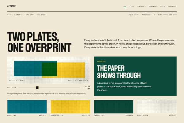 Affiche