accent#FFB938
bg#0F1838
surface#19254F
text#FBF3E4
muted#B7BEDD
border#2A3A73
on accent#0F1838
success#76D8B6
warning#FFB938
Limelight stages an interface as a proscenium.
Its pictures are drawn in Keylight.
Tokens, rules and the paired art style Keylight.
Each face set in this language's own words.
Limelight
Limelight
Limelight stages an interface as a proscenium.
Limelight stages an interface as a proscenium.
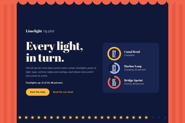
Limelight stages an interface as a proscenium. Coral curtain wings and a scalloped valance frame one ink-navy stage, a row of footlights counts the charge, and the page is lit one runner at a time: you pick a leg on the stage plan and its pool of light follows, and when the anchor is ready the spotlight widens and the stage lifts them into colour. It keeps the drama of a relay finish and drops the gacha gloss, the metallic frames and the cyan glow.
Generation 3 of Limelight, revised in place from arni's approved round 9 specimen (limelight-d). It keeps the relay world (Yokohama Night Relay, five legs, 88 percent anchor charge, Ren Asano on the bridge), the state logic and the Keylight pairing, and replaces the charge-frame bracket and spark meter with a proscenium.
Theatrical and calm: a large, flat stage with one focal moment per scene, 72 to 140px between sections, 20px between pools and 24 to 48px inside a card.
Phones (390px) stack to one column: the picture sits on top with a 7 percent curtain at each side and 12 footlights, the headline and copy sit below on flat ground, the stage plan becomes a stack of rows and the table keeps leg, runner and status. The tablet band (601 to 1199px) keeps the row of pools and a single column of copy. Above 1440px the copy and plan are capped and centred and only the stage and curtain span the viewport.
keylight-cel-anime
en-019efd96-a348-76f0-bf47-46a01216e947
Keylight cel-anime plates re-lit for the stage: a relay runner in a navy and cream jacket caught in one amber follow-spot confined to the right third, with a calm empty navy stage on the left 60 percent for type, and a close portrait with a calm navy top and bottom for the circular spotlight. Flat saturated cels, crisp ink line, speed streaks and small blooms on an ink-navy ground, in amber, coral and periwinkle rather than cyan and magenta.
One full-bleed stage plate per landing, painted with var(--hero-image) at 100% 50%, the lit beam kept to the right third so the copy sits on calm navy at every width; on phones the plate sits on top and the copy below on flat ground. One square portrait for the circular spotlight reveal, shown through var(--portrait-image). Inside pages carry no illustration; the pools are the object.
Text over the beam, a darkening scrim or fade over the plate, cyan or magenta light, photography, 3D renders, and a second hero image.
# Limelight

## Philosophy

Limelight stages an interface as a proscenium. Coral curtain wings and a scalloped valance frame one ink-navy stage, a row of footlights counts the charge, and the page is lit one runner at a time: you pick a leg on the stage plan and its pool of light follows, and when the anchor is ready the spotlight widens and the stage lifts them into colour. It keeps the drama of a relay finish and drops the gacha gloss, the metallic frames and the cyan glow.

### Values

- The page is a stage: the curtain draws open on load and the stage is lit from the footlights up.
- One lit runner at a time: choosing a leg lights its pool and swaps its cue panel.
- Light means state: marquee amber is complete, periwinkle is charging, curtain coral is priority, and every colour sits beside a word.
- Pools are size and fill: a ring grows and fills as a leg nears the handoff, so charge reads before any number.
- Calm ground for type: headlines sit on flat navy, never on the lit beam of the picture.
- A fat display face, a fine body and tall numerals, so the page reads from across a room.

### Anti-Values

- Corner brackets, spark meters and key-light frames around every card.
- Cyan, magenta and violet glow on a near-black ground.
- Tracked mono labels, numbered section tags and highlighter marks on the last word of a headline.
- A darkening gradient laid over the hero picture, or a faded picture behind text.
- Any line, bar or stripe on a side of a card.
- Metallic double frames, jewel corners and gacha ornament.

### Visual Character

- Ink navy #0F1838 ground with cream #FBF3E4 type, flat and unlit until something is chosen.
- Coral and fold curtain wings, a scalloped valance and a closed-curtain finale, drawn as flat vertical folds.
- A row of 24 round footlights in marquee amber #FFB938 that counts the charge, lit one by one.
- Stage-plan pools: filled rings with Six Caps numerals, sized by charge and coloured gold, periwinkle or coral by state.
- A circular spotlight portrait that starts small and dim and widens to full colour for the reveal.
- Abril Fatface display set tight, Hind Madurai body at fine weight, Six Caps numerals.
- Pills for every control and one 24px radius for every card.

### Lineage

> Generation 3 of Limelight, revised in place from arni's approved round 9 specimen (limelight-d). It keeps the relay world (Yokohama Night Relay, five legs, 88 percent anchor charge, Ren Asano on the bridge), the state logic and the Keylight pairing, and replaces the charge-frame bracket and spark meter with a proscenium.

## Tokens

### Colors

| Name | Value |
|------|-------|
| bg | `#0F1838` |
| surface | `#19254F` |
| text | `#FBF3E4` |
| muted | `#B7BEDD` |
| border | `#2A3A73` |
| accent | `#FFB938` |
| on_accent | `#0F1838` |
| success | `#76D8B6` |
| warning | `#FFB938` |
| error | `#FF9DB0` |
| info | `#A3BCFF` |
| coral | `#F2644B` |
| fold | `#E85A40` |

### Derived

- **Glow**: rgba(255,185,56,.2), the marquee amber at 20 percent, used only as a soft ring around a lit pool, a lit bulb, a spotlight or a slider thumb
- **Curtain**: coral #F2644B and fold #E85A40 in 28px vertical stripes on a 56px repeat, flat, used on the wings, the valance and the closing curtain
- **Unlit**: wing floor #19254F on the stage ground, stage #0F1838 on a card
- **Overlay Shadow**: 0 28px 56px -24px rgba(3,7,22,.9), only under a menu, dialog, toast or tooltip

### Typography

- **Heading Font**: Abril Fatface
- **Body Font**: Hind Madurai
- **Numeral Font**: Six Caps
- **Heading Weight**: 400
- **Body Weight**: 400
- **Button Weight**: 600
- **Numeral Weight**: 400
- **Heading Transform**: none
- **Letter Spacing**: -0.02em on Abril Fatface display text; 0.02em on Six Caps numerals; 0 on body
- **Base Size**: 17px
- **Line Height**: 1.6
- **Scale**: ["15px label, 0.9em of body","17px to 19px body and buttons, fluid","22px to 26px cue names and sub-heads","28px Six Caps numerals in tables and the wordmark","30px to 44px cue titles and dialog titles","40px to 72px section titles","48px to 68px Six Caps numerals in a ring","52px to 92px the one headline per view","120px to 230px Six Caps numeral on a cue"]
- **Google Fonts Url**: https://fonts.googleapis.com/css2?family=Abril+Fatface&family=Hind+Madurai:wght@400;500;600&family=Six+Caps&display=swap

### Radii

- **None**: 0px
- **Md**: 24px
- **Lg**: 24px
- **Full**: 9999px

### Shadows

- **Pool**: 0 0 0 12px rgba(255,185,56,.2), a flat ring of marquee glow around the chosen pool
- **Bulb**: drop-shadow(0 0 7px rgba(255,185,56,.55)) on the lit footlights only
- **Lift**: 0 28px 56px -24px rgba(3,7,22,.9), only on a menu, dialog, toast or tooltip
- **None**: everything else is flat

### Spacing

- **Base**: 8px
- **Scale**: ["4px","8px","12px","16px","20px","24px","32px","48px","72px","140px"]

### Surfaces

- **Treatment**: proscenium-stage
- **Ground**: Ink navy #0F1838, flat. The page is the stage.
- **Card Style**: One wing-floor card #19254F with radius 24 holds the stage plan, a cue panel, the roster or a form group. Nothing is nested and no card carries a line, bar or stripe on any side.
- **Wells**: Inputs, selects and chips are pills on the wing floor; inside a card they drop to the stage colour.
- **Curtain**: Coral wings at 9 percent of the width at each side of the hero, a scalloped valance across the top and a closed coral curtain as the finale.

### Borders

- **Default Width**: 0
- **Style**: none
- **Character**: No borders, no rules and no card edges. Rings are filled arcs, the unlit track is a tint and focus is a 3px cream outline offset 4px.

### Motion

- **Duration**: 200ms
- **Easing**: cubic-bezier(0.16, 0.84, 0.3, 1)
- **Draw**: 1.6s: the wings open from 52 percent to 9 percent on load, then slide outward at 0.35 of the scroll
- **Light**: 1.5s: the footlights switch on one by one, steps(21), up to the charge
- **Spot**: .9s: the spotlight circle widens from 300px to 560px and returns to full colour
- **Philosophy**: Settled first and gated by html.anim; every effect is skipped under prefers-reduced-motion and the leg and reveal controls need no script.

### Controls

- **Button Height**: 56px (44 small, 64 large)
- **Input Height**: 56px
- **Radius**: 9999px, 24px on a textarea
- **Focus**: 3px cream outline at 4px offset

## Rules

### Composition

- Build every landing on the proscenium: coral wings and a valance at the edges of the first screen, one flat navy stage between them.
- Keep one lit runner at a time: the stage plan shows all legs as pools and only the chosen one is at full light with its cue panel open.
- Set the headline and copy on flat navy beside the picture, never on the beam of light; on phones the picture sits on top and the text on flat ground.
- End the page on the closed curtain, with one navy button on it.

### Hierarchy

- Hierarchy comes from the curtain, the lit pool and the size of the display face before any other emphasis.
- One headline per view in Abril Fatface 52 to 92px; section titles 40 to 72px; cue names 22 to 26px.
- Body is Hind Madurai 400 at 17 to 19px; labels are 500 at 15px.
- State is told by a pool colour and always by a word: amber complete, periwinkle charging, coral priority.

### Density

Theatrical and calm: a large, flat stage with one focal moment per scene, 72 to 140px between sections, 20px between pools and 24 to 48px inside a card.

### Signature Patterns

- Proscenium: coral curtain wings at 9 percent of the width, a scalloped valance and a flat navy stage; the wings draw open from 52 percent on load and slide outward as you scroll.
- Footlights: 24 round bulbs along the foot of the stage that count the charge, lit one by one up to 21 of 24 (88 percent) and drawn as a flat amber row with a soft glow.
- Stage plan: five pools, filled rings with Six Caps numerals sized by charge, where choosing a leg lights its pool and swaps the cue panel, with no script.
- Spotlight reveal: a circular portrait that starts small, dim and desaturated and widens to full colour with a marquee glow ring when you stage the reveal.
- Closed curtain: the finale is a full coral curtain of vertical folds, with a valance-free edge, one navy button and the colophon.

## Layout

### Grid

- **Type**: proscenium page: full-bleed stage hero, then a contained column
- **Max Width**: 1240px content, 1160px inside the hero, centred and capped above 1440px
- **Gutter**: clamp(20px, 5vw, 72px)
- **Column Behavior**: Hero copy and picture sit in two columns from 900px; the stage plan is a row of five pools from 601px and a stack of rows below; every grid child has min-width:0.

### Whitespace

- **Section Gap**: clamp(72px, 10vw, 140px) top and bottom
- **Card Gap**: 20px between pools, 20px between a plan and its cue panel
- **Content Padding**: 24 to 48px inside a card
- **Approach**: Space and tint separate things. The only shapes with weight are the curtain, the lit pools and the spotlight.

### Density

- **Default**: comfortable
- **Comfortable**: {"button_height":"56px","input_height":"56px","row_height":"56 to 64px table rows"}

### Responsive

Phones (390px) stack to one column: the picture sits on top with a 7 percent curtain at each side and 12 footlights, the headline and copy sit below on flat ground, the stage plan becomes a stack of rows and the table keeps leg, runner and status. The tablet band (601 to 1199px) keeps the row of pools and a single column of copy. Above 1440px the copy and plan are capped and centred and only the stage and curtain span the viewport.

### Breakpoints

- **Mobile**: 390px
- **Phone Max**: 600px
- **Tablet**: 834px
- **Desktop**: 1280px
- **Wide**: 1441px
- **Ultrawide**: 2560px

## Guidance

### Do

- Start on flat ink navy and let the curtain, the pools and the spotlight be the only weighty things.
- Pair every state colour with its word: Complete, Charging, Priority.
- Size a ring by its charge and fill it clockwise from the top.
- Keep one amber button per view and let every other action step back to a surface pill or a lit word.
- Set headlines in Abril Fatface at -0.02em and numerals in Six Caps.
- Give the hero a calm navy area for type and keep the lit beam clear of copy.
- Respect prefers-reduced-motion and keep the leg and reveal controls working without script.

### Don't

- Don't put a line, bar, bracket or stripe on any side of a card.
- Don't use cyan, magenta or a violet-black ground.
- Don't lay a gradient or a faded picture behind text.
- Don't use tracked mono labels, numbered section tags or highlighter marks.
- Don't use more than one amber button in a view, or amber for anything that is not lit or primary.
- Don't use square corners, a 16px radius or a pill on a card; cards are 24 and controls are pills.
- Don't nest cards or box the navigation into a bar.

### Accessibility

AA and better on the stage: cream #FBF3E4 is 15.8:1 and haze #B7BEDD is 9.5:1 on #0F1838; marquee #FFB938 is 10.1:1, periwinkle #A3BCFF 9.3:1 and curtain coral #F2644B 5.5:1 on the stage, and coral is 4.7:1 on the wing floor #19254F; the button label #0F1838 on marquee is 10.1:1 and on coral 5.5:1. State is never carried by colour alone: every ring and chip sits beside a word. Focus is a 3px cream outline at 4px offset. The leg and reveal controls are radio inputs and a checkbox that work with no script, the footlights are decorative and aria-hidden, and the curtain draw and the footlight sequence are skipped under prefers-reduced-motion.

### Usage Context

Live control rooms, race and event dashboards, launch and reveal pages, sports and performance products, and any interface where the next moment should feel staged.

## Imagery Direction

### Pairs With

keylight-cel-anime

### Art Style Id

en-019efd96-a348-76f0-bf47-46a01216e947

### Summary

Keylight cel-anime plates re-lit for the stage: a relay runner in a navy and cream jacket caught in one amber follow-spot confined to the right third, with a calm empty navy stage on the left 60 percent for type, and a close portrait with a calm navy top and bottom for the circular spotlight. Flat saturated cels, crisp ink line, speed streaks and small blooms on an ink-navy ground, in amber, coral and periwinkle rather than cyan and magenta.

### Subjects

- a relay runner holding a baton alone in a warm follow-spot
- a close portrait of the anchor in a navy and cream team jacket
- an empty proscenium stage with a pool of amber light
- a baton handoff at the line

### Usage

One full-bleed stage plate per landing, painted with var(--hero-image) at 100% 50%, the lit beam kept to the right third so the copy sits on calm navy at every width; on phones the plate sits on top and the copy below on flat ground. One square portrait for the circular spotlight reveal, shown through var(--portrait-image). Inside pages carry no illustration; the pools are the object.

### Avoid

Text over the beam, a darkening scrim or fade over the plate, cyan or magenta light, photography, 3D renders, and a second hero image.
---
version: "alpha"
name: "Limelight"
description: "Limelight stages an interface as a proscenium. Coral curtain wings and a scalloped valance frame one ink-navy stage, a row of footlights counts the charge, and the page is lit one runner at a time: you pick a leg on the stage plan and it..."
colors:
  bg: "#0F1838"
  surface: "#19254F"
  text: "#FBF3E4"
  muted: "#B7BEDD"
  border: "#2A3A73"
  accent: "#FFB938"
  on_accent: "#0F1838"
  success: "#76D8B6"
  warning: "#FFB938"
  error: "#FF9DB0"
  info: "#A3BCFF"
  coral: "#F2644B"
  fold: "#E85A40"
typography:
  headline-lg:
    fontFamily: "Abril Fatface"
    fontSize: "2.075rem"
    fontWeight: 700
    lineHeight: 1.1
    letterSpacing: "-0.02em"
  headline-md:
    fontFamily: "Abril Fatface"
    fontSize: "1.66rem"
    fontWeight: 600
    lineHeight: 1.15
    letterSpacing: "-0.02em"
  body-md:
    fontFamily: "Hind Madurai"
    fontSize: "17px"
    fontWeight: 400
    lineHeight: 1.5
    letterSpacing: "-0.02em"
  label-md:
    fontFamily: "Hind Madurai"
    fontSize: "0.75rem"
    fontWeight: 600
    lineHeight: 1
    letterSpacing: "0.08em"
rounded:
  none: "0px"
  md: "24px"
  lg: "24px"
  full: "9999px"
spacing:
  base: "8px"
  xs: "4px"
  sm: "8px"
  md: "12px"
  lg: "16px"
  xl: "20px"
  2xl: "24px"
  3xl: "32px"
  4xl: "48px"
  step-8: "72px"
  step-9: "140px"
components:
  color-reference-bg:
    backgroundColor: "{colors.bg}"
  color-reference-surface:
    backgroundColor: "{colors.surface}"
  color-reference-text:
    backgroundColor: "{colors.text}"
  color-reference-muted:
    backgroundColor: "{colors.muted}"
  color-reference-border:
    backgroundColor: "{colors.border}"
  color-reference-accent:
    backgroundColor: "{colors.accent}"
  color-reference-on_accent:
    backgroundColor: "{colors.on_accent}"
  color-reference-success:
    backgroundColor: "{colors.success}"
  color-reference-warning:
    backgroundColor: "{colors.warning}"
  color-reference-error:
    backgroundColor: "{colors.error}"
  color-reference-info:
    backgroundColor: "{colors.info}"
  color-reference-coral:
    backgroundColor: "{colors.coral}"
  color-reference-fold:
    backgroundColor: "{colors.fold}"
  button-primary:
    backgroundColor: "{colors.accent}"
    textColor: "{colors.on_accent}"
    typography: "{typography.label-md}"
    rounded: "{rounded.md}"
    padding: "{spacing.md}"
  card-surface:
    backgroundColor: "{colors.surface}"
    textColor: "{colors.text}"
    rounded: "{rounded.md}"
    padding: "{spacing.md}"
  input-default:
    backgroundColor: "{colors.surface}"
    textColor: "{colors.text}"
    rounded: "{rounded.md}"
    height: "44px"
---

# Limelight

## Overview

Limelight stages an interface as a proscenium. Coral curtain wings and a scalloped valance frame one ink-navy stage, a row of footlights counts the charge, and the page is lit one runner at a time: you pick a leg on the stage plan and its pool of light follows, and when the anchor is ready the spotlight widens and the stage lifts them into colour. It keeps the drama of a relay finish and drops the gacha gloss, the metallic frames and the cyan glow.

### Values

- The page is a stage: the curtain draws open on load and the stage is lit from the footlights up.
- One lit runner at a time: choosing a leg lights its pool and swaps its cue panel.
- Light means state: marquee amber is complete, periwinkle is charging, curtain coral is priority, and every colour sits beside a word.
- Pools are size and fill: a ring grows and fills as a leg nears the handoff, so charge reads before any number.
- Calm ground for type: headlines sit on flat navy, never on the lit beam of the picture.
- A fat display face, a fine body and tall numerals, so the page reads from across a room.

### Anti-Values

- Corner brackets, spark meters and key-light frames around every card.
- Cyan, magenta and violet glow on a near-black ground.
- Tracked mono labels, numbered section tags and highlighter marks on the last word of a headline.
- A darkening gradient laid over the hero picture, or a faded picture behind text.
- Any line, bar or stripe on a side of a card.
- Metallic double frames, jewel corners and gacha ornament.

### Visual Character

- Ink navy #0F1838 ground with cream #FBF3E4 type, flat and unlit until something is chosen.
- Coral and fold curtain wings, a scalloped valance and a closed-curtain finale, drawn as flat vertical folds.
- A row of 24 round footlights in marquee amber #FFB938 that counts the charge, lit one by one.
- Stage-plan pools: filled rings with Six Caps numerals, sized by charge and coloured gold, periwinkle or coral by state.
- A circular spotlight portrait that starts small and dim and widens to full colour for the reveal.
- Abril Fatface display set tight, Hind Madurai body at fine weight, Six Caps numerals.
- Pills for every control and one 24px radius for every card.

### Lineage

> Generation 3 of Limelight, revised in place from arni's approved round 9 specimen (limelight-d). It keeps the relay world (Yokohama Night Relay, five legs, 88 percent anchor charge, Ren Asano on the bridge), the state logic and the Keylight pairing, and replaces the charge-frame bracket and spark meter with a proscenium.

## Colors

Use the YAML color tokens as the normative palette. The prose below names the roles agents should preserve when generating UI.

| Token | Value |
|-------|-------|
| bg | `#0F1838` |
| surface | `#19254F` |
| text | `#FBF3E4` |
| muted | `#B7BEDD` |
| border | `#2A3A73` |
| accent | `#FFB938` |
| on_accent | `#0F1838` |
| success | `#76D8B6` |
| warning | `#FFB938` |
| error | `#FF9DB0` |
| info | `#A3BCFF` |
| coral | `#F2644B` |
| fold | `#E85A40` |

## Typography

Load the fonts from Google Fonts: https://fonts.googleapis.com/css2?family=Abril+Fatface&family=Hind+Madurai:wght@400;500;600&family=Six+Caps&display=swap

- **Headline-Lg**: Abril Fatface, 2.075rem, weight 700, line-height 1.1.
- **Headline-Md**: Abril Fatface, 1.66rem, weight 600, line-height 1.15.
- **Body-Md**: Hind Madurai, 17px, weight 400, line-height 1.5.
- **Label-Md**: Hind Madurai, 0.75rem, weight 600, line-height 1.

## Layout

### Spacing Tokens

- **Base**: `8px`
- **Xs**: `4px`
- **Sm**: `8px`
- **Md**: `12px`
- **Lg**: `16px`
- **Xl**: `20px`
- **2xl**: `24px`
- **3xl**: `32px`
- **4xl**: `48px`
- **Step-8**: `72px`
- **Step-9**: `140px`

### Grid

- **Type**: proscenium page: full-bleed stage hero, then a contained column
- **Max Width**: 1240px content, 1160px inside the hero, centred and capped above 1440px
- **Gutter**: clamp(20px, 5vw, 72px)
- **Column Behavior**: Hero copy and picture sit in two columns from 900px; the stage plan is a row of five pools from 601px and a stack of rows below; every grid child has min-width:0.

### Whitespace

- **Section Gap**: clamp(72px, 10vw, 140px) top and bottom
- **Card Gap**: 20px between pools, 20px between a plan and its cue panel
- **Content Padding**: 24 to 48px inside a card
- **Approach**: Space and tint separate things. The only shapes with weight are the curtain, the lit pools and the spotlight.

### Density

- **Default**: comfortable
- **Comfortable**: {"button_height":"56px","input_height":"56px","row_height":"56 to 64px table rows"}

### Responsive

Phones (390px) stack to one column: the picture sits on top with a 7 percent curtain at each side and 12 footlights, the headline and copy sit below on flat ground, the stage plan becomes a stack of rows and the table keeps leg, runner and status. The tablet band (601 to 1199px) keeps the row of pools and a single column of copy. Above 1440px the copy and plan are capped and centred and only the stage and curtain span the viewport.

### Breakpoints

- **Mobile**: 390px
- **Phone Max**: 600px
- **Tablet**: 834px
- **Desktop**: 1280px
- **Wide**: 1441px
- **Ultrawide**: 2560px

## Elevation & Depth

### Shadows

- **Pool**: 0 0 0 12px rgba(255,185,56,.2), a flat ring of marquee glow around the chosen pool
- **Bulb**: drop-shadow(0 0 7px rgba(255,185,56,.55)) on the lit footlights only
- **Lift**: 0 28px 56px -24px rgba(3,7,22,.9), only on a menu, dialog, toast or tooltip
- **None**: everything else is flat

## Shapes

### Rounded

- **None**: `0px`
- **Md**: `24px`
- **Lg**: `24px`
- **Full**: `9999px`

### Surfaces

- **Treatment**: proscenium-stage
- **Ground**: Ink navy #0F1838, flat. The page is the stage.
- **Card Style**: One wing-floor card #19254F with radius 24 holds the stage plan, a cue panel, the roster or a form group. Nothing is nested and no card carries a line, bar or stripe on any side.
- **Wells**: Inputs, selects and chips are pills on the wing floor; inside a card they drop to the stage colour.
- **Curtain**: Coral wings at 9 percent of the width at each side of the hero, a scalloped valance across the top and a closed coral curtain as the finale.

### Borders

- **Default Width**: 0
- **Style**: none
- **Character**: No borders, no rules and no card edges. Rings are filled arcs, the unlit track is a tint and focus is a 3px cream outline offset 4px.

## Components

### Composition

- Build every landing on the proscenium: coral wings and a valance at the edges of the first screen, one flat navy stage between them.
- Keep one lit runner at a time: the stage plan shows all legs as pools and only the chosen one is at full light with its cue panel open.
- Set the headline and copy on flat navy beside the picture, never on the beam of light; on phones the picture sits on top and the text on flat ground.
- End the page on the closed curtain, with one navy button on it.

### Hierarchy

- Hierarchy comes from the curtain, the lit pool and the size of the display face before any other emphasis.
- One headline per view in Abril Fatface 52 to 92px; section titles 40 to 72px; cue names 22 to 26px.
- Body is Hind Madurai 400 at 17 to 19px; labels are 500 at 15px.
- State is told by a pool colour and always by a word: amber complete, periwinkle charging, coral priority.

### Density

Theatrical and calm: a large, flat stage with one focal moment per scene, 72 to 140px between sections, 20px between pools and 24 to 48px inside a card.

### Signature Patterns

- Proscenium: coral curtain wings at 9 percent of the width, a scalloped valance and a flat navy stage; the wings draw open from 52 percent on load and slide outward as you scroll.
- Footlights: 24 round bulbs along the foot of the stage that count the charge, lit one by one up to 21 of 24 (88 percent) and drawn as a flat amber row with a soft glow.
- Stage plan: five pools, filled rings with Six Caps numerals sized by charge, where choosing a leg lights its pool and swaps the cue panel, with no script.
- Spotlight reveal: a circular portrait that starts small, dim and desaturated and widens to full colour with a marquee glow ring when you stage the reveal.
- Closed curtain: the finale is a full coral curtain of vertical folds, with a valance-free edge, one navy button and the colophon.

## shadcn/ui Usage

When the target app uses shadcn/ui, copy DESIGN.md with shadcn instead of the plain DESIGN.md. It contains the same Katagami design-language source plus the shadcn/ui primitives, imports, theme variables, component recipes, and preview-shot guidance.

DESIGN.md with shadcn: `/language/en-01a1379a-e350-71f2-9d3e-0c2bc76ae2b8/DESIGN.with-shadcn.md`.

Machine-readable companions for automation: `/language/en-01a1379a-e350-71f2-9d3e-0c2bc76ae2b8/shadcn.json` (registry theme), `/language/en-01a1379a-e350-71f2-9d3e-0c2bc76ae2b8/shadcn-components.md` (component recipes) and `/language/en-01a1379a-e350-71f2-9d3e-0c2bc76ae2b8/shadcn-shots.json` (preview shots). The human-facing handoff is still DESIGN.md with shadcn.

Install recommended primitives with `npx shadcn@latest add button card input textarea select dialog sheet tabs badge separator checkbox switch slider tooltip dropdown-menu table`.

Use these primitives in shadcn apps:
- button
- card
- input
- textarea
- select
- dialog
- sheet
- tabs
- badge
- separator
- checkbox
- switch
- slider
- tooltip
- dropdown-menu
- table

Implementation rule for agents: import shadcn primitives from `@/components/ui/*`, apply the generated CSS variables first, then compose the language-specific recipes from the companion MD. Katagami remains the source of truth; shadcn names are the implementation surface.

## Do's and Don'ts

- Do Start on flat ink navy and let the curtain, the pools and the spotlight be the only weighty things.
- Do Pair every state colour with its word: Complete, Charging, Priority.
- Do Size a ring by its charge and fill it clockwise from the top.
- Do Keep one amber button per view and let every other action step back to a surface pill or a lit word.
- Do Set headlines in Abril Fatface at -0.02em and numerals in Six Caps.
- Do Give the hero a calm navy area for type and keep the lit beam clear of copy.
- Do Respect prefers-reduced-motion and keep the leg and reveal controls working without script.
- Don't Don't put a line, bar, bracket or stripe on any side of a card.
- Don't Don't use cyan, magenta or a violet-black ground.
- Don't Don't lay a gradient or a faded picture behind text.
- Don't Don't use tracked mono labels, numbered section tags or highlighter marks.
- Don't Don't use more than one amber button in a view, or amber for anything that is not lit or primary.
- Don't Don't use square corners, a 16px radius or a pill on a card; cards are 24 and controls are pills.
- Don't Don't nest cards or box the navigation into a bar.

### Accessibility

AA and better on the stage: cream #FBF3E4 is 15.8:1 and haze #B7BEDD is 9.5:1 on #0F1838; marquee #FFB938 is 10.1:1, periwinkle #A3BCFF 9.3:1 and curtain coral #F2644B 5.5:1 on the stage, and coral is 4.7:1 on the wing floor #19254F; the button label #0F1838 on marquee is 10.1:1 and on coral 5.5:1. State is never carried by colour alone: every ring and chip sits beside a word. Focus is a 3px cream outline at 4px offset. The leg and reveal controls are radio inputs and a checkbox that work with no script, the footlights are decorative and aria-hidden, and the curtain draw and the footlight sequence are skipped under prefers-reduced-motion.

### Usage Context

Live control rooms, race and event dashboards, launch and reveal pages, sports and performance products, and any interface where the next moment should feel staged.

## Imagery Direction

### Pairs With

keylight-cel-anime

### Art Style Id

en-019efd96-a348-76f0-bf47-46a01216e947

### Summary

Keylight cel-anime plates re-lit for the stage: a relay runner in a navy and cream jacket caught in one amber follow-spot confined to the right third, with a calm empty navy stage on the left 60 percent for type, and a close portrait with a calm navy top and bottom for the circular spotlight. Flat saturated cels, crisp ink line, speed streaks and small blooms on an ink-navy ground, in amber, coral and periwinkle rather than cyan and magenta.

### Subjects

- a relay runner holding a baton alone in a warm follow-spot
- a close portrait of the anchor in a navy and cream team jacket
- an empty proscenium stage with a pool of amber light
- a baton handoff at the line

### Usage

One full-bleed stage plate per landing, painted with var(--hero-image) at 100% 50%, the lit beam kept to the right third so the copy sits on calm navy at every width; on phones the plate sits on top and the copy below on flat ground. One square portrait for the circular spotlight reveal, shown through var(--portrait-image). Inside pages carry no illustration; the pools are the object.

### Avoid

Text over the beam, a darkening scrim or fade over the plate, cyan or magenta light, photography, 3D renders, and a second hero image.
```json
{
  "$schema": "https://ui.shadcn.com/schema/registry-item.json",
  "name": "limelight",
  "type": "registry:theme",
  "title": "Limelight shadcn Theme",
  "cssVars": {
    "theme": {},
    "light": {
      "background": "#0F1838",
      "foreground": "#FBF3E4",
      "card": "#19254F",
      "card-foreground": "#FBF3E4",
      "popover": "#19254F",
      "popover-foreground": "#FBF3E4",
      "primary": "#FBF3E4",
      "primary-foreground": "#111111",
      "secondary": "#f4f4f5",
      "secondary-foreground": "#111111",
      "muted": "#B7BEDD",
      "muted-foreground": "#FBF3E4",
      "accent": "#FFB938",
      "accent-foreground": "#111111",
      "destructive": "#FF9DB0",
      "border": "#2A3A73",
      "input": "#2A3A73",
      "ring": "#FFB938",
      "chart-1": "#FBF3E4",
      "chart-2": "#f4f4f5",
      "chart-3": "#FFB938",
      "chart-4": "#76D8B6",
      "chart-5": "#FFB938",
      "sidebar": "#19254F",
      "sidebar-foreground": "#FBF3E4",
      "sidebar-primary": "#FBF3E4",
      "sidebar-primary-foreground": "#111111",
      "sidebar-accent": "#A3BCFF",
      "sidebar-accent-foreground": "#ffffff",
      "sidebar-border": "#2A3A73",
      "sidebar-ring": "#FFB938",
      "radius": "24px"
    },
    "dark": {
      "background": "#0f1115",
      "foreground": "#f8fafc",
      "card": "#181b22",
      "card-foreground": "#f8fafc",
      "popover": "#181b22",
      "popover-foreground": "#f8fafc",
      "primary": "#FBF3E4",
      "primary-foreground": "#111111",
      "secondary": "#252a33",
      "secondary-foreground": "#f8fafc",
      "muted": "#252a33",
      "muted-foreground": "#a1a1aa",
      "accent": "#FFB938",
      "accent-foreground": "#111111",
      "destructive": "#FF9DB0",
      "border": "#303642",
      "input": "#303642",
      "ring": "#FFB938",
      "chart-1": "#FBF3E4",
      "chart-2": "#f4f4f5",
      "chart-3": "#FFB938",
      "chart-4": "#76D8B6",
      "chart-5": "#FFB938",
      "sidebar": "#181b22",
      "sidebar-foreground": "#f8fafc",
      "sidebar-primary": "#FBF3E4",
      "sidebar-primary-foreground": "#111111",
      "sidebar-accent": "#FFB938",
      "sidebar-accent-foreground": "#111111",
      "sidebar-border": "#303642",
      "sidebar-ring": "#FFB938",
      "radius": "24px"
    }
  },
  "meta": {
    "source": "katagami",
    "languageId": "en-01a1379a-e350-71f2-9d3e-0c2bc76ae2b8",
    "slug": "limelight",
    "componentManifest": [
      "button",
      "card",
      "input",
      "textarea",
      "select",
      "dialog",
      "sheet",
      "tabs",
      "badge",
      "separator",
      "checkbox",
      "switch",
      "slider",
      "tooltip",
      "dropdown-menu",
      "table"
    ],
    "installCommand": "npx shadcn@latest add button card input textarea select dialog sheet tabs badge separator checkbox switch slider tooltip dropdown-menu table",
    "nativeTokenNames": {
      "colors": [
        "accent",
        "bg",
        "border",
        "coral",
        "error",
        "fold",
        "info",
        "muted",
        "on_accent",
        "success",
        "surface",
        "text",
        "warning"
      ],
      "derived": [
        "curtain",
        "glow",
        "overlay_shadow",
        "unlit"
      ],
      "typography": [
        "base_size",
        "body_font",
        "body_weight",
        "button_weight",
        "google_fonts_url",
        "heading_font",
        "heading_transform",
        "heading_weight",
        "letter_spacing",
        "line_height",
        "numeral_font",
        "numeral_weight",
        "scale"
      ],
      "radii": [
        "full",
        "lg",
        "md",
        "none"
      ],
      "shadows": [
        "bulb",
        "lift",
        "none",
        "pool"
      ],
      "spacing": [
        "base",
        "scale"
      ],
      "surfaces": [
        "card_style",
        "curtain",
        "ground",
        "treatment",
        "wells"
      ],
      "borders": [
        "character",
        "default_width",
        "style"
      ],
      "motion": [
        "draw",
        "duration",
        "easing",
        "light",
        "philosophy",
        "spot"
      ],
      "controls": [
        "button_height",
        "focus",
        "input_height",
        "radius"
      ]
    }
  }
}
```The art style its pictures are drawn in and the colours its tokens carry.
The theme variables are generated from the tokens. Component recipes and preview shots have not been written for this language yet.
For an app that uses shadcn/ui: the DESIGN.md plus the install list, theme variables, component recipes, preview shots and a starter TSX file, in one Markdown file.
The same pieces as separate files: theme, CSS, TSX starter, recipes and the preview contract.
npx shadcn@latest add button card input textarea select dialog sheet tabs badge separator checkbox switch slider tooltip dropdown-menu table:root {
--background: #0F1838;
--foreground: #FBF3E4;
--card: #19254F;
--card-foreground: #FBF3E4;
--popover: #19254F;
--popover-foreground: #FBF3E4;
--primary: #FBF3E4;
--primary-foreground: #111111;
--secondary: #f4f4f5;
--secondary-foreground: #111111;
--muted: #B7BEDD;
--muted-foreground: #FBF3E4;
--accent: #FFB938;
--accent-foreground: #111111;
--destructive: #FF9DB0;
--border: #2A3A73;
--input: #2A3A73;
--ring: #FFB938;
--chart-1: #FBF3E4;
--chart-2: #f4f4f5;
--chart-3: #FFB938;
--chart-4: #76D8B6;
--chart-5: #FFB938;
--sidebar: #19254F;
--sidebar-foreground: #FBF3E4;
--sidebar-primary: #FBF3E4;
--sidebar-primary-foreground: #111111;
--sidebar-accent: #A3BCFF;
--sidebar-accent-foreground: #ffffff;
--sidebar-border: #2A3A73;
--sidebar-ring: #FFB938;
--radius: 24px;
}
.dark {
--background: #0f1115;
--foreground: #f8fafc;
--card: #181b22;
--card-foreground: #f8fafc;
--popover: #181b22;
--popover-foreground: #f8fafc;
--primary: #FBF3E4;
--primary-foreground: #111111;
--secondary: #252a33;
--secondary-foreground: #f8fafc;
--muted: #252a33;
--muted-foreground: #a1a1aa;
--accent: #FFB938;
--accent-foreground: #111111;
--destructive: #FF9DB0;
--border: #303642;
--input: #303642;
--ring: #FFB938;
--chart-1: #FBF3E4;
--chart-2: #f4f4f5;
--chart-3: #FFB938;
--chart-4: #76D8B6;
--chart-5: #FFB938;
--sidebar: #181b22;
--sidebar-foreground: #f8fafc;
--sidebar-primary: #FBF3E4;
--sidebar-primary-foreground: #111111;
--sidebar-accent: #FFB938;
--sidebar-accent-foreground: #111111;
--sidebar-border: #303642;
--sidebar-ring: #FFB938;
--radius: 24px;
}
import { Badge } from "@/components/ui/badge";
import { Button } from "@/components/ui/button";
import {
  Card,
  CardContent,
  CardDescription,
  CardFooter,
  CardHeader,
  CardTitle,
} from "@/components/ui/card";
import { Input } from "@/components/ui/input";
import { Tabs, TabsList, TabsTrigger } from "@/components/ui/tabs";

export function LimelightShadcnKit() {
  return (
    <section className="grid gap-4 rounded-[var(--radius)] border bg-background p-4 text-foreground">
      <div className="flex items-start justify-between gap-4">
        <div>
          <Badge variant="outline">shadcn/ui</Badge>
          <h2 className="mt-3 text-2xl font-semibold tracking-tight">Limelight</h2>
          <p className="mt-1 max-w-xl text-sm text-muted-foreground">
            Use the Katagami registry theme, then compose these shadcn primitives
            with the language-specific component recipes.
          </p>
        </div>
        <Button>Apply theme</Button>
      </div>

      <Tabs defaultValue="components">
        <TabsList>
          <TabsTrigger value="components">Components</TabsTrigger>
          <TabsTrigger value="states">States</TabsTrigger>
          <TabsTrigger value="export">Export</TabsTrigger>
        </TabsList>
      </Tabs>

      <Card>
        <CardHeader>
          <CardTitle>Component recipe</CardTitle>
          <CardDescription>
            Replace this starter content with the agent-authored product scene
            from components.md and preview-shots.json.
          </CardDescription>
        </CardHeader>
        <CardContent className="grid gap-3 sm:grid-cols-[1fr_auto]">
          <Input defaultValue="Tokenized shadcn surface" aria-label="Recipe name" />
          <Button variant="secondary">Preview state</Button>
        </CardContent>
        <CardFooter className="justify-between">
          <Badge>Ready</Badge>
          <Button variant="outline">Copy recipe</Button>
        </CardFooter>
      </Card>
    </section>
  );
}
{
  "$schema": "https://ui.shadcn.com/schema/registry-item.json",
  "name": "limelight",
  "type": "registry:theme",
  "title": "Limelight",
  "description": "Ink navy stage with coral curtain wings, amber footlights and pools of light: round controls, 24px cards, no lines, one marquee button per view.",
  "cssVars": {
    "theme": {
      "font-sans": "Hind Madurai, system-ui, sans-serif",
      "font-mono": "Hind Madurai, system-ui, sans-serif",
      "font-display": "Abril Fatface, Georgia, serif",
      "radius": "24px"
    },
    "light": {
      "background": "#0F1838",
      "foreground": "#FBF3E4",
      "card": "#19254F",
      "card-foreground": "#FBF3E4",
      "popover": "#19254F",
      "popover-foreground": "#FBF3E4",
      "primary": "#FFB938",
      "primary-foreground": "#0F1838",
      "secondary": "#19254F",
      "secondary-foreground": "#FBF3E4",
      "muted": "#19254F",
      "muted-foreground": "#B7BEDD",
      "accent": "#2A3A73",
      "accent-foreground": "#FBF3E4",
      "destructive": "#FF9DB0",
      "destructive-foreground": "#0F1838",
      "border": "transparent",
      "input": "transparent",
      "ring": "#FBF3E4",
      "chart-1": "#FFB938",
      "chart-2": "#A3BCFF",
      "chart-3": "#F2644B",
      "chart-4": "#76D8B6",
      "chart-5": "#FF9DB0",
      "radius": "24px"
    },
    "dark": {
      "background": "#0F1838",
      "foreground": "#FBF3E4",
      "card": "#19254F",
      "card-foreground": "#FBF3E4",
      "popover": "#19254F",
      "popover-foreground": "#FBF3E4",
      "primary": "#FFB938",
      "primary-foreground": "#0F1838",
      "secondary": "#19254F",
      "secondary-foreground": "#FBF3E4",
      "muted": "#19254F",
      "muted-foreground": "#B7BEDD",
      "accent": "#2A3A73",
      "accent-foreground": "#FBF3E4",
      "destructive": "#FF9DB0",
      "destructive-foreground": "#0F1838",
      "border": "transparent",
      "input": "transparent",
      "ring": "#FBF3E4",
      "chart-1": "#FFB938",
      "chart-2": "#A3BCFF",
      "chart-3": "#F2644B",
      "chart-4": "#76D8B6",
      "chart-5": "#FF9DB0",
      "radius": "24px"
    }
  },
  "componentManifest": [
    "button",
    "card",
    "input",
    "textarea",
    "select",
    "dialog",
    "sheet",
    "tabs",
    "badge",
    "separator",
    "checkbox",
    "switch",
    "slider",
    "tooltip",
    "dropdown-menu",
    "table"
  ],
  "meta": {
    "nativeTokenNames": {
      "bg": "background (the stage)",
      "surface": "card / popover / secondary / muted (the wing floor)",
      "text": "foreground / ring",
      "muted": "muted-foreground",
      "accent": "primary and chart-1 (marquee, complete)",
      "info": "chart-2 (periwinkle, charging)",
      "coral": "chart-3 (priority) and the curtain (native only)",
      "fold": "native only (the curtain's second tone)",
      "error": "destructive",
      "border": "accent (the rail tint for hover rows); --border stays transparent"
    },
    "note": "Limelight is a dark-stage language, so the dark scope repeats the light values. The shadcn primary is marquee amber and only one primary button belongs in a view; coral is a state and the curtain, never an action. Inside a Card the wing floor and the secondary fill are the same colour, so wells inside a Card use the background instead.",
    "componentManifest": [
      "button",
      "card",
      "input",
      "textarea",
      "select",
      "dialog",
      "sheet",
      "tabs",
      "badge",
      "separator",
      "checkbox",
      "switch",
      "slider",
      "tooltip",
      "dropdown-menu",
      "table"
    ]
  }
}
---
artifact: component-recipes-v1
language: limelight
author: katagami-agent
primitives: 16
---

# Limelight shadcn/ui Components

Author: `katagami-agent`

## Intent

Limelight dresses shadcn/ui as an ink-navy stage lit one runner at a time. The page sits on flat navy; a Card is a 24px wing-floor plane that holds the stage plan, a cue panel, the roster or a form group; every control is a pill; and the only weighty things are the curtain, the lit pools and the spotlight, which are built as their own components outside shadcn. Amber is the one action and the complete state, periwinkle is charging, coral is priority, and every colour sits beside a word. Nothing carries a border, a rule or a stripe on any side.

## Required primitives

button, card, input, textarea, select, dialog, sheet, tabs, badge, separator, checkbox, switch, slider, tooltip, dropdown-menu, table. Import them from `@/components/ui/*`; do not build a second component system.

## Token cues

```css
--background:#0F1838;
--foreground:#FBF3E4;
--card:#19254F;
--card-foreground:#FBF3E4;
--popover:#19254F;
--popover-foreground:#FBF3E4;
--primary:#FFB938;
--primary-foreground:#0F1838;
--secondary:#19254F;
--secondary-foreground:#FBF3E4;
--muted:#19254F;
--muted-foreground:#B7BEDD;
--accent:#2A3A73;
--accent-foreground:#FBF3E4;
--destructive:#FF9DB0;
--destructive-foreground:#0F1838;
--border:transparent;
--input:transparent;
--ring:#FBF3E4;
--chart-1:#FFB938;
--chart-2:#A3BCFF;
--chart-3:#F2644B;
--chart-4:#76D8B6;
--chart-5:#FF9DB0;
--radius:24px;
```

Native names are kept in the theme: `bg` is the stage, `surface` is the wing floor, `accent` is marquee amber, `info` is periwinkle, `coral` and `fold` are the curtain, and `border` `#2A3A73` is a hover tint, never a drawn line.

## Visual character to preserve

- One lit runner at a time: the chosen pool is at full light and the others sit back.
- No borders, rules, brackets or stripes on any side of a Card; rows and groups separate by space and tint.
- Two radii only: 24px on every Card, panel, textarea, toast and tooltip, and rounded-full on every control, chip, ring and bulb.
- Amber is the one button and the complete state, periwinkle is charging, coral is priority; never colour without a word.
- Abril Fatface for the one big line, Hind Madurai 17 to 19px for reading, Six Caps for numerals.
- Only a menu, dialog, toast or tooltip lifts, on one deep navy shadow that follows its corners.

## ShadSync visual profile

- family: stage-light
- material: flat navy planes lit by amber pools
- contour: pill-and-24
- border: none
- underlay: False
- grain: False
- stickerBadges: False
- motion: curtain draw and footlight sequence on load, spotlight widen on press
- density: comfortable
- radius: 24, 9999
- accents: marquee-amber, curtain-coral, periwinkle

## Signature component recipes

- **button:** `h-14 rounded-full px-8 font-semibold text-[17px] whitespace-nowrap border-0`. `default` is `bg-primary text-primary-foreground` (marquee with a navy label), one per view; it turns `bg-foreground` on hover and presses `scale-[.96]` on active. `secondary` is `bg-secondary text-foreground hover:bg-accent`. `destructive` is `bg-secondary text-destructive hover:bg-destructive hover:text-destructive-foreground`, never a solid salmon block at rest. `link` is a marquee word with a soft pool of light that sweeps in behind it from the left. Sizes `h-11 px-5` and `h-16 px-10`. Focus: `outline-3 outline-offset-4 outline-ring`.
- **card:** `rounded-3xl border-0 bg-card p-6 shadow-none md:p-10`. No line, bar, bracket or stripe on any side. Never nest a Card. The stage plan is one Card holding five pools; a cue panel is a second Card below it.
- **input:** `h-14 rounded-full border-0 bg-secondary px-6 text-base shadow-none`; inside a Card use `bg-background` so the well still reads. Focus is `outline-3 outline-offset-4 outline-ring`, not a box. An error tints `bg-destructive/15` and writes the message beneath in `text-destructive`.
- **textarea:** the input well with the card radius: `min-h-[124px] rounded-3xl px-6 py-4 leading-normal`, vertical resize only.
- **select:** the input pill with a custom 16px chevron in `muted-foreground`; `SelectContent` is `bg-popover rounded-3xl p-2.5` with the lift shadow; items are `rounded-full px-4 py-3` and tint `bg-accent` when highlighted.
- **dialog:** `bg-popover rounded-3xl p-8 border-0` with `shadow-[0_28px_56px_-24px_rgba(3,7,22,.9)]` over a 60 percent stage overlay; the title is Abril Fatface 30 to 44px, the body is muted, with one marquee button and a lit link as the quiet action.
- **sheet:** a right-side `bg-popover rounded-l-3xl` panel sliding in on `cubic-bezier(.16,.84,.3,1)`; roster details inside as rows of Six Caps numerals, names and Badges; no line on its edge.
- **tabs:** `TabsList` is a `rounded-full bg-secondary p-1.5 gap-1` tray; triggers are `h-11 rounded-full px-5 font-medium text-muted-foreground`; the active trigger takes `bg-foreground text-background`. No underline.
- **badge:** a pill with a dot, not a block of colour: `h-9 rounded-full bg-secondary px-4 text-[15px] font-medium` with a 10px dot in marquee for complete, periwinkle for charging and coral for priority. The word always carries the state.
- **separator:** do not draw one. Use space (20px between pools, 56px between groups) and the tint of the wing floor.
- **checkbox:** `size-[26px] rounded-full border-0 bg-secondary`; checked fills `bg-primary` with a drawn navy tick.
- **switch:** a `h-[34px] w-[58px] rounded-full bg-secondary` track with a muted round knob; checked turns the track marquee and the knob navy, sliding on `cubic-bezier(.16,.84,.3,1)`.
- **slider:** a 10px `bg-secondary` pill track, a `bg-primary` range and a 28px `bg-foreground` thumb with a 7px marquee glow ring; the reading prints beneath (21 of 24 footlights).
- **tooltip:** `bg-foreground text-background rounded-3xl px-5 py-3 text-[15px] font-medium`, no arrow, on the lift shadow.
- **dropdown-menu:** `bg-popover rounded-3xl p-2.5` with the lift shadow; items are `rounded-full px-4 py-3` with a muted shortcut at the right, highlighted `bg-accent`; the destructive item is `text-destructive`.
- **table:** the roster. It sits in a Card; rows are parted by space (`border-spacing-y-1.5`) with no dividers; hover and selected rows light as a `bg-accent` pill; leg numerals are Six Caps 28px, charge is a mini footlight row, state is a Badge. Hide Course and Charge below 640px.

### The curtain, the footlights and the spotlight (the signature, outside shadcn)

None of these is a shadcn primitive. Build the proscenium once as a container that overflows hidden: two coral wings 9 percent wide with flat 28px vertical folds in `#F2644B` and `#E85A40`, a scalloped valance over them (72px period, 36px scallops under a 10px bar) and a flat `#0F1838` stage between them. On load the wings animate from 52 percent to 9 percent over 1.6s and then translate outward at 0.35 of the scroll, gated by `html.anim` and skipped under reduced motion. The footlights are 24 round bulbs drawn as a repeating tile, unlit in `#19254F` on the stage and lit in `#FFB938` with a soft `drop-shadow(0 0 7px)` up to the charge (21 of 24 is 88 percent), switched on one by one with `steps(21)`. A pool is a filled ring: a `conic-gradient` of the state colour over a `#0F1838` track with a `#19254F` centre and a Six Caps numeral, its diameter set by the charge. The spotlight is a circular portrait that widens from 300px to 560px and returns to full colour when a checkbox is checked, so it works with no script.

## Preview shots

- `application-shell`: The control room. The proscenium at the edges, the one headline and a marquee button on flat navy, then the stage plan Card with five pools sized by charge and the roster table below with one lit row and state Badges.
- `detail-editor`: Race entry. A race entry form on flat navy: pill fields for callsign and leg, a select with a custom chevron, a stage note in a 24px well, round checkboxes, a switch, the footlights slider, one marquee button and a quiet pill.
- `data-operations`: The roster and the cue menu. Pill tabs for Cue sheet, Run of show and Crew, the roster table in a Card with a lit row, the leg actions menu open, and a dialog asking whether to call the anchor early.

Each shot carries a renderable `scene` with headline, description, actions and rows or fields.

## Implementation contract

- Start from local `@/components/ui/*` shadcn primitives and apply `/katagami/shadcn/limelight/registry-theme.json`.
- Keep `--border` and `--input` transparent; hover rows and tracks take their tone from `accent`, the rail tint.
- Set `--radius: 24px` for Cards and use `rounded-full` on every control.
- One `default` (marquee) button per view; secondary actions are surface pills or lit words.
- No line, bar, bracket or stripe on any side of a Card, and never nest Cards.
- Keep coral off every shadcn primary; it belongs to the priority state and the curtain.
- Respect `prefers-reduced-motion`: skip the curtain draw and the footlight sequence, keep the settled stage.

## Copy-paste component example

```tsx
import { Badge } from "@/components/ui/badge";
import { Button } from "@/components/ui/button";
import { Card } from "@/components/ui/card";

const legs = [
  { n: "03", name: "Harbor Loop", state: "Charging", dot: "bg-[#A3BCFF]" },
  { n: "04", name: "Market Run", state: "Charging", dot: "bg-[#A3BCFF]" },
  { n: "05", name: "Bridge Sprint", state: "Priority", dot: "bg-[#F2644B]" },
];

export function StagePlan() {
  return (
    <Card className="gap-6 rounded-3xl border-0 bg-card p-6 shadow-none md:p-10">
      <h2 className="font-[Abril_Fatface] text-[40px] leading-[1.02] tracking-[-0.02em]">
        Ren Asano is at 88 percent.
      </h2>
      <ul className="flex flex-col gap-2">
        {legs.map((l) => (
          <li key={l.n} className="grid grid-cols-[64px_1fr_auto] items-center gap-4 rounded-full px-4 py-3 hover:bg-accent">
            <span className="font-[Six_Caps] text-[28px] tracking-[.02em]">{l.n}</span>
            <span className="font-medium">{l.name}</span>
            <Badge className="h-9 gap-2.5 rounded-full bg-secondary px-4 text-[15px] font-medium text-foreground">
              <span className={`size-2.5 rounded-full ${l.dot}`} />
              {l.state}
            </Badge>
          </li>
        ))}
      </ul>
      <Button className="h-14 self-start rounded-full px-8 text-[17px] font-semibold">Call the anchor</Button>
    </Card>
  );
}
```
{
  "artifact": "katagami:shadcn-preview-shots",
  "version": "preview-shots-v1",
  "schema": "katagami:shadcn-preview-shots/renderable-v1",
  "renderable": true,
  "author": "katagami-agent",
  "requiresVisualProfile": true,
  "language": {
    "id": "en-019efda2-dca8-7a32-839a-2c9a95ed64a3",
    "name": "Limelight",
    "slug": "limelight"
  },
  "installCommand": "npx shadcn@latest add button card input textarea select dialog sheet tabs badge separator checkbox switch slider tooltip dropdown-menu table",
  "primitives": [
    "button",
    "card",
    "input",
    "textarea",
    "select",
    "dialog",
    "sheet",
    "tabs",
    "badge",
    "separator",
    "checkbox",
    "switch",
    "slider",
    "tooltip",
    "dropdown-menu",
    "table"
  ],
  "identityNotes": [
    "The page is a proscenium: coral curtain wings, a scalloped valance, a flat navy stage and a row of round footlights.",
    "Choosing a leg lights its pool of light and swaps its cue panel; only one runner is lit at a time.",
    "Amber is the one button and the complete state; periwinkle is charging; coral is priority.",
    "Abril Fatface for the big line, Hind Madurai for reading, Six Caps for numerals; pills for controls, 24px for cards."
  ],
  "visualProfile": {
    "family": "stage-light",
    "material": "flat navy planes lit by amber pools",
    "contour": "pill-and-24",
    "border": "none",
    "underlay": false,
    "grain": false,
    "stickerBadges": false,
    "motion": "curtain draw and footlight sequence on load, spotlight widen on press",
    "density": "comfortable",
    "radius": [
      24,
      9999
    ],
    "accents": [
      "marquee-amber",
      "curtain-coral",
      "periwinkle"
    ]
  },
  "componentRecipes": [
    {
      "primitive": "button",
      "intent": "`h-14 rounded-full px-8 font-semibold text-[17px] whitespace-nowrap border-0`. `default` is `bg-primary text-primary-foreground` (marquee with a navy label), one per view; it turns `bg-foreground` on hover and presses `scale-[.96]` on active. `secondary` is `bg-secondary text-foreground hover:bg-accent`. `destructive` is `bg-secondary text-destructive hover:bg-destructive hover:text-destructive-foreground`, never a solid salmon block at rest. `link` is a marquee word with a soft pool of light that sweeps in behind it from the left. Sizes `h-11 px-5` and `h-16 px-10`. Focus: `outline-3 outline-offset-4 outline-ring`.",
      "recipe": "`h-14 rounded-full px-8 font-semibold text-[17px] whitespace-nowrap border-0`. `default` is `bg-primary text-primary-foreground` (marquee with a navy label), one per view; it turns `bg-foreground` on hover and presses `scale-[.96]` on active. `secondary` is `bg-secondary text-foreground hover:bg-accent`. `destructive` is `bg-secondary text-destructive hover:bg-destructive hover:text-destructive-foreground`, never a solid salmon block at rest. `link` is a marquee word with a soft pool of light that sweeps in behind it from the left. Sizes `h-11 px-5` and `h-16 px-10`. Focus: `outline-3 outline-offset-4 outline-ring`."
    },
    {
      "primitive": "card",
      "intent": "`rounded-3xl border-0 bg-card p-6 shadow-none md:p-10`. No line, bar, bracket or stripe on any side. Never nest a Card. The stage plan is one Card holding five pools; a cue panel is a second Card below it.",
      "recipe": "`rounded-3xl border-0 bg-card p-6 shadow-none md:p-10`. No line, bar, bracket or stripe on any side. Never nest a Card. The stage plan is one Card holding five pools; a cue panel is a second Card below it."
    },
    {
      "primitive": "input",
      "intent": "`h-14 rounded-full border-0 bg-secondary px-6 text-base shadow-none`; inside a Card use `bg-background` so the well still reads. Focus is `outline-3 outline-offset-4 outline-ring`, not a box. An error tints `bg-destructive/15` and writes the message beneath in `text-destructive`.",
      "recipe": "`h-14 rounded-full border-0 bg-secondary px-6 text-base shadow-none`; inside a Card use `bg-background` so the well still reads. Focus is `outline-3 outline-offset-4 outline-ring`, not a box. An error tints `bg-destructive/15` and writes the message beneath in `text-destructive`."
    },
    {
      "primitive": "textarea",
      "intent": "the input well with the card radius: `min-h-[124px] rounded-3xl px-6 py-4 leading-normal`, vertical resize only.",
      "recipe": "the input well with the card radius: `min-h-[124px] rounded-3xl px-6 py-4 leading-normal`, vertical resize only."
    },
    {
      "primitive": "select",
      "intent": "the input pill with a custom 16px chevron in `muted-foreground`; `SelectContent` is `bg-popover rounded-3xl p-2.5` with the lift shadow; items are `rounded-full px-4 py-3` and tint `bg-accent` when highlighted.",
      "recipe": "the input pill with a custom 16px chevron in `muted-foreground`; `SelectContent` is `bg-popover rounded-3xl p-2.5` with the lift shadow; items are `rounded-full px-4 py-3` and tint `bg-accent` when highlighted."
    },
    {
      "primitive": "dialog",
      "intent": "`bg-popover rounded-3xl p-8 border-0` with `shadow-[0_28px_56px_-24px_rgba(3,7,22,.9)]` over a 60 percent stage overlay; the title is Abril Fatface 30 to 44px, the body is muted, with one marquee button and a lit link as the quiet action.",
      "recipe": "`bg-popover rounded-3xl p-8 border-0` with `shadow-[0_28px_56px_-24px_rgba(3,7,22,.9)]` over a 60 percent stage overlay; the title is Abril Fatface 30 to 44px, the body is muted, with one marquee button and a lit link as the quiet action."
    },
    {
      "primitive": "sheet",
      "intent": "a right-side `bg-popover rounded-l-3xl` panel sliding in on `cubic-bezier(.16,.84,.3,1)`; roster details inside as rows of Six Caps numerals, names and Badges; no line on its edge.",
      "recipe": "a right-side `bg-popover rounded-l-3xl` panel sliding in on `cubic-bezier(.16,.84,.3,1)`; roster details inside as rows of Six Caps numerals, names and Badges; no line on its edge."
    },
    {
      "primitive": "tabs",
      "intent": "`TabsList` is a `rounded-full bg-secondary p-1.5 gap-1` tray; triggers are `h-11 rounded-full px-5 font-medium text-muted-foreground`; the active trigger takes `bg-foreground text-background`. No underline.",
      "recipe": "`TabsList` is a `rounded-full bg-secondary p-1.5 gap-1` tray; triggers are `h-11 rounded-full px-5 font-medium text-muted-foreground`; the active trigger takes `bg-foreground text-background`. No underline."
    },
    {
      "primitive": "badge",
      "intent": "a pill with a dot, not a block of colour: `h-9 rounded-full bg-secondary px-4 text-[15px] font-medium` with a 10px dot in marquee for complete, periwinkle for charging and coral for priority. The word always carries the state.",
      "recipe": "a pill with a dot, not a block of colour: `h-9 rounded-full bg-secondary px-4 text-[15px] font-medium` with a 10px dot in marquee for complete, periwinkle for charging and coral for priority. The word always carries the state."
    },
    {
      "primitive": "separator",
      "intent": "do not draw one. Use space (20px between pools, 56px between groups) and the tint of the wing floor.",
      "recipe": "do not draw one. Use space (20px between pools, 56px between groups) and the tint of the wing floor."
    },
    {
      "primitive": "checkbox",
      "intent": "`size-[26px] rounded-full border-0 bg-secondary`; checked fills `bg-primary` with a drawn navy tick.",
      "recipe": "`size-[26px] rounded-full border-0 bg-secondary`; checked fills `bg-primary` with a drawn navy tick."
    },
    {
      "primitive": "switch",
      "intent": "a `h-[34px] w-[58px] rounded-full bg-secondary` track with a muted round knob; checked turns the track marquee and the knob navy, sliding on `cubic-bezier(.16,.84,.3,1)`.",
      "recipe": "a `h-[34px] w-[58px] rounded-full bg-secondary` track with a muted round knob; checked turns the track marquee and the knob navy, sliding on `cubic-bezier(.16,.84,.3,1)`."
    },
    {
      "primitive": "slider",
      "intent": "a 10px `bg-secondary` pill track, a `bg-primary` range and a 28px `bg-foreground` thumb with a 7px marquee glow ring; the reading prints beneath (21 of 24 footlights).",
      "recipe": "a 10px `bg-secondary` pill track, a `bg-primary` range and a 28px `bg-foreground` thumb with a 7px marquee glow ring; the reading prints beneath (21 of 24 footlights)."
    },
    {
      "primitive": "tooltip",
      "intent": "`bg-foreground text-background rounded-3xl px-5 py-3 text-[15px] font-medium`, no arrow, on the lift shadow.",
      "recipe": "`bg-foreground text-background rounded-3xl px-5 py-3 text-[15px] font-medium`, no arrow, on the lift shadow."
    },
    {
      "primitive": "dropdown-menu",
      "intent": "`bg-popover rounded-3xl p-2.5` with the lift shadow; items are `rounded-full px-4 py-3` with a muted shortcut at the right, highlighted `bg-accent`; the destructive item is `text-destructive`.",
      "recipe": "`bg-popover rounded-3xl p-2.5` with the lift shadow; items are `rounded-full px-4 py-3` with a muted shortcut at the right, highlighted `bg-accent`; the destructive item is `text-destructive`."
    },
    {
      "primitive": "table",
      "intent": "the roster. It sits in a Card; rows are parted by space (`border-spacing-y-1.5`) with no dividers; hover and selected rows light as a `bg-accent` pill; leg numerals are Six Caps 28px, charge is a mini footlight row, state is a Badge. Hide Course and Charge below 640px.",
      "recipe": "the roster. It sits in a Card; rows are parted by space (`border-spacing-y-1.5`) with no dividers; hover and selected rows light as a `bg-accent` pill; leg numerals are Six Caps 28px, charge is a mini footlight row, state is a Badge. Hide Course and Charge below 640px."
    }
  ],
  "shots": [
    {
      "id": "application-shell",
      "title": "The control room",
      "viewport": "desktop",
      "primitives": [
        "button",
        "card",
        "badge",
        "table",
        "separator",
        "tooltip"
      ],
      "composition": "The proscenium at the edges, the one headline and a marquee button on flat navy, then the stage plan Card with five pools sized by charge and the roster table below with one lit row and state Badges.",
      "mustShow": [
        "coral curtain wings and a scalloped valance",
        "a row of footlights lit to 88 percent",
        "five pools of light in marquee, periwinkle and coral",
        "one marquee button",
        "the lit roster row"
      ],
      "avoid": [
        "borders, rules or stripes on any card",
        "cyan or magenta light",
        "gradients behind text",
        "tracked mono labels"
      ],
      "mustShowStates": [
        "primary marquee button",
        "complete, charging and priority badges",
        "row hover on a rail tint",
        "tooltip on a pool"
      ],
      "avoidRules": [
        "no borders",
        "no card side stripes",
        "no emoji on buttons",
        "no nested cards"
      ],
      "scene": {
        "headline": "Ren Asano is at 88 percent.",
        "description": "The bridge is next. Three footlights are still dark, and the whole crowd is waiting on this exchange.",
        "primaryAction": "Call the anchor",
        "secondaryAction": "Hold the leg",
        "rows": [
          {
            "label": "01 Plaza Start, Sora Mitsui",
            "value": "4:12",
            "status": "Complete"
          },
          {
            "label": "02 Canal Bend, Daichi Oda",
            "value": "5:38",
            "status": "Complete"
          },
          {
            "label": "03 Harbor Loop, Hikari Endo",
            "value": "64 percent",
            "status": "Charging"
          },
          {
            "label": "04 Market Run, Mei Tanabe",
            "value": "71 percent",
            "status": "Charging"
          },
          {
            "label": "05 Bridge Sprint, Ren Asano",
            "value": "88 percent",
            "status": "Priority"
          }
        ]
      }
    },
    {
      "id": "detail-editor",
      "title": "Race entry",
      "viewport": "desktop",
      "primitives": [
        "card",
        "input",
        "select",
        "textarea",
        "checkbox",
        "switch",
        "slider",
        "button",
        "badge"
      ],
      "composition": "A race entry form on flat navy: pill fields for callsign and leg, a select with a custom chevron, a stage note in a 24px well, round checkboxes, a switch, the footlights slider, one marquee button and a quiet pill.",
      "mustShow": [
        "pill inputs on the wing floor",
        "a focused field with a cream outline",
        "a custom select chevron",
        "checked round checkbox in marquee",
        "switch on in marquee",
        "an error in salmon words"
      ],
      "avoid": [
        "browser default controls",
        "outlined inputs",
        "square corners"
      ],
      "mustShowStates": [
        "focus outline",
        "checked",
        "switch on",
        "error",
        "primary button"
      ],
      "avoidRules": [
        "no borders",
        "no nested cards"
      ],
      "scene": {
        "headline": "Enter the relay",
        "description": "Five legs, one lit runner each. Pick your leg and the footlights you need before the handoff window opens.",
        "primaryAction": "Enter the relay",
        "secondaryAction": "Clear the form",
        "fields": [
          {
            "label": "Runner callsign",
            "value": "Hikari Endo",
            "type": "text"
          },
          {
            "label": "Assigned leg",
            "value": "Leg 5, Bridge Sprint",
            "type": "select"
          },
          {
            "label": "Stage note",
            "value": "Hold the baton until the ring closes.",
            "type": "textarea"
          },
          {
            "label": "Footlights needed to call",
            "value": "21 of 24",
            "type": "range"
          }
        ],
        "statuses": [
          "Focus",
          "Checked",
          "Charging"
        ]
      }
    },
    {
      "id": "data-operations",
      "title": "The roster and the cue menu",
      "viewport": "desktop",
      "primitives": [
        "tabs",
        "dropdown-menu",
        "table",
        "badge",
        "dialog",
        "sheet",
        "button",
        "separator"
      ],
      "composition": "Pill tabs for Cue sheet, Run of show and Crew, the roster table in a Card with a lit row, the leg actions menu open, and a dialog asking whether to call the anchor early.",
      "mustShow": [
        "active tab in cream",
        "open leg actions menu",
        "Priority badge with a coral dot",
        "call-the-anchor dialog",
        "a roster sheet"
      ],
      "avoid": [
        "row dividers",
        "underlined tabs",
        "solid salmon buttons at rest"
      ],
      "mustShowStates": [
        "active tab",
        "menu open",
        "row hover",
        "destructive word"
      ],
      "avoidRules": [
        "no dividers",
        "no card stripes"
      ],
      "scene": {
        "headline": "Call the anchor now?",
        "description": "Ren Asano is at 88 percent. Calling early skips the last three footlights, and the crowd will see it.",
        "primaryAction": "Call the anchor",
        "secondaryAction": "Wait for full charge",
        "rows": [
          {
            "label": "03 Harbor Loop, Hikari Endo",
            "value": "5:51 pace",
            "status": "On the line"
          },
          {
            "label": "04 Market Run, Mei Tanabe",
            "value": "6:20 pace",
            "status": "Next up"
          },
          {
            "label": "05 Bridge Sprint, Ren Asano",
            "value": "Held",
            "status": "Priority"
          },
          {
            "label": "R1 Reserve, Kaito Sato",
            "value": "None",
            "status": "Waiting"
          }
        ],
        "statuses": [
          "Complete",
          "Charging",
          "Priority",
          "Waiting"
        ]
      }
    }
  ],
  "qualityRules": {
    "do": [
      "Keep one lit runner at a time and pair every state colour with its word",
      "Separate with space and tint, never a line",
      "One marquee action per view; other actions are surface pills or lit words",
      "Set numerals in Six Caps and size a ring by its charge"
    ],
    "dont": [
      "No borders, rules, brackets or stripes on any side of a Card",
      "No cyan, magenta or gradients behind text",
      "No square corners and no 16px radius",
      "No second marquee button in a view",
      "No emoji on buttons"
    ]
  }
}
Keep Limelight and swap a palette and an art style onto it. The landing recolors live.
 Limelight