accent#7CFF72
bg#07110E
surface#0C1B17
text#D8FFD7
muted#82A89B
border#35584F
surface 2#102521
accent 2#6BE7FF
accent 3#FFB347
Phosphor Deck is a mission-console design language for the moment the numbers move.
Its pictures are drawn in Cathode.
Tokens, rules and the paired art style Cathode.
Each face set in this language's own words.
Phosphor Deck
Phosphor Deck
Phosphor Deck is a mission-console design language for the moment the numbers move.
Phosphor Deck is a mission-console design language for the moment the numbers move.
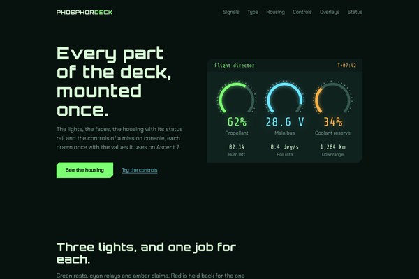
Phosphor Deck is a mission-console design language for the moment the numbers move. Dense telemetry sits on near-black green glass: one resting green carries live data, cyan is the secondary channel, amber claims emphasis, and red is held for the one alarm that matters. Colour carries state and nothing else, and everything that matters is mounted in an instrument housing: a chamfered phosphor face opened by a status rail, with a scanline display zone and a vector-grid underlay wherever a trace needs depth.
Revised in place from arni's approved range-9 specimen (phosphor-deck-i, 2026-10-07). It keeps the deck-black ground, phosphor green, cyan and amber, Orbitron, Chakra Petch and Share Tech Mono, the page order (hero, grammar, deck, close) and the chamfered housing with its status rail. It replaces icon cards and invented quotes with facts, regenerates the hero with a calm left field and no veil, moves success to a mint and error to a coral, sets labels at 17px in sentence case, and removes the housing seam and the rule on the rail.
Moderately high inside a bay, generous between bays: 48 to 64px between housings, 20 to 30px inside one, and 64 to 112px between sections. Density reads as engineered, not crowded.
From 390px to 2560px. Below 1000px the hero stacks: the headline first, then the Cathode picture at 300 to 500px tall. Tablets (600 to 1000px) keep the single column with larger measure and two-up numerics; non-essential table columns drop on phones. Above 1440px the content caps at 1180px and centres.
cathode
en-019efa09-e80f-7032-af0d-074c0f36d645
Imagery captured off a glowing cathode-ray tube in the Cathode style: baked-in scanlines, phosphor bloom, a little chromatic fringing and a gentle barrel curve, luminous green with cyan and amber on near-black. The landing hero is one wireframe globe with a cyan ascent arc, composed to the right with a calm, dark left 42% for the headline, edge to edge with no bezel and no veil.
The landing hero is painted with background-image: var(--hero-image) on a real element, never an img tag, with the picture's subject on the right and the headline set on its calm left field. On phones the picture drops below the headline at 300 to 500px tall.
A monitor bezel or TV set; a gradient veil or panel over the hero; text baked into the picture; a centred tiny subject on blank space; pastel or muddy tones.
# Phosphor Deck

## Philosophy

Phosphor Deck is a mission-console design language for the moment the numbers move. Dense telemetry sits on near-black green glass: one resting green carries live data, cyan is the secondary channel, amber claims emphasis, and red is held for the one alarm that matters. Colour carries state and nothing else, and everything that matters is mounted in an instrument housing: a chamfered phosphor face opened by a status rail, with a scanline display zone and a vector-grid underlay wherever a trace needs depth.

### Values

- Colour carries state and nothing else: green rests, amber claims, red is held.
- Every signal has a job, a hex value and a contrast ratio against the ground, and none does another's work.
- The value reads before the label: numerics are the largest, brightest thing in a bay.
- Mount what matters in a housing and leave the rest on the glass.
- Tight inside a bay, generous between bays, the same deck from a 390px handset to a wall of 2560px glass.

### Anti-Values

- Rounded consumer pills: controls are cut, not rounded.
- Glass and blur: a borderless, blurred card hides where one reading ends and the next begins.
- Slow or bouncy motion: the bloom brightens and nothing drifts.
- Small tracked uppercase labels, status chips that claim all systems green, and invented testimonials.
- A line on any edge of a housing: no seam, outline or highlight rule around or across a card.

### Visual Character

- A near-black green ground #07110E with phosphor-face housings #0C1B17, parted by tint and space and never by a line.
- Chamfered geometry: a 14px cut on the top-left and bottom-right corners of every housing, radius 0 on everything else.
- Status rails: the title on the left in green and the signal code on the right in amber, with nothing drawn between them.
- Scanline display zones with a vector-grid or horizon underlay, used for charts and instruments only.
- Numerics in Share Tech Mono at 32 to 51px with a soft green or cyan bloom, the brightest thing in any bay.
- A hero captured off a CRT in the Cathode style: a green wireframe globe with a cyan ascent arc, and a calm field on the left for the headline.

### Lineage

> Revised in place from arni's approved range-9 specimen (phosphor-deck-i, 2026-10-07). It keeps the deck-black ground, phosphor green, cyan and amber, Orbitron, Chakra Petch and Share Tech Mono, the page order (hero, grammar, deck, close) and the chamfered housing with its status rail. It replaces icon cards and invented quotes with facts, regenerates the hero with a calm left field and no veil, moves success to a mint and error to a coral, sets labels at 17px in sentence case, and removes the housing seam and the rule on the rail.

## Tokens

### Colors

| Name | Value |
|------|-------|
| bg | `#07110E` |
| surface | `#0C1B17` |
| surface_2 | `#102521` |
| text | `#D8FFD7` |
| muted | `#82A89B` |
| border | `#35584F` |
| accent | `#7CFF72` |
| accent_2 | `#6BE7FF` |
| accent_3 | `#FFB347` |
| on_accent | `#07110E` |
| success | `#5FE3A1` |
| warning | `#FFB347` |
| error | `#FF7A6E` |
| info | `#6BE7FF` |

### Typography

- **Heading Font**: Orbitron
- **Body Font**: Chakra Petch
- **Mono Font**: Share Tech Mono
- **Heading Weight**: 800
- **Body Weight**: 400
- **Button Weight**: 700
- **Mono Weight**: 400
- **Heading Transform**: none
- **Letter Spacing**: 0.02em on Orbitron titles, 0 on Chakra Petch and Share Tech Mono
- **Base Size**: 17px
- **Line Height**: 1.55
- **Scale**: ["14.5px","17px","20px","26px","38px","46px","59px"]
- **Google Fonts Url**: https://fonts.googleapis.com/css2?family=Orbitron:wght@500;700;800&family=Chakra+Petch:wght@400;500;600;700&family=Share+Tech+Mono&display=swap

### Radii

- **None**: 0px
- **Md**: 0px
- **Lg**: 0px
- **Full**: 0px

### Geometry

- **Chamfer**: 14px on housings, 10px on buttons, 8px on fields, 5px on small marks, always the top-left and bottom-right corners cut by clip-path

### Shadows

- **Bloom Green**: drop-shadow(0 0 16px rgba(124,255,114,0.45)) on a wrapper, because a clip-path cuts a shadow on its own element
- **Bloom Text**: text-shadow 0 0 26px rgba(124,255,114,0.4) on numerics, cyan at 0.35 on a secondary reading
- **Lift**: drop-shadow(0 14px 28px rgba(0,0,0,0.6)) plus a green bloom at 0.16, only on an open menu, dialog or toast
- **None**: housings and fields carry no outline, seam or shadow at rest

### Spacing

- **Base**: 8px
- **Scale**: ["4px","8px","12px","16px","24px","32px","48px","64px","96px","112px"]

### Surfaces

- **Treatment**: near-black green glass with mounted instrument housings
- **Card Style**: a chamfered #0C1B17 face on the #07110E ground, opened by a status rail; no outline, no seam, no bar on any side
- **Display Zone**: #102521 under a 3px horizontal scanline field at 26% black, with a vector-grid or horizon underlay for charts
- **Bg Pattern**: none on the ground; scanlines live only inside display zones

### Borders

- **Default Width**: 0
- **Style**: none
- **Character**: No borders, seams or edge rules. A housing is parted from the ground by its tint and by space. The border colour #35584F is used only for vector-grid strokes inside a display zone.

### Motion

- **Duration**: 180ms
- **Easing**: cubic-bezier(0.2, 0.8, 0.2, 1)
- **Philosophy**: Snappy. Hover and focus brighten the bloom or the face; nothing bounces, drifts or reshapes. Reduced motion removes every transition and the settled page is complete without script.

### Controls

- **Height**: 54px buttons, 54px fields, 28px switch track
- **Radius**: 0px, chamfered by clip-path
- **Focus**: an inner 3px ring on a button, a stacked phosphor ring plus bloom on a field

## Rules

### Composition

- Order a page hero, grammar, deck, close: a full-bleed Cathode hero with the headline on its calm left field, the three signals with their hex values and contrast ratios, one deck section holding the numerics, a trace and the bay status, then one closing action.
- Mount anything that matters in one housing. Never nest a housing in a housing, and leave plain copy on the glass.
- Set the headline on the picture pixels of the calm left field. Never add a veil, scrim or panel over the hero.
- Give a view one primary action. A second action is a text link.

### Hierarchy

- Numerics first: Share Tech Mono at 32 to 51px with a bloom is the brightest and largest thing in a bay.
- Orbitron 800 for titles at 0.02em, Chakra Petch 400 for prose at 17px, Share Tech Mono for readings, codes and times.
- Labels are 17px in sentence case. A signal code in a status rail may be mono caps.
- Amber arrives as a block or a code, never as a coloured word inside a paragraph.

### Density

Moderately high inside a bay, generous between bays: 48 to 64px between housings, 20 to 30px inside one, and 64 to 112px between sections. Density reads as engineered, not crowded.

### Signature Patterns

- Instrument housing: a chamfered #0C1B17 face with a 14px cut on two opposite corners, opened by a status rail, framed by tint and space and never by a line.
- Status rail: the title on the left in green and a signal code on the right in amber, with nothing between them.
- Scanline display zone with a vector-grid underlay: where a trace, a plot or a gauge lives.
- Phosphor bloom: numerics and traces glow, and hover and focus brighten the glow or the face. Nothing moves.
- Signal roles: three lights, each with a job, a hex value and a contrast ratio against the ground.

## Layout

### Grid

- **Type**: hero, grammar, deck, close
- **Max Width**: 1180px content, centred above 1440px; only the hero spans the viewport
- **Gutter**: 64px desktop, 5vw tablet, 20px phone
- **Column Behavior**: Three-up lists and a 5fr/7fr deck split use minmax(0,1fr) columns with min-width:0 on every child; everything stacks to one column below 1000px.

### Whitespace

- **Section Gap**: 112px desktop, 64px phone
- **Card Gap**: 48 to 72px between housings, 24 to 56px between columns
- **Content Padding**: 20 to 30px inside a housing under its rail
- **Approach**: Tight inside a bay, generous between bays. Tint and space do the separating.

### Density

- **Default**: engineered
- **Comfortable**: {"button_height":"54px","input_height":"54px","row_height":"44 to 56px table rows"}

### Responsive

From 390px to 2560px. Below 1000px the hero stacks: the headline first, then the Cathode picture at 300 to 500px tall. Tablets (600 to 1000px) keep the single column with larger measure and two-up numerics; non-essential table columns drop on phones. Above 1440px the content caps at 1180px and centres.

### Breakpoints

- **Mobile**: 390px
- **Phone Max**: 600px
- **Tablet**: 834px
- **Stack**: 1000px
- **Desktop**: 1280px
- **Ultrawide**: 2560px

## Guidance

### Do

- Let green be the resting data state, amber the emphasis and red the one alarm held in reserve.
- State each signal's job, hex value and contrast ratio where it is introduced.
- Mount every important region as a chamfered housing opened by a status rail.
- Set numerics in Share Tech Mono, large and glowing, with the label under them in muted 17px.
- Brighten the bloom or the face on hover and focus, and ring a focused button on the inside.
- Pair every status colour with a word and an SVG icon.

### Don't

- Don't draw a seam, outline or highlight rule on any side of a housing, and don't draw a rule inside its rail.
- Don't add rounded pills, blurred glass cards or gradient washes over the hero.
- Don't use tiny tracked uppercase labels, status chips or invented testimonials.
- Don't let amber or red read as a coloured word in a paragraph.
- Don't use slow, bouncy or drifting motion.
- Don't wash the ground toward white or pastel.

### Accessibility

Luminous text on near-black throughout: body #D8FFD7 is 17.5:1 on #07110E, muted #82A89B 7.3:1, green #7CFF72 15.0:1, cyan #6BE7FF 13.2:1, amber #FFB347 10.8:1, mint #5FE3A1 11.9:1 and coral #FF7A6E 7.5:1; the dark label on a green button is 15.0:1. Body is 17px or larger and table rows 14.5px or larger. Status is never colour alone: each state pairs its colour with a word and an SVG icon. Every control is explicitly styled with a visible hover and focus state (a brighter face, an inner 3px ring on buttons, a phosphor ring on fields). Motion respects prefers-reduced-motion and the settled page renders with no script.

### Usage Context

Mission and operations consoles, telemetry dashboards, developer and infrastructure tools, hardware control panels, launch and flight software, and any product where dense live numbers must read at a glance.

## Imagery Direction

### Pairs With

cathode

### Art Style Id

en-019efa09-e80f-7032-af0d-074c0f36d645

### Summary

Imagery captured off a glowing cathode-ray tube in the Cathode style: baked-in scanlines, phosphor bloom, a little chromatic fringing and a gentle barrel curve, luminous green with cyan and amber on near-black. The landing hero is one wireframe globe with a cyan ascent arc, composed to the right with a calm, dark left 42% for the headline, edge to edge with no bezel and no veil.

### Subjects

- a green vector wireframe globe with a cyan ascent arc
- orbital trajectory and telemetry displays
- oscilloscope waveforms and readout panels
- instrument clusters and gauges

### Usage

The landing hero is painted with background-image: var(--hero-image) on a real element, never an img tag, with the picture's subject on the right and the headline set on its calm left field. On phones the picture drops below the headline at 300 to 500px tall.

### Avoid

A monitor bezel or TV set; a gradient veil or panel over the hero; text baked into the picture; a centred tiny subject on blank space; pastel or muddy tones.
---
version: "alpha"
name: "Phosphor Deck"
description: "Phosphor Deck is a mission-console design language for the moment the numbers move. Dense telemetry sits on near-black green glass: one resting green carries live data, cyan is the secondary channel, amber claims emphasis, and red is hel..."
colors:
  bg: "#07110E"
  surface: "#0C1B17"
  surface_2: "#102521"
  text: "#D8FFD7"
  muted: "#82A89B"
  border: "#35584F"
  accent: "#7CFF72"
  accent_2: "#6BE7FF"
  accent_3: "#FFB347"
  on_accent: "#07110E"
  success: "#5FE3A1"
  warning: "#FFB347"
  error: "#FF7A6E"
  info: "#6BE7FF"
typography:
  headline-lg:
    fontFamily: "Orbitron"
    fontSize: "2.075rem"
    fontWeight: 700
    lineHeight: 1.1
    letterSpacing: "-0.02em"
  headline-md:
    fontFamily: "Orbitron"
    fontSize: "1.66rem"
    fontWeight: 600
    lineHeight: 1.15
    letterSpacing: "-0.02em"
  body-md:
    fontFamily: "Chakra Petch"
    fontSize: "17px"
    fontWeight: 400
    lineHeight: 1.5
    letterSpacing: "-0.02em"
  label-md:
    fontFamily: "Share Tech Mono"
    fontSize: "0.75rem"
    fontWeight: 600
    lineHeight: 1
    letterSpacing: "0.08em"
rounded:
  none: "0px"
  md: "0px"
  lg: "0px"
  full: "0px"
spacing:
  base: "8px"
  xs: "4px"
  sm: "8px"
  md: "12px"
  lg: "16px"
  xl: "24px"
  2xl: "32px"
  3xl: "48px"
  4xl: "64px"
  step-8: "96px"
  step-9: "112px"
components:
  color-reference-bg:
    backgroundColor: "{colors.bg}"
  color-reference-surface:
    backgroundColor: "{colors.surface}"
  color-reference-surface_2:
    backgroundColor: "{colors.surface_2}"
  color-reference-text:
    backgroundColor: "{colors.text}"
  color-reference-muted:
    backgroundColor: "{colors.muted}"
  color-reference-border:
    backgroundColor: "{colors.border}"
  color-reference-accent:
    backgroundColor: "{colors.accent}"
  color-reference-accent_2:
    backgroundColor: "{colors.accent_2}"
  color-reference-accent_3:
    backgroundColor: "{colors.accent_3}"
  color-reference-on_accent:
    backgroundColor: "{colors.on_accent}"
  color-reference-success:
    backgroundColor: "{colors.success}"
  color-reference-warning:
    backgroundColor: "{colors.warning}"
  color-reference-error:
    backgroundColor: "{colors.error}"
  color-reference-info:
    backgroundColor: "{colors.info}"
  button-primary:
    backgroundColor: "{colors.accent}"
    textColor: "{colors.on_accent}"
    typography: "{typography.label-md}"
    rounded: "{rounded.md}"
    padding: "{spacing.md}"
  card-surface:
    backgroundColor: "{colors.surface}"
    textColor: "{colors.text}"
    rounded: "{rounded.md}"
    padding: "{spacing.md}"
  input-default:
    backgroundColor: "{colors.surface}"
    textColor: "{colors.text}"
    rounded: "{rounded.md}"
    height: "44px"
---

# Phosphor Deck

## Overview

Phosphor Deck is a mission-console design language for the moment the numbers move. Dense telemetry sits on near-black green glass: one resting green carries live data, cyan is the secondary channel, amber claims emphasis, and red is held for the one alarm that matters. Colour carries state and nothing else, and everything that matters is mounted in an instrument housing: a chamfered phosphor face opened by a status rail, with a scanline display zone and a vector-grid underlay wherever a trace needs depth.

### Values

- Colour carries state and nothing else: green rests, amber claims, red is held.
- Every signal has a job, a hex value and a contrast ratio against the ground, and none does another's work.
- The value reads before the label: numerics are the largest, brightest thing in a bay.
- Mount what matters in a housing and leave the rest on the glass.
- Tight inside a bay, generous between bays, the same deck from a 390px handset to a wall of 2560px glass.

### Anti-Values

- Rounded consumer pills: controls are cut, not rounded.
- Glass and blur: a borderless, blurred card hides where one reading ends and the next begins.
- Slow or bouncy motion: the bloom brightens and nothing drifts.
- Small tracked uppercase labels, status chips that claim all systems green, and invented testimonials.
- A line on any edge of a housing: no seam, outline or highlight rule around or across a card.

### Visual Character

- A near-black green ground #07110E with phosphor-face housings #0C1B17, parted by tint and space and never by a line.
- Chamfered geometry: a 14px cut on the top-left and bottom-right corners of every housing, radius 0 on everything else.
- Status rails: the title on the left in green and the signal code on the right in amber, with nothing drawn between them.
- Scanline display zones with a vector-grid or horizon underlay, used for charts and instruments only.
- Numerics in Share Tech Mono at 32 to 51px with a soft green or cyan bloom, the brightest thing in any bay.
- A hero captured off a CRT in the Cathode style: a green wireframe globe with a cyan ascent arc, and a calm field on the left for the headline.

### Lineage

> Revised in place from arni's approved range-9 specimen (phosphor-deck-i, 2026-10-07). It keeps the deck-black ground, phosphor green, cyan and amber, Orbitron, Chakra Petch and Share Tech Mono, the page order (hero, grammar, deck, close) and the chamfered housing with its status rail. It replaces icon cards and invented quotes with facts, regenerates the hero with a calm left field and no veil, moves success to a mint and error to a coral, sets labels at 17px in sentence case, and removes the housing seam and the rule on the rail.

## Colors

Use the YAML color tokens as the normative palette. The prose below names the roles agents should preserve when generating UI.

| Token | Value |
|-------|-------|
| bg | `#07110E` |
| surface | `#0C1B17` |
| surface_2 | `#102521` |
| text | `#D8FFD7` |
| muted | `#82A89B` |
| border | `#35584F` |
| accent | `#7CFF72` |
| accent_2 | `#6BE7FF` |
| accent_3 | `#FFB347` |
| on_accent | `#07110E` |
| success | `#5FE3A1` |
| warning | `#FFB347` |
| error | `#FF7A6E` |
| info | `#6BE7FF` |

## Typography

Load the fonts from Google Fonts: https://fonts.googleapis.com/css2?family=Orbitron:wght@500;700;800&family=Chakra+Petch:wght@400;500;600;700&family=Share+Tech+Mono&display=swap

- **Headline-Lg**: Orbitron, 2.075rem, weight 700, line-height 1.1.
- **Headline-Md**: Orbitron, 1.66rem, weight 600, line-height 1.15.
- **Body-Md**: Chakra Petch, 17px, weight 400, line-height 1.5.
- **Label-Md**: Share Tech Mono, 0.75rem, weight 600, line-height 1.

## Layout

### Spacing Tokens

- **Base**: `8px`
- **Xs**: `4px`
- **Sm**: `8px`
- **Md**: `12px`
- **Lg**: `16px`
- **Xl**: `24px`
- **2xl**: `32px`
- **3xl**: `48px`
- **4xl**: `64px`
- **Step-8**: `96px`
- **Step-9**: `112px`

### Grid

- **Type**: hero, grammar, deck, close
- **Max Width**: 1180px content, centred above 1440px; only the hero spans the viewport
- **Gutter**: 64px desktop, 5vw tablet, 20px phone
- **Column Behavior**: Three-up lists and a 5fr/7fr deck split use minmax(0,1fr) columns with min-width:0 on every child; everything stacks to one column below 1000px.

### Whitespace

- **Section Gap**: 112px desktop, 64px phone
- **Card Gap**: 48 to 72px between housings, 24 to 56px between columns
- **Content Padding**: 20 to 30px inside a housing under its rail
- **Approach**: Tight inside a bay, generous between bays. Tint and space do the separating.

### Density

- **Default**: engineered
- **Comfortable**: {"button_height":"54px","input_height":"54px","row_height":"44 to 56px table rows"}

### Responsive

From 390px to 2560px. Below 1000px the hero stacks: the headline first, then the Cathode picture at 300 to 500px tall. Tablets (600 to 1000px) keep the single column with larger measure and two-up numerics; non-essential table columns drop on phones. Above 1440px the content caps at 1180px and centres.

### Breakpoints

- **Mobile**: 390px
- **Phone Max**: 600px
- **Tablet**: 834px
- **Stack**: 1000px
- **Desktop**: 1280px
- **Ultrawide**: 2560px

## Elevation & Depth

### Shadows

- **Bloom Green**: drop-shadow(0 0 16px rgba(124,255,114,0.45)) on a wrapper, because a clip-path cuts a shadow on its own element
- **Bloom Text**: text-shadow 0 0 26px rgba(124,255,114,0.4) on numerics, cyan at 0.35 on a secondary reading
- **Lift**: drop-shadow(0 14px 28px rgba(0,0,0,0.6)) plus a green bloom at 0.16, only on an open menu, dialog or toast
- **None**: housings and fields carry no outline, seam or shadow at rest

## Shapes

### Rounded

- **None**: `0px`
- **Md**: `0px`
- **Lg**: `0px`
- **Full**: `0px`

### Surfaces

- **Treatment**: near-black green glass with mounted instrument housings
- **Card Style**: a chamfered #0C1B17 face on the #07110E ground, opened by a status rail; no outline, no seam, no bar on any side
- **Display Zone**: #102521 under a 3px horizontal scanline field at 26% black, with a vector-grid or horizon underlay for charts
- **Bg Pattern**: none on the ground; scanlines live only inside display zones

### Borders

- **Default Width**: 0
- **Style**: none
- **Character**: No borders, seams or edge rules. A housing is parted from the ground by its tint and by space. The border colour #35584F is used only for vector-grid strokes inside a display zone.

## Components

### Composition

- Order a page hero, grammar, deck, close: a full-bleed Cathode hero with the headline on its calm left field, the three signals with their hex values and contrast ratios, one deck section holding the numerics, a trace and the bay status, then one closing action.
- Mount anything that matters in one housing. Never nest a housing in a housing, and leave plain copy on the glass.
- Set the headline on the picture pixels of the calm left field. Never add a veil, scrim or panel over the hero.
- Give a view one primary action. A second action is a text link.

### Hierarchy

- Numerics first: Share Tech Mono at 32 to 51px with a bloom is the brightest and largest thing in a bay.
- Orbitron 800 for titles at 0.02em, Chakra Petch 400 for prose at 17px, Share Tech Mono for readings, codes and times.
- Labels are 17px in sentence case. A signal code in a status rail may be mono caps.
- Amber arrives as a block or a code, never as a coloured word inside a paragraph.

### Density

Moderately high inside a bay, generous between bays: 48 to 64px between housings, 20 to 30px inside one, and 64 to 112px between sections. Density reads as engineered, not crowded.

### Signature Patterns

- Instrument housing: a chamfered #0C1B17 face with a 14px cut on two opposite corners, opened by a status rail, framed by tint and space and never by a line.
- Status rail: the title on the left in green and a signal code on the right in amber, with nothing between them.
- Scanline display zone with a vector-grid underlay: where a trace, a plot or a gauge lives.
- Phosphor bloom: numerics and traces glow, and hover and focus brighten the glow or the face. Nothing moves.
- Signal roles: three lights, each with a job, a hex value and a contrast ratio against the ground.

## shadcn/ui Usage

When the target app uses shadcn/ui, copy DESIGN.md with shadcn instead of the plain DESIGN.md. It contains the same Katagami design-language source plus the shadcn/ui primitives, imports, theme variables, component recipes, and preview-shot guidance.

DESIGN.md with shadcn: `/language/en-01a1379b-40d4-7d61-a231-a49ed8eedf8f/DESIGN.with-shadcn.md`.

Machine-readable companions for automation: `/language/en-01a1379b-40d4-7d61-a231-a49ed8eedf8f/shadcn.json` (registry theme), `/language/en-01a1379b-40d4-7d61-a231-a49ed8eedf8f/shadcn-components.md` (component recipes) and `/language/en-01a1379b-40d4-7d61-a231-a49ed8eedf8f/shadcn-shots.json` (preview shots). The human-facing handoff is still DESIGN.md with shadcn.

Install recommended primitives with `npx shadcn@latest add button card input textarea select dialog sheet tabs badge separator checkbox switch slider tooltip dropdown-menu table`.

Use these primitives in shadcn apps:
- button
- card
- input
- textarea
- select
- dialog
- sheet
- tabs
- badge
- separator
- checkbox
- switch
- slider
- tooltip
- dropdown-menu
- table

Implementation rule for agents: import shadcn primitives from `@/components/ui/*`, apply the generated CSS variables first, then compose the language-specific recipes from the companion MD. Katagami remains the source of truth; shadcn names are the implementation surface.

## Do's and Don'ts

- Do Let green be the resting data state, amber the emphasis and red the one alarm held in reserve.
- Do State each signal's job, hex value and contrast ratio where it is introduced.
- Do Mount every important region as a chamfered housing opened by a status rail.
- Do Set numerics in Share Tech Mono, large and glowing, with the label under them in muted 17px.
- Do Brighten the bloom or the face on hover and focus, and ring a focused button on the inside.
- Do Pair every status colour with a word and an SVG icon.
- Don't Don't draw a seam, outline or highlight rule on any side of a housing, and don't draw a rule inside its rail.
- Don't Don't add rounded pills, blurred glass cards or gradient washes over the hero.
- Don't Don't use tiny tracked uppercase labels, status chips or invented testimonials.
- Don't Don't let amber or red read as a coloured word in a paragraph.
- Don't Don't use slow, bouncy or drifting motion.
- Don't Don't wash the ground toward white or pastel.

### Accessibility

Luminous text on near-black throughout: body #D8FFD7 is 17.5:1 on #07110E, muted #82A89B 7.3:1, green #7CFF72 15.0:1, cyan #6BE7FF 13.2:1, amber #FFB347 10.8:1, mint #5FE3A1 11.9:1 and coral #FF7A6E 7.5:1; the dark label on a green button is 15.0:1. Body is 17px or larger and table rows 14.5px or larger. Status is never colour alone: each state pairs its colour with a word and an SVG icon. Every control is explicitly styled with a visible hover and focus state (a brighter face, an inner 3px ring on buttons, a phosphor ring on fields). Motion respects prefers-reduced-motion and the settled page renders with no script.

### Usage Context

Mission and operations consoles, telemetry dashboards, developer and infrastructure tools, hardware control panels, launch and flight software, and any product where dense live numbers must read at a glance.

## Imagery Direction

### Pairs With

cathode

### Art Style Id

en-019efa09-e80f-7032-af0d-074c0f36d645

### Summary

Imagery captured off a glowing cathode-ray tube in the Cathode style: baked-in scanlines, phosphor bloom, a little chromatic fringing and a gentle barrel curve, luminous green with cyan and amber on near-black. The landing hero is one wireframe globe with a cyan ascent arc, composed to the right with a calm, dark left 42% for the headline, edge to edge with no bezel and no veil.

### Subjects

- a green vector wireframe globe with a cyan ascent arc
- orbital trajectory and telemetry displays
- oscilloscope waveforms and readout panels
- instrument clusters and gauges

### Usage

The landing hero is painted with background-image: var(--hero-image) on a real element, never an img tag, with the picture's subject on the right and the headline set on its calm left field. On phones the picture drops below the headline at 300 to 500px tall.

### Avoid

A monitor bezel or TV set; a gradient veil or panel over the hero; text baked into the picture; a centred tiny subject on blank space; pastel or muddy tones.
```json
{
  "$schema": "https://ui.shadcn.com/schema/registry-item.json",
  "name": "phosphor-deck",
  "type": "registry:theme",
  "title": "Phosphor Deck shadcn Theme",
  "cssVars": {
    "theme": {},
    "light": {
      "background": "#07110E",
      "foreground": "#D8FFD7",
      "card": "#0C1B17",
      "card-foreground": "#D8FFD7",
      "popover": "#0C1B17",
      "popover-foreground": "#D8FFD7",
      "primary": "#D8FFD7",
      "primary-foreground": "#111111",
      "secondary": "#f4f4f5",
      "secondary-foreground": "#111111",
      "muted": "#82A89B",
      "muted-foreground": "#D8FFD7",
      "accent": "#7CFF72",
      "accent-foreground": "#111111",
      "destructive": "#FF7A6E",
      "border": "#35584F",
      "input": "#35584F",
      "ring": "#7CFF72",
      "chart-1": "#D8FFD7",
      "chart-2": "#f4f4f5",
      "chart-3": "#7CFF72",
      "chart-4": "#5FE3A1",
      "chart-5": "#FFB347",
      "sidebar": "#0C1B17",
      "sidebar-foreground": "#D8FFD7",
      "sidebar-primary": "#D8FFD7",
      "sidebar-primary-foreground": "#111111",
      "sidebar-accent": "#6BE7FF",
      "sidebar-accent-foreground": "#111111",
      "sidebar-border": "#35584F",
      "sidebar-ring": "#7CFF72",
      "radius": "0px"
    },
    "dark": {
      "background": "#0f1115",
      "foreground": "#f8fafc",
      "card": "#181b22",
      "card-foreground": "#f8fafc",
      "popover": "#181b22",
      "popover-foreground": "#f8fafc",
      "primary": "#D8FFD7",
      "primary-foreground": "#111111",
      "secondary": "#252a33",
      "secondary-foreground": "#f8fafc",
      "muted": "#252a33",
      "muted-foreground": "#a1a1aa",
      "accent": "#7CFF72",
      "accent-foreground": "#111111",
      "destructive": "#FF7A6E",
      "border": "#303642",
      "input": "#303642",
      "ring": "#7CFF72",
      "chart-1": "#D8FFD7",
      "chart-2": "#f4f4f5",
      "chart-3": "#7CFF72",
      "chart-4": "#5FE3A1",
      "chart-5": "#FFB347",
      "sidebar": "#181b22",
      "sidebar-foreground": "#f8fafc",
      "sidebar-primary": "#D8FFD7",
      "sidebar-primary-foreground": "#111111",
      "sidebar-accent": "#7CFF72",
      "sidebar-accent-foreground": "#111111",
      "sidebar-border": "#303642",
      "sidebar-ring": "#7CFF72",
      "radius": "0px"
    }
  },
  "meta": {
    "source": "katagami",
    "languageId": "en-01a1379b-40d4-7d61-a231-a49ed8eedf8f",
    "slug": "phosphor-deck",
    "componentManifest": [
      "button",
      "card",
      "input",
      "textarea",
      "select",
      "dialog",
      "sheet",
      "tabs",
      "badge",
      "separator",
      "checkbox",
      "switch",
      "slider",
      "tooltip",
      "dropdown-menu",
      "table"
    ],
    "installCommand": "npx shadcn@latest add button card input textarea select dialog sheet tabs badge separator checkbox switch slider tooltip dropdown-menu table",
    "nativeTokenNames": {
      "colors": [
        "accent",
        "accent_2",
        "accent_3",
        "bg",
        "border",
        "error",
        "info",
        "muted",
        "on_accent",
        "success",
        "surface",
        "surface_2",
        "text",
        "warning"
      ],
      "typography": [
        "base_size",
        "body_font",
        "body_weight",
        "button_weight",
        "google_fonts_url",
        "heading_font",
        "heading_transform",
        "heading_weight",
        "letter_spacing",
        "line_height",
        "mono_font",
        "mono_weight",
        "scale"
      ],
      "radii": [
        "full",
        "lg",
        "md",
        "none"
      ],
      "geometry": [
        "chamfer"
      ],
      "shadows": [
        "bloom_green",
        "bloom_text",
        "lift",
        "none"
      ],
      "spacing": [
        "base",
        "scale"
      ],
      "surfaces": [
        "bg_pattern",
        "card_style",
        "display_zone",
        "treatment"
      ],
      "borders": [
        "character",
        "default_width",
        "style"
      ],
      "motion": [
        "duration",
        "easing",
        "philosophy"
      ],
      "controls": [
        "focus",
        "height",
        "radius"
      ]
    }
  }
}
```The art style its pictures are drawn in and the colours its tokens carry.
The theme variables are generated from the tokens. Component recipes and preview shots have not been written for this language yet.
For an app that uses shadcn/ui: the DESIGN.md plus the install list, theme variables, component recipes, preview shots and a starter TSX file, in one Markdown file.
The same pieces as separate files: theme, CSS, TSX starter, recipes and the preview contract.
npx shadcn@latest add button card input textarea select dialog sheet tabs badge separator checkbox switch slider tooltip dropdown-menu table:root {
--background: #07110E;
--foreground: #D8FFD7;
--card: #0C1B17;
--card-foreground: #D8FFD7;
--popover: #0C1B17;
--popover-foreground: #D8FFD7;
--primary: #D8FFD7;
--primary-foreground: #111111;
--secondary: #f4f4f5;
--secondary-foreground: #111111;
--muted: #82A89B;
--muted-foreground: #D8FFD7;
--accent: #7CFF72;
--accent-foreground: #111111;
--destructive: #FF7A6E;
--border: #35584F;
--input: #35584F;
--ring: #7CFF72;
--chart-1: #D8FFD7;
--chart-2: #f4f4f5;
--chart-3: #7CFF72;
--chart-4: #5FE3A1;
--chart-5: #FFB347;
--sidebar: #0C1B17;
--sidebar-foreground: #D8FFD7;
--sidebar-primary: #D8FFD7;
--sidebar-primary-foreground: #111111;
--sidebar-accent: #6BE7FF;
--sidebar-accent-foreground: #111111;
--sidebar-border: #35584F;
--sidebar-ring: #7CFF72;
--radius: 0px;
}
.dark {
--background: #0f1115;
--foreground: #f8fafc;
--card: #181b22;
--card-foreground: #f8fafc;
--popover: #181b22;
--popover-foreground: #f8fafc;
--primary: #D8FFD7;
--primary-foreground: #111111;
--secondary: #252a33;
--secondary-foreground: #f8fafc;
--muted: #252a33;
--muted-foreground: #a1a1aa;
--accent: #7CFF72;
--accent-foreground: #111111;
--destructive: #FF7A6E;
--border: #303642;
--input: #303642;
--ring: #7CFF72;
--chart-1: #D8FFD7;
--chart-2: #f4f4f5;
--chart-3: #7CFF72;
--chart-4: #5FE3A1;
--chart-5: #FFB347;
--sidebar: #181b22;
--sidebar-foreground: #f8fafc;
--sidebar-primary: #D8FFD7;
--sidebar-primary-foreground: #111111;
--sidebar-accent: #7CFF72;
--sidebar-accent-foreground: #111111;
--sidebar-border: #303642;
--sidebar-ring: #7CFF72;
--radius: 0px;
}
import { Badge } from "@/components/ui/badge";
import { Button } from "@/components/ui/button";
import {
  Card,
  CardContent,
  CardDescription,
  CardFooter,
  CardHeader,
  CardTitle,
} from "@/components/ui/card";
import { Input } from "@/components/ui/input";
import { Tabs, TabsList, TabsTrigger } from "@/components/ui/tabs";

export function PhosphorDeckShadcnKit() {
  return (
    <section className="grid gap-4 rounded-[var(--radius)] border bg-background p-4 text-foreground">
      <div className="flex items-start justify-between gap-4">
        <div>
          <Badge variant="outline">shadcn/ui</Badge>
          <h2 className="mt-3 text-2xl font-semibold tracking-tight">Phosphor Deck</h2>
          <p className="mt-1 max-w-xl text-sm text-muted-foreground">
            Use the Katagami registry theme, then compose these shadcn primitives
            with the language-specific component recipes.
          </p>
        </div>
        <Button>Apply theme</Button>
      </div>

      <Tabs defaultValue="components">
        <TabsList>
          <TabsTrigger value="components">Components</TabsTrigger>
          <TabsTrigger value="states">States</TabsTrigger>
          <TabsTrigger value="export">Export</TabsTrigger>
        </TabsList>
      </Tabs>

      <Card>
        <CardHeader>
          <CardTitle>Component recipe</CardTitle>
          <CardDescription>
            Replace this starter content with the agent-authored product scene
            from components.md and preview-shots.json.
          </CardDescription>
        </CardHeader>
        <CardContent className="grid gap-3 sm:grid-cols-[1fr_auto]">
          <Input defaultValue="Tokenized shadcn surface" aria-label="Recipe name" />
          <Button variant="secondary">Preview state</Button>
        </CardContent>
        <CardFooter className="justify-between">
          <Badge>Ready</Badge>
          <Button variant="outline">Copy recipe</Button>
        </CardFooter>
      </Card>
    </section>
  );
}
{
  "$schema": "https://ui.shadcn.com/schema/registry-item.json",
  "name": "phosphor-deck",
  "type": "registry:theme",
  "title": "Phosphor Deck",
  "description": "Mission-console glass for shadcn: chamfered housings opened by a status rail, one resting green, glowing mono numerics, square, borderless and dark.",
  "cssVars": {
    "theme": {
      "font-sans": "Chakra Petch, system-ui, sans-serif",
      "font-mono": "Share Tech Mono, ui-monospace, monospace",
      "font-display": "Orbitron, system-ui, sans-serif",
      "radius": "0px"
    },
    "light": {
      "background": "#07110E",
      "foreground": "#D8FFD7",
      "card": "#0C1B17",
      "card-foreground": "#D8FFD7",
      "popover": "#102521",
      "popover-foreground": "#D8FFD7",
      "primary": "#7CFF72",
      "primary-foreground": "#07110E",
      "secondary": "#102521",
      "secondary-foreground": "#6BE7FF",
      "muted": "#102521",
      "muted-foreground": "#82A89B",
      "accent": "#102521",
      "accent-foreground": "#7CFF72",
      "destructive": "#FF7A6E",
      "destructive-foreground": "#07110E",
      "border": "transparent",
      "input": "transparent",
      "ring": "#7CFF72",
      "chart-1": "#7CFF72",
      "chart-2": "#6BE7FF",
      "chart-3": "#FFB347",
      "chart-4": "#5FE3A1",
      "chart-5": "#FF7A6E",
      "radius": "0px"
    },
    "dark": {
      "background": "#07110E",
      "foreground": "#D8FFD7",
      "card": "#0C1B17",
      "card-foreground": "#D8FFD7",
      "popover": "#102521",
      "popover-foreground": "#D8FFD7",
      "primary": "#7CFF72",
      "primary-foreground": "#07110E",
      "secondary": "#102521",
      "secondary-foreground": "#6BE7FF",
      "muted": "#102521",
      "muted-foreground": "#82A89B",
      "accent": "#102521",
      "accent-foreground": "#7CFF72",
      "destructive": "#FF7A6E",
      "destructive-foreground": "#07110E",
      "border": "transparent",
      "input": "transparent",
      "ring": "#7CFF72",
      "chart-1": "#7CFF72",
      "chart-2": "#6BE7FF",
      "chart-3": "#FFB347",
      "chart-4": "#5FE3A1",
      "chart-5": "#FF7A6E",
      "radius": "0px"
    }
  },
  "componentManifest": [
    "button",
    "card",
    "input",
    "textarea",
    "select",
    "dialog",
    "sheet",
    "tabs",
    "badge",
    "separator",
    "checkbox",
    "switch",
    "slider",
    "tooltip",
    "dropdown-menu",
    "table"
  ],
  "meta": {
    "nativeTokenNames": {
      "bg": "background",
      "surface": "card (housings and the quiet section band)",
      "surface_2": "popover / secondary / muted / accent (display glass, fields, menus, dialogs)",
      "text": "foreground",
      "muted": "muted-foreground",
      "accent": "primary / ring / chart-1",
      "accent_2": "secondary-foreground / chart-2 and links",
      "accent_3": "chart-3 and signal codes (native only)",
      "success": "chart-4 and Held (native only)",
      "error": "destructive / chart-5",
      "on_accent": "primary-foreground",
      "border": "native only (vector-grid strokes); --border stays transparent"
    },
    "note": "Phosphor Deck is a dark-only language, so the light scope repeats the dark values. The shadcn primary is the resting green, and amber and cyan are native roles that map to chart colours, signal codes and links.",
    "componentManifest": [
      "button",
      "card",
      "input",
      "textarea",
      "select",
      "dialog",
      "sheet",
      "tabs",
      "badge",
      "separator",
      "checkbox",
      "switch",
      "slider",
      "tooltip",
      "dropdown-menu",
      "table"
    ]
  }
}
---
artifact: component-recipes-v1
language: phosphor-deck
author: katagami-agent
primitives: 16
---

# Phosphor Deck shadcn/ui Components

Author: `katagami-agent`

## Intent

Phosphor Deck dresses shadcn/ui as a mission console: dense telemetry on near-black green glass, one resting green, cyan for the secondary channel, amber for emphasis and coral held for the one alarm. Everything that matters is a chamfered housing opened by a status rail, with fields, menus and dialogs as wells of display glass. Nothing is outlined, rounded or blurred; depth is tint and a bloom that brightens on hover and focus.

## Required primitives

button, card, input, textarea, select, dialog, sheet, tabs, badge, separator, checkbox, switch, slider, tooltip, dropdown-menu, table. Import them from `@/components/ui/*`; do not build a second component system.

## Token cues

```css
--background:#07110E;
--foreground:#D8FFD7;
--card:#0C1B17;
--card-foreground:#D8FFD7;
--popover:#102521;
--popover-foreground:#D8FFD7;
--primary:#7CFF72;
--primary-foreground:#07110E;
--secondary:#102521;
--secondary-foreground:#6BE7FF;
--muted:#102521;
--muted-foreground:#82A89B;
--accent:#102521;
--accent-foreground:#7CFF72;
--destructive:#FF7A6E;
--destructive-foreground:#07110E;
--border:transparent;
--input:transparent;
--ring:#7CFF72;
--chart-1:#7CFF72;
--chart-2:#6BE7FF;
--chart-3:#FFB347;
--chart-4:#5FE3A1;
--chart-5:#FF7A6E;
--radius:0px;
```

Native names are kept in the theme: `bg`, `surface`, `surface_2`, `accent_2`, `accent_3` and `success`, which a shadcn role does not carry. The chamfer is made with clip-path and the radius stays `0px`.

## Visual character to preserve

- Colour carries state and nothing else: green rests, cyan relays, amber claims, coral is the one alarm.
- Mount what matters in a chamfered housing opened by a status rail. Never nest one, and never draw a seam, outline or bar on any side.
- No borders: `--border` and `--input` stay transparent, and wells take their tone from `bg-secondary`.
- One geometry: radius 0 with a clip-path chamfer, including the switch and the radio.
- Numerics are the largest, brightest thing in a bay: Share Tech Mono with a soft bloom, labels beneath in muted 17px sentence case.
- Hover and focus brighten a face or a bloom. A clip-path cuts a shadow or outline off its own element, so blooms go on a wrapper.

## ShadSync visual profile

- family: instrument-glass
- material: near-black green glass with phosphor faces
- contour: chamfered
- border: none
- underlay: False
- grain: False
- stickerBadges: False
- motion: bloom brightens on hover and focus
- density: dense
- radius: 0
- accents: phosphor-green, signal-cyan, amber

## Signature component recipes

- **button:** `h-[54px] rounded-none px-8 text-[17px] font-bold whitespace-nowrap border-0`, chamfered with `[clip-path:polygon(10px_0,100%_0,100%_calc(100%-10px),calc(100%-10px)_100%,0_100%,0_10px)]`. `default` is `bg-primary text-primary-foreground` (a green face with a dark label), one per view. Hover is `hover:brightness-[1.14]`, focus is an inner ring `focus-visible:outline-none focus-visible:shadow-[inset_0_0_0_3px_var(--background)]` because a clip-path cuts an outline off, and active sinks `active:translate-y-px`. `secondary` is `bg-secondary text-secondary-foreground` (cyan on glass), `destructive` is `bg-secondary text-destructive` with an icon, and `link` is a cyan word with a 4px underline offset that blooms on hover (`hover:[text-shadow:0_0_14px_rgba(107,231,255,.6)]`).
- **card:** a housing, not a framed Card: `rounded-none border-0 bg-card p-0 shadow-none` with a 14px chamfer cut by clip-path on a pseudo layer so a bloom can follow its shape. Open it with a status rail in `CardHeader`: the title in `text-primary` on the left and a mono signal code in amber on the right, 17px, nothing drawn between them. Content sits under the rail with `px-6 pb-7`. Never nest a card, and never draw a seam, outline or bar on any side.
- **input:** a chamfered well: `h-[54px] rounded-none border-0 bg-secondary px-[18px] font-mono text-[17px] shadow-none` with an 8px clip-path. Focus rings the shape on a wrapper using two stacked `drop-shadow(0 0 1px var(--ring))` plus a 12px bloom at 45%, because a clip-path cuts a ring on the element itself. An error swaps the ring to `--destructive` and adds an icon and a 14.5px message beneath.
- **textarea:** the input well at `min-h-[112px] py-3.5`, vertical resize only, with the same chamfer, ring and error treatment.
- **select:** the input well with a custom 14px cyan SVG chevron on the right (`pr-[46px]`). `SelectContent` is `bg-popover rounded-none py-2.5` with the lift shadow, and its items are 44px rows where the highlighted one is `bg-primary/15 text-primary`.
- **dialog:** `bg-popover rounded-none p-8 border-0` with a 14px chamfer and the lift: `drop-shadow(0 14px 26px rgba(0,0,0,.6))` plus a faint green bloom. An Orbitron 26px title, a muted 17px body, one green button and one secondary.
- **sheet:** a right-side `bg-popover rounded-none` panel with the same lift, opening in 180ms on `cubic-bezier(0.2,0.8,0.2,1)`. It opens with a status rail (title left, code right) and prints its readings in Share Tech Mono.
- **tabs:** `TabsList` has no tray (`bg-transparent p-0 gap-2`). Triggers are 44px words in `text-muted-foreground` with an 8px chamfer, and the active trigger takes `bg-secondary text-primary` with a text bloom. No underline.
- **badge:** a state word with an icon, not a pill: `bg-transparent p-0 rounded-none font-mono text-[14.5px]`, mint `#5FE3A1` for Held, amber for Watch, `text-destructive` for Fault and `text-muted-foreground` for Idle, each beside an 18px SVG icon.
- **separator:** do not draw one. Use space: 48 to 72px between housings and 12px between rows. The only rules in the language are vector-grid strokes inside a display zone.
- **checkbox:** `size-6 rounded-none border-0 bg-secondary` with a 5px chamfer. Checked fills `bg-primary` with a drawn dark tick polygon, and focus rings it inside by 3px.
- **switch:** a chamfered `h-7 w-14 rounded-none bg-secondary` track with a 20px square muted knob. Checked turns the track `bg-primary` and the knob dark, sliding 28px in 180ms.
- **slider:** a 6px `bg-secondary` track, a `bg-primary` range and a 14px by 28px square `bg-foreground` thumb that turns green on focus. The reading prints in Share Tech Mono with a bloom (92%).
- **tooltip:** `bg-foreground text-background rounded-none px-3 py-2 font-mono text-[14.5px]` with a 6px chamfer and no arrow, so it reads as an inverse label over a housing.
- **dropdown-menu:** `bg-popover rounded-none py-2.5` with a 10px chamfer and the lift shadow. Rows are 44px with the key in 14.5px mono on the right, the highlighted row is `bg-primary/15 text-primary` with a text bloom, and the destructive row is `text-destructive`.
- **table:** the log housing: rows with no dividers, readings in `font-mono text-[14.5px]`, the channel in Chakra Petch 17px and one state word with an icon per row. Even rows take `bg-secondary/55`, hover takes `bg-secondary`, and the Limit column hides below 700px.

### The housing and the status rail (the signature, outside shadcn)

A housing is not a shadcn primitive. Build it once: a `position:relative; isolation:isolate` wrapper whose `::before` is the chamfered face (`clip-path: polygon(14px 0,100% 0,100% calc(100% - 14px),calc(100% - 14px) 100%,0 100%,0 14px)` on `#0C1B17`), so `filter: drop-shadow(0 0 18px rgba(124,255,114,.28))` on hover and focus follows the cut shape. Its first row is the status rail: a 17px Share Tech Mono flex row with the title in green and a signal code in amber, justified apart, with no rule between. Charts and gauges live in a display zone: `#102521` under `repeating-linear-gradient(0deg, rgba(0,0,0,.26) 0 1px, transparent 1px 3px)` with an SVG vector grid in `#35584F` strokes.

## Preview shots

- `application-shell`: Ascent 7 is holding. The flight director: a chamfered housing opened by a status rail, big mono numerics with a bloom, the bays listed as table rows with a state word and icon each, one green button and a text link, and a tooltip on the chamber reading.
- `detail-editor`: Flight plan, draft 3. A flight-plan housing under a status rail: glass wells for call sign and window, a focused well with its phosphor ring, a vehicle select with a cyan chevron, a note textarea, a checkbox, a switch, the throttle slider with a mono readout, one green button and a text link.
- `data-operations`: The bay log, live. Word tabs for Readings, Commands and History with the active one on glass, the command menu open and lifted, log rows with state words and icons, a dialog asking to hold the burn, and a side sheet printing a bay's readings in mono.

Each shot carries a renderable `scene` with headline, description, actions and rows or fields.

## Implementation contract

- Start from local `@/components/ui/*` shadcn primitives and apply `/katagami/shadcn/phosphor-deck/registry-theme.json`.
- Keep `--border` and `--input` transparent; wells get their tone from `bg-secondary` on the ground.
- Set `--radius: 0px` and make the chamfer with clip-path on every control.
- One `default` (green) button per view; a second action is a text link.
- No Card frames or seams around a housing, and never nest one.
- Put a bloom on a wrapper, never on the clipped element itself, and ring a focused button on the inside.
- Respect `prefers-reduced-motion`: remove every transition and keep the settled page.

## Copy-paste component example

```tsx
import { Button } from "@/components/ui/button";
import { Card, CardContent, CardHeader, CardTitle } from "@/components/ui/card";
import { Badge } from "@/components/ui/badge";

const bays = [
  { name: "Propulsion", reading: "Chamber 94.1 bar", state: "Held", tone: "text-[#5FE3A1]" },
  { name: "Thermal", reading: "Loop B 71.4 C", state: "Watch", tone: "text-[#FFB347]" },
  { name: "Guidance", reading: "Star tracker B, no lock", state: "Fault", tone: "text-destructive" },
];

export function FlightDirector() {
  return (
    <Card className="rounded-none border-0 bg-card p-0 shadow-none [clip-path:polygon(14px_0,100%_0,100%_calc(100%-14px),calc(100%-14px)_100%,0_100%,0_14px)]">
      <CardHeader className="flex-row justify-between px-6 pb-3 pt-4 font-mono text-[17px]">
        <CardTitle className="text-[17px] font-normal text-primary">Flight director</CardTitle>
        <span className="text-[#FFB347]">T+07:42</span>
      </CardHeader>
      <CardContent className="grid gap-5 px-6 pb-7">
        <p className="font-mono text-[46px] leading-none text-primary [text-shadow:0_0_26px_rgba(124,255,114,.4)]">94.1</p>
        {bays.map((b) => (
          <div key={b.name} className="grid grid-cols-[1fr_auto_auto] items-center gap-6">
            <span>{b.name}</span>
            <span className="font-mono text-[14.5px]">{b.reading}</span>
            <Badge className={`bg-transparent p-0 font-mono text-[14.5px] ${b.tone}`}>{b.state}</Badge>
          </div>
        ))}
        <Button className="h-[54px] self-start rounded-none px-8 text-[17px] font-bold">Arm the burn</Button>
      </CardContent>
    </Card>
  );
}
```
{
  "artifact": "katagami:shadcn-preview-shots",
  "version": "preview-shots-v1",
  "schema": "katagami:shadcn-preview-shots/renderable-v1",
  "renderable": true,
  "author": "katagami-agent",
  "requiresVisualProfile": true,
  "language": {
    "id": "en-019efa17-4006-74c2-87d0-c5c61377025c",
    "name": "Phosphor Deck",
    "slug": "phosphor-deck"
  },
  "installCommand": "npx shadcn@latest add button card input textarea select dialog sheet tabs badge separator checkbox switch slider tooltip dropdown-menu table",
  "primitives": [
    "button",
    "card",
    "input",
    "textarea",
    "select",
    "dialog",
    "sheet",
    "tabs",
    "badge",
    "separator",
    "checkbox",
    "switch",
    "slider",
    "tooltip",
    "dropdown-menu",
    "table"
  ],
  "identityNotes": [
    "A housing is a chamfered phosphor face opened by a status rail: title left in green, signal code right in amber, nothing between.",
    "Colour is state: green rests, cyan relays, amber claims, mint holds, coral is the one alarm, always with a word and an icon.",
    "No borders, seams or dividers anywhere; tint and space part things.",
    "Orbitron names it, Chakra Petch explains it and Share Tech Mono prints the numbers."
  ],
  "visualProfile": {
    "family": "instrument-glass",
    "material": "near-black green glass with phosphor faces",
    "contour": "chamfered",
    "border": "none",
    "underlay": false,
    "grain": false,
    "stickerBadges": false,
    "motion": "bloom brightens on hover and focus",
    "density": "dense",
    "radius": [
      0
    ],
    "accents": [
      "phosphor-green",
      "signal-cyan",
      "amber"
    ]
  },
  "componentRecipes": [
    {
      "primitive": "button",
      "intent": "`h-[54px] rounded-none px-8 text-[17px] font-bold whitespace-nowrap border-0`, chamfered with `[clip-path:polygon(10px_0,100%_0,100%_calc(100%-10px),calc(100%-10px)_100%,0_100%,0_10px)]`. `default` is `bg-primary text-primary-foreground` (a green face with a dark label), one per view. Hover is `hover:brightness-[1.14]`, focus is an inner ring `focus-visible:outline-none focus-visible:shadow-[inset_0_0_0_3px_var(--background)]` because a clip-path cuts an outline off, and active sinks `active:translate-y-px`. `secondary` is `bg-secondary text-secondary-foreground` (cyan on glass), `destructive` is `bg-secondary text-destructive` with an icon, and `link` is a cyan word with a 4px underline offset that blooms on hover (`hover:[text-shadow:0_0_14px_rgba(107,231,255,.6)]`).",
      "recipe": "`h-[54px] rounded-none px-8 text-[17px] font-bold whitespace-nowrap border-0`, chamfered with `[clip-path:polygon(10px_0,100%_0,100%_calc(100%-10px),calc(100%-10px)_100%,0_100%,0_10px)]`. `default` is `bg-primary text-primary-foreground` (a green face with a dark label), one per view. Hover is `hover:brightness-[1.14]`, focus is an inner ring `focus-visible:outline-none focus-visible:shadow-[inset_0_0_0_3px_var(--background)]` because a clip-path cuts an outline off, and active sinks `active:translate-y-px`. `secondary` is `bg-secondary text-secondary-foreground` (cyan on glass), `destructive` is `bg-secondary text-destructive` with an icon, and `link` is a cyan word with a 4px underline offset that blooms on hover (`hover:[text-shadow:0_0_14px_rgba(107,231,255,.6)]`)."
    },
    {
      "primitive": "card",
      "intent": "a housing, not a framed Card: `rounded-none border-0 bg-card p-0 shadow-none` with a 14px chamfer cut by clip-path on a pseudo layer so a bloom can follow its shape. Open it with a status rail in `CardHeader`: the title in `text-primary` on the left and a mono signal code in amber on the right, 17px, nothing drawn between them. Content sits under the rail with `px-6 pb-7`. Never nest a card, and never draw a seam, outline or bar on any side.",
      "recipe": "a housing, not a framed Card: `rounded-none border-0 bg-card p-0 shadow-none` with a 14px chamfer cut by clip-path on a pseudo layer so a bloom can follow its shape. Open it with a status rail in `CardHeader`: the title in `text-primary` on the left and a mono signal code in amber on the right, 17px, nothing drawn between them. Content sits under the rail with `px-6 pb-7`. Never nest a card, and never draw a seam, outline or bar on any side."
    },
    {
      "primitive": "input",
      "intent": "a chamfered well: `h-[54px] rounded-none border-0 bg-secondary px-[18px] font-mono text-[17px] shadow-none` with an 8px clip-path. Focus rings the shape on a wrapper using two stacked `drop-shadow(0 0 1px var(--ring))` plus a 12px bloom at 45%, because a clip-path cuts a ring on the element itself. An error swaps the ring to `--destructive` and adds an icon and a 14.5px message beneath.",
      "recipe": "a chamfered well: `h-[54px] rounded-none border-0 bg-secondary px-[18px] font-mono text-[17px] shadow-none` with an 8px clip-path. Focus rings the shape on a wrapper using two stacked `drop-shadow(0 0 1px var(--ring))` plus a 12px bloom at 45%, because a clip-path cuts a ring on the element itself. An error swaps the ring to `--destructive` and adds an icon and a 14.5px message beneath."
    },
    {
      "primitive": "textarea",
      "intent": "the input well at `min-h-[112px] py-3.5`, vertical resize only, with the same chamfer, ring and error treatment.",
      "recipe": "the input well at `min-h-[112px] py-3.5`, vertical resize only, with the same chamfer, ring and error treatment."
    },
    {
      "primitive": "select",
      "intent": "the input well with a custom 14px cyan SVG chevron on the right (`pr-[46px]`). `SelectContent` is `bg-popover rounded-none py-2.5` with the lift shadow, and its items are 44px rows where the highlighted one is `bg-primary/15 text-primary`.",
      "recipe": "the input well with a custom 14px cyan SVG chevron on the right (`pr-[46px]`). `SelectContent` is `bg-popover rounded-none py-2.5` with the lift shadow, and its items are 44px rows where the highlighted one is `bg-primary/15 text-primary`."
    },
    {
      "primitive": "dialog",
      "intent": "`bg-popover rounded-none p-8 border-0` with a 14px chamfer and the lift: `drop-shadow(0 14px 26px rgba(0,0,0,.6))` plus a faint green bloom. An Orbitron 26px title, a muted 17px body, one green button and one secondary.",
      "recipe": "`bg-popover rounded-none p-8 border-0` with a 14px chamfer and the lift: `drop-shadow(0 14px 26px rgba(0,0,0,.6))` plus a faint green bloom. An Orbitron 26px title, a muted 17px body, one green button and one secondary."
    },
    {
      "primitive": "sheet",
      "intent": "a right-side `bg-popover rounded-none` panel with the same lift, opening in 180ms on `cubic-bezier(0.2,0.8,0.2,1)`. It opens with a status rail (title left, code right) and prints its readings in Share Tech Mono.",
      "recipe": "a right-side `bg-popover rounded-none` panel with the same lift, opening in 180ms on `cubic-bezier(0.2,0.8,0.2,1)`. It opens with a status rail (title left, code right) and prints its readings in Share Tech Mono."
    },
    {
      "primitive": "tabs",
      "intent": "`TabsList` has no tray (`bg-transparent p-0 gap-2`). Triggers are 44px words in `text-muted-foreground` with an 8px chamfer, and the active trigger takes `bg-secondary text-primary` with a text bloom. No underline.",
      "recipe": "`TabsList` has no tray (`bg-transparent p-0 gap-2`). Triggers are 44px words in `text-muted-foreground` with an 8px chamfer, and the active trigger takes `bg-secondary text-primary` with a text bloom. No underline."
    },
    {
      "primitive": "badge",
      "intent": "a state word with an icon, not a pill: `bg-transparent p-0 rounded-none font-mono text-[14.5px]`, mint `#5FE3A1` for Held, amber for Watch, `text-destructive` for Fault and `text-muted-foreground` for Idle, each beside an 18px SVG icon.",
      "recipe": "a state word with an icon, not a pill: `bg-transparent p-0 rounded-none font-mono text-[14.5px]`, mint `#5FE3A1` for Held, amber for Watch, `text-destructive` for Fault and `text-muted-foreground` for Idle, each beside an 18px SVG icon."
    },
    {
      "primitive": "separator",
      "intent": "do not draw one. Use space: 48 to 72px between housings and 12px between rows. The only rules in the language are vector-grid strokes inside a display zone.",
      "recipe": "do not draw one. Use space: 48 to 72px between housings and 12px between rows. The only rules in the language are vector-grid strokes inside a display zone."
    },
    {
      "primitive": "checkbox",
      "intent": "`size-6 rounded-none border-0 bg-secondary` with a 5px chamfer. Checked fills `bg-primary` with a drawn dark tick polygon, and focus rings it inside by 3px.",
      "recipe": "`size-6 rounded-none border-0 bg-secondary` with a 5px chamfer. Checked fills `bg-primary` with a drawn dark tick polygon, and focus rings it inside by 3px."
    },
    {
      "primitive": "switch",
      "intent": "a chamfered `h-7 w-14 rounded-none bg-secondary` track with a 20px square muted knob. Checked turns the track `bg-primary` and the knob dark, sliding 28px in 180ms.",
      "recipe": "a chamfered `h-7 w-14 rounded-none bg-secondary` track with a 20px square muted knob. Checked turns the track `bg-primary` and the knob dark, sliding 28px in 180ms."
    },
    {
      "primitive": "slider",
      "intent": "a 6px `bg-secondary` track, a `bg-primary` range and a 14px by 28px square `bg-foreground` thumb that turns green on focus. The reading prints in Share Tech Mono with a bloom (92%).",
      "recipe": "a 6px `bg-secondary` track, a `bg-primary` range and a 14px by 28px square `bg-foreground` thumb that turns green on focus. The reading prints in Share Tech Mono with a bloom (92%)."
    },
    {
      "primitive": "tooltip",
      "intent": "`bg-foreground text-background rounded-none px-3 py-2 font-mono text-[14.5px]` with a 6px chamfer and no arrow, so it reads as an inverse label over a housing.",
      "recipe": "`bg-foreground text-background rounded-none px-3 py-2 font-mono text-[14.5px]` with a 6px chamfer and no arrow, so it reads as an inverse label over a housing."
    },
    {
      "primitive": "dropdown-menu",
      "intent": "`bg-popover rounded-none py-2.5` with a 10px chamfer and the lift shadow. Rows are 44px with the key in 14.5px mono on the right, the highlighted row is `bg-primary/15 text-primary` with a text bloom, and the destructive row is `text-destructive`.",
      "recipe": "`bg-popover rounded-none py-2.5` with a 10px chamfer and the lift shadow. Rows are 44px with the key in 14.5px mono on the right, the highlighted row is `bg-primary/15 text-primary` with a text bloom, and the destructive row is `text-destructive`."
    },
    {
      "primitive": "table",
      "intent": "the log housing: rows with no dividers, readings in `font-mono text-[14.5px]`, the channel in Chakra Petch 17px and one state word with an icon per row. Even rows take `bg-secondary/55`, hover takes `bg-secondary`, and the Limit column hides below 700px.",
      "recipe": "the log housing: rows with no dividers, readings in `font-mono text-[14.5px]`, the channel in Chakra Petch 17px and one state word with an icon per row. Even rows take `bg-secondary/55`, hover takes `bg-secondary`, and the Limit column hides below 700px."
    }
  ],
  "shots": [
    {
      "id": "application-shell",
      "title": "Ascent 7 is holding",
      "viewport": "desktop",
      "primitives": [
        "button",
        "card",
        "badge",
        "table",
        "separator",
        "tooltip"
      ],
      "composition": "The flight director: a chamfered housing opened by a status rail, big mono numerics with a bloom, the bays listed as table rows with a state word and icon each, one green button and a text link, and a tooltip on the chamber reading.",
      "mustShow": [
        "a housing with a status rail (title left in green, code right in amber)",
        "numerics in Share Tech Mono with a bloom",
        "state words with icons: Held, Watch, Fault",
        "one green button Arm the burn"
      ],
      "avoid": [
        "a seam, outline or bar on any side of the housing",
        "a rule drawn inside the rail",
        "rounded corners or pills",
        "tiny tracked uppercase labels"
      ],
      "mustShowStates": [
        "primary button",
        "row hover",
        "watch state in amber",
        "fault state in coral"
      ],
      "avoidRules": [
        "no borders",
        "no nested cards",
        "no status chip",
        "no emoji on buttons"
      ],
      "scene": {
        "headline": "Ascent 7 is holding.",
        "description": "Chamber pressure is steady at 94.1 bar and the uplink is clean. Loop B crossed its amber line at 07:31 and the pump is holding it.",
        "primaryAction": "Arm the burn",
        "secondaryAction": "Read the flight plan",
        "rows": [
          {
            "label": "Propulsion",
            "value": "Chamber 94.1 bar",
            "status": "Held"
          },
          {
            "label": "Thermal",
            "value": "Loop B 71.4 C",
            "status": "Watch"
          },
          {
            "label": "Comms",
            "value": "Uplink 38.6 Mbps",
            "status": "Held"
          },
          {
            "label": "Guidance",
            "value": "Star tracker B, no lock",
            "status": "Fault"
          }
        ]
      }
    },
    {
      "id": "detail-editor",
      "title": "Flight plan, draft 3",
      "viewport": "desktop",
      "primitives": [
        "card",
        "input",
        "select",
        "textarea",
        "checkbox",
        "switch",
        "slider",
        "button",
        "badge"
      ],
      "composition": "A flight-plan housing under a status rail: glass wells for call sign and window, a focused well with its phosphor ring, a vehicle select with a cyan chevron, a note textarea, a checkbox, a switch, the throttle slider with a mono readout, one green button and a text link.",
      "mustShow": [
        "a focused well with a phosphor ring and bloom",
        "a custom cyan select chevron",
        "a checked green checkbox with a dark tick",
        "a switch on in green",
        "an error in coral with an icon and a message"
      ],
      "avoid": [
        "browser default controls",
        "outlined inputs",
        "rounded corners",
        "a ring drawn on a clipped element"
      ],
      "mustShowStates": [
        "focus ring",
        "checked",
        "switch on",
        "error",
        "primary button"
      ],
      "avoidRules": [
        "no borders",
        "no nested cards",
        "radius 0 with a chamfer"
      ],
      "scene": {
        "headline": "Flight plan, draft 3",
        "description": "Set the window, pick the ascent profile and tell ground what to do if Pump B drops.",
        "primaryAction": "Save flight plan",
        "secondaryAction": "Discard changes",
        "fields": [
          {
            "label": "Call sign",
            "value": "DECK-7",
            "type": "text"
          },
          {
            "label": "Vehicle",
            "value": "Ascent 7, stage 2",
            "type": "select"
          },
          {
            "label": "Window length",
            "value": "9 min",
            "type": "text"
          },
          {
            "label": "Throttle limit",
            "value": "92%",
            "type": "range"
          }
        ],
        "statuses": [
          "Focus",
          "Checked",
          "Error"
        ]
      }
    },
    {
      "id": "data-operations",
      "title": "The bay log, live",
      "viewport": "desktop",
      "primitives": [
        "tabs",
        "dropdown-menu",
        "table",
        "badge",
        "dialog",
        "sheet",
        "button",
        "separator"
      ],
      "composition": "Word tabs for Readings, Commands and History with the active one on glass, the command menu open and lifted, log rows with state words and icons, a dialog asking to hold the burn, and a side sheet printing a bay's readings in mono.",
      "mustShow": [
        "the active tab on a glass face with green text",
        "the open command menu with one highlighted row",
        "a Fault row in coral with a cross",
        "the Hold the burn dialog lifted off the deck"
      ],
      "avoid": [
        "row dividers",
        "a tab underline",
        "solid red buttons",
        "blurred glass cards"
      ],
      "mustShowStates": [
        "active tab",
        "menu open",
        "row hover",
        "destructive word"
      ],
      "avoidRules": [
        "no dividers",
        "no pills",
        "no gradient wash"
      ],
      "scene": {
        "headline": "The bay log, live",
        "description": "Five channels since 07:12. Loop B wants a watch and star tracker B has lost lock.",
        "primaryAction": "Hold the burn",
        "secondaryAction": "Keep burning",
        "rows": [
          {
            "label": "07:42 Chamber pressure",
            "value": "94.1 bar",
            "status": "Held"
          },
          {
            "label": "07:31 Loop B coolant",
            "value": "71.4 C",
            "status": "Watch"
          },
          {
            "label": "07:39 Star tracker B",
            "value": "no lock",
            "status": "Fault"
          },
          {
            "label": "07:12 Uplink",
            "value": "38.6 Mbps",
            "status": "Held"
          },
          {
            "label": "06:58 Gimbal 2",
            "value": "0.4 deg",
            "status": "Idle"
          }
        ],
        "statuses": [
          "Held",
          "Watch",
          "Fault",
          "Idle"
        ]
      }
    }
  ],
  "qualityRules": {
    "do": [
      "Mount important regions as a chamfered housing opened by a status rail",
      "State each signal's job, hex and contrast ratio",
      "Set numerics in Share Tech Mono with a bloom",
      "Pair every status colour with a word and an icon"
    ],
    "dont": [
      "No seam, outline or rule on any side of a housing or inside its rail",
      "No rounded pills, blurred glass cards or gradient washes",
      "No tiny tracked uppercase labels or status chips",
      "No amber or red as a coloured word in a paragraph",
      "No emoji on buttons"
    ]
  }
}
Keep Phosphor Deck and swap a palette and an art style onto it. The landing recolors live.
 Phosphor Deck